
If you are freelance, close to becoming an agency, I suggest you discover a selection of websites of websites made with Divi. An inspiring selection that could even give you ideas for your future web creations...
It's always good to watch what web agencies offer in terms of design. Generally speaking, their sites are avant-garde and send signals of confidence. I'm saying that. "in general" Because it's not always the case...
Moreover, the web agency websites are rarely made under WordPress. But it's democratizing, and the theme of choice is often Divi...
1 - The Studio

The originality of this web agency website in its header hero. That is the image of the homepage. A heart that beats and ejects inspiring words.
The rest of the homepage is sober and simple. Few text and only 3 colors: white, red and black.
The main navigation appears under the icon of a "sandwich" and leads us to the main pages of the site. A simple portfolio page displays a gallery of web projects already realized.
2 - Black Panther
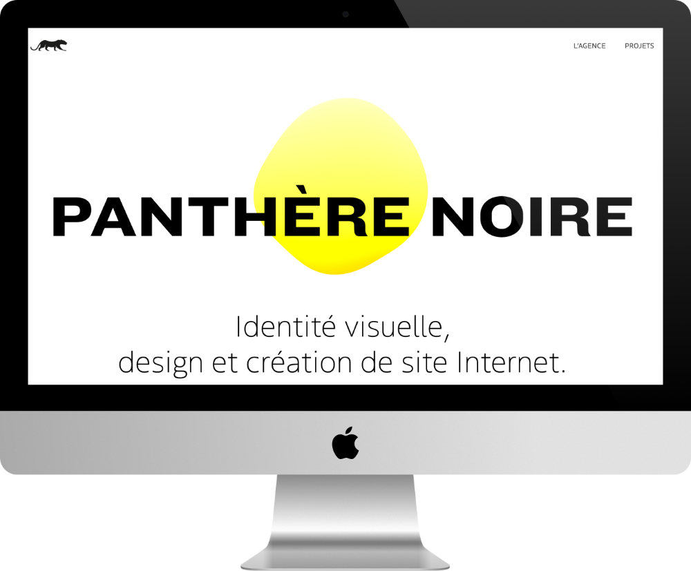
Unlike the previous, the originality of this agency website not only resides in its homepage...
There's this header hero, on the homepage, which shows a kind of yellow magma The shape of which changes with the mouse passing, it's fascinating, I love!
But there is also this attraction that is made as the mouse moves over the images of the portfolio. Looks like our mouse is loving. It's super addictive. I played with it a little while before I got back to work. 😉 Hey!
Finally there is the menu - the main navigation - which is intended to be minimalist. On the fly, the elements are "off". It's a shame because, for me, it evokes a negative feeling. (when I bar something, I don't want it anymore) But it has the merit of being original and getting out of the typical navigations that are usually found under Divi.
This web agency website made with Divi is one of the most successful of this selection.
3 - 2DSIGN
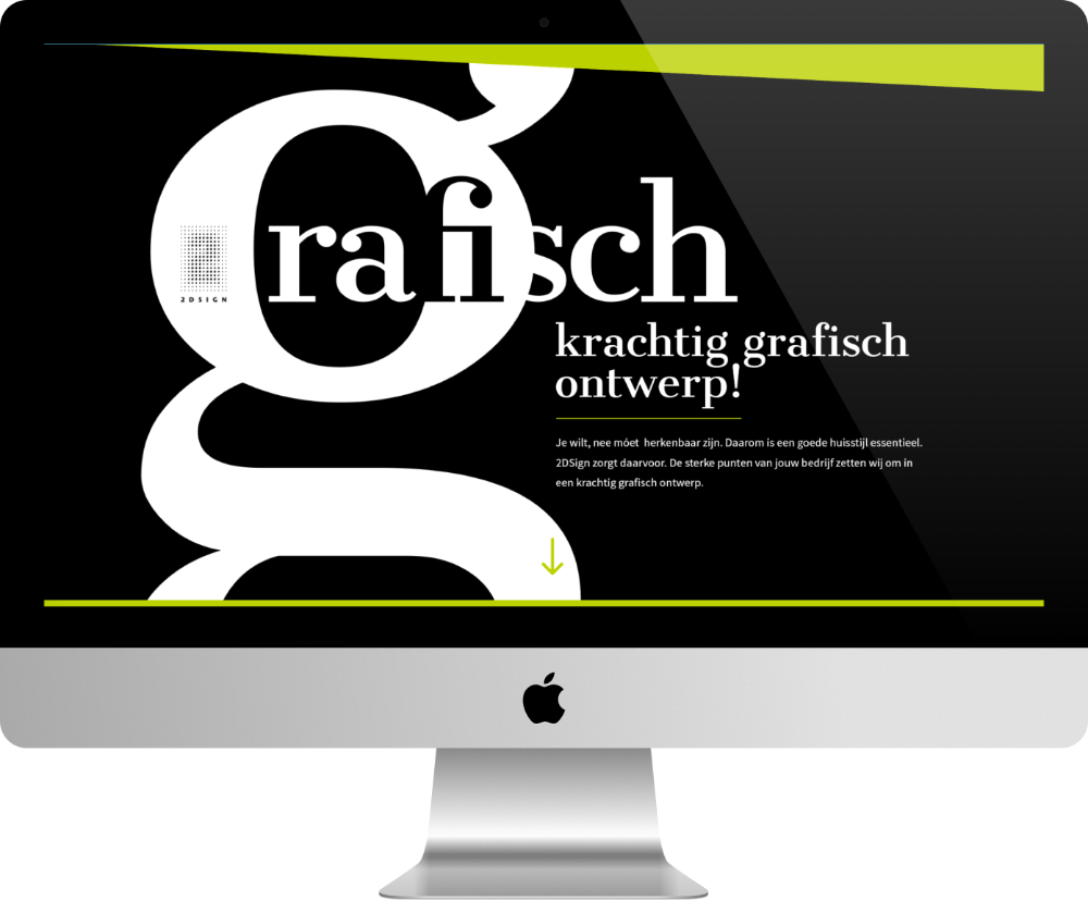
Here, the sections follow each other and alternate white, green, black and grey. The graphic chart is very punchy, I love it! The site does not lack content either.
I would say that the CREATE page is even more successful than the ACCUEIL page.
The portfolio page is filterable but the items have been kept as it is, according to the basic Divi module. However, the effort was made on the single project pages.
I find this site sober and consistent even if I don't understand a Dutch word.
4 - WolfByte
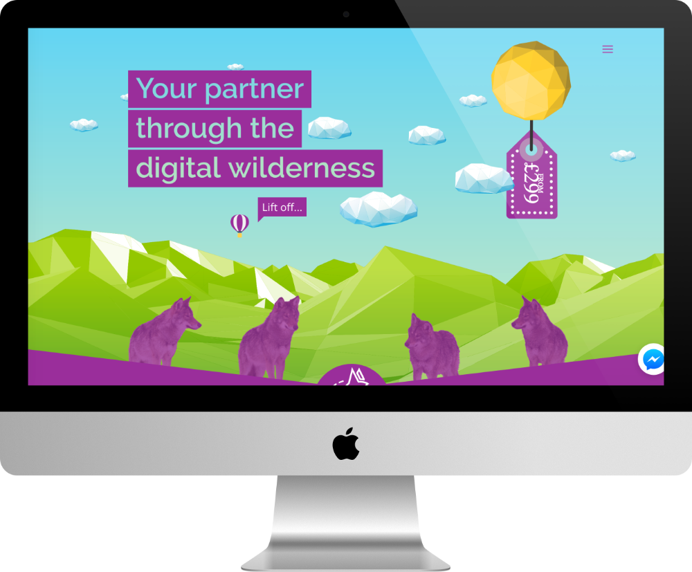
Wow! The homepage, she throws it away! A graphic very in the air of time, flashy colors, moving clouds and wolves who want to communicate over the mouse...
Here's what this web agency website made with Divi !
If you scrolle down, a background image is fixed and lets slide sections with very graphic shapes. Not to mention some customer reviews that allow potential customers to reassure themselves...
The main navigation is "recovery" and leads us to rather basic pages with little content. That's too bad! Let's hope Internet users enter via the homepage 😉 !!!
5 - TeixWeb
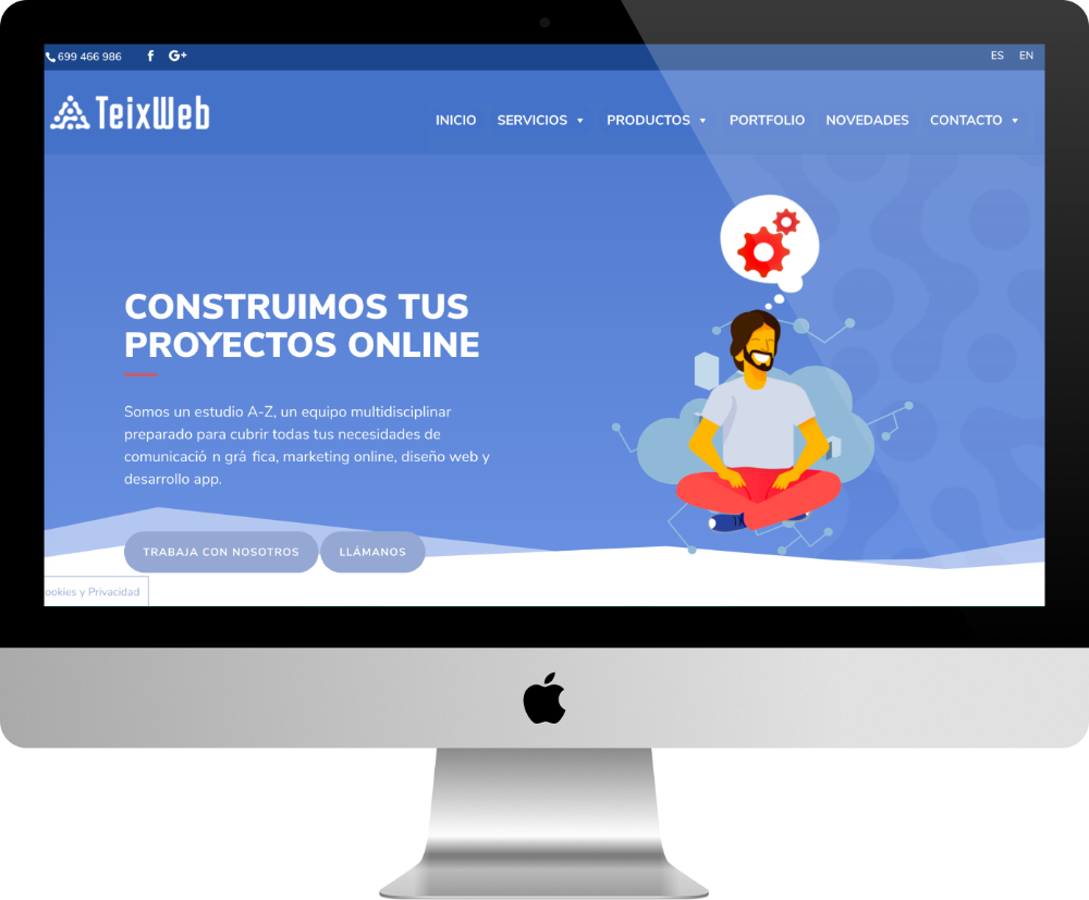
The layout on the homepage is pretty nice. The sections are separated by dividers easily achievable with the Divi Builder.
Main navigation displays images in its menus drop-downs to rounded corners. Right above, we see an Ariane thread discreet that allows the Internet user to quickly know where it is.
In each page, we find original elements that make you want to visit each page to look for new ones...
Vector colours and images are very nice.
6 - Sunflowercreative
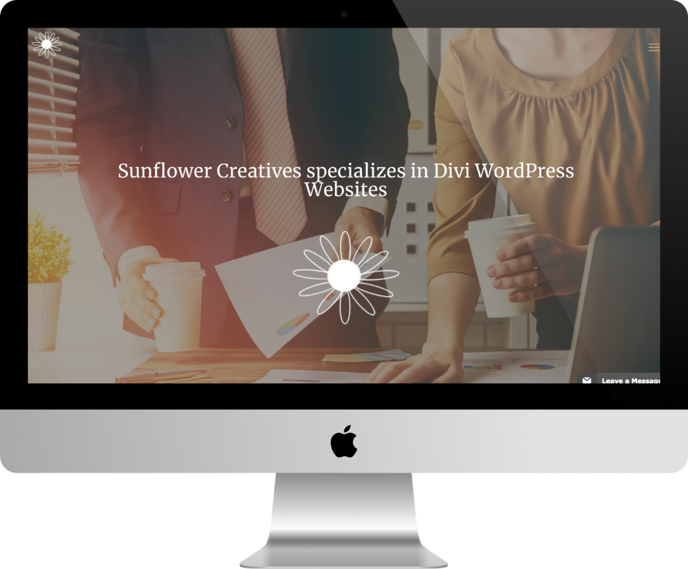
SunFlowerCreative is a web agency composed of 5 specialists. Their creations are mainly made under WordPress. Their site is rather simple but remains consistent.
A little corporate design can help get the trust of some customers.
The colors are soft, in anthracite, brown and golden tones.
Hello, merci pour ce partage.
Toujours un plaisir de voir du contenu de qualité sur Divi, surtout en français.
J’utilise Divi depuis plusieurs années et je trouve qu’avec une vraie maîtrise, on peut aller très loin en design et en performance.
Beaucoup sous-estiment son potentiel, mais bien exploité, il permet de créer des sites vraiment premium.
Chez WeDezign, on aime justement repousser ses limites et en tirer le meilleur.
Si jamais ça t’intéresse, voici un aperçu de notre approche : http://www.wedezign.fr
Hâte de voir comment le thème évolue avec Divi 5 ! 🙂
Encore bravo pour ton travail et au plaisir de te lire,
Alexandre
Merci Alexandre. Tout à fait d’accord !