
Your client wishes to display a line with the logos of its 9 main customersHow do you do it? You've probably met this situation before, haven't you? In this article, I explain how to align more than 6 elements on the same line!
1 - More than 6 columns in Divi...
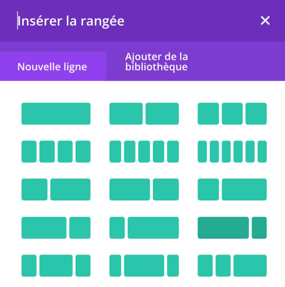
I'm sure it didn't escape you that the number of columns within a row (line) in Divi was limited.
You can add columns 1/1 - 2/2 - 3/3 - 4/4 - 5/5 - 6/6 but nothing beyond...
When you need to align more than 6 elements on a single lineIt becomes impossible, or complicated...
However, it is not so complicated if you use the Flexbox CSS.
Did you know that? You can test Divi for free by visiting on this page and by clicking on "TRY IT FOR FREE"
2 - Concrete case: 9 logos to display
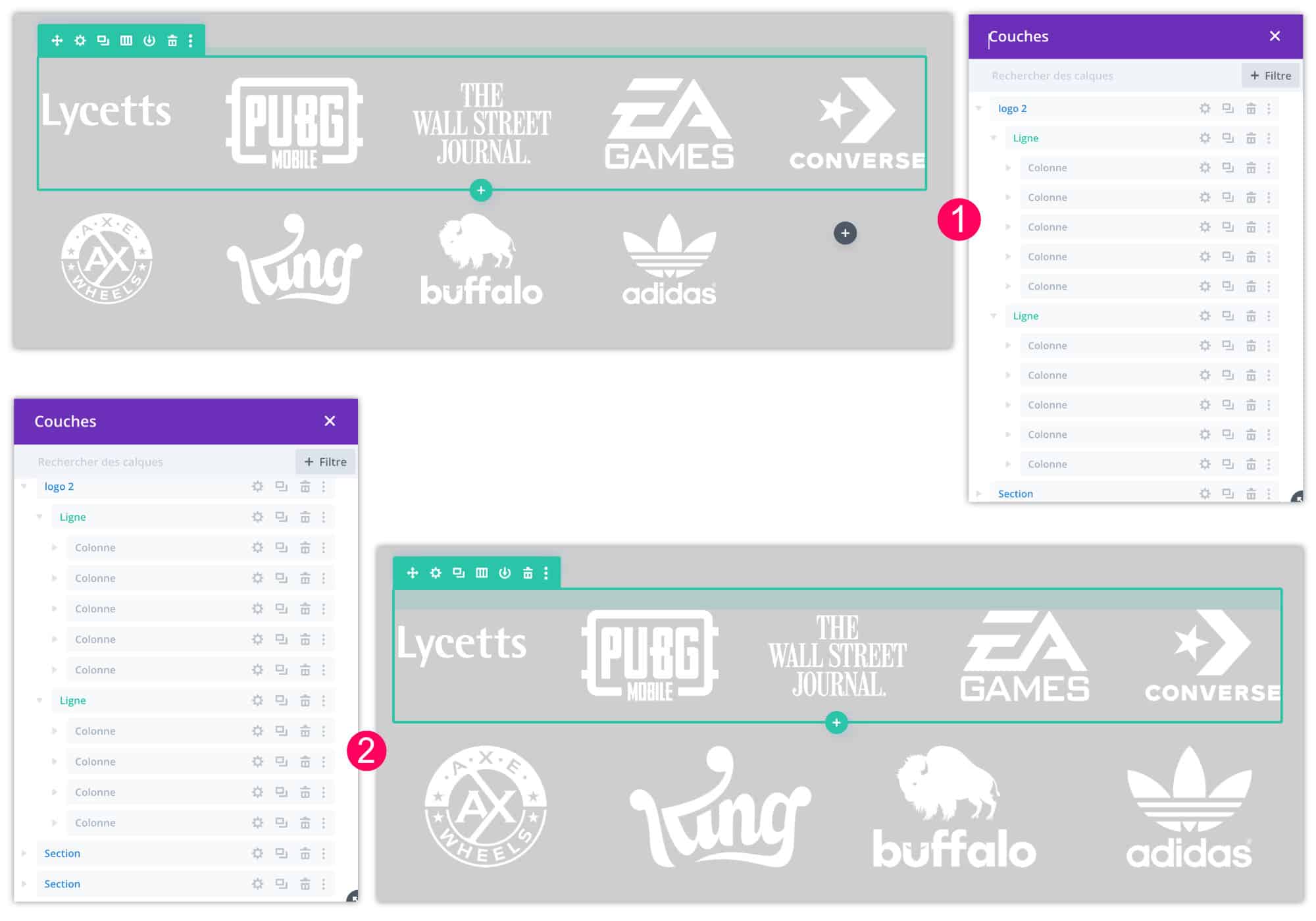
Let's take a concrete case: your client wants to display 9 small logos within its layout. Which choice do you choose:
👉 Option 1: you add two lines cut in 5. In the first line you display 5 logos and in the second line you display 4 with the last empty column.
👉 Option 2: You add two lines. One line cut in 5 and another cut in 4.
These two options are not satisfactory. In the first, there will be an empty location and in the second, there will be logos bigger than others, unless you play with margins or dimensions... In short, about!
There is then a 3rd option: using the flexbox to display the 9 logos on the same line!
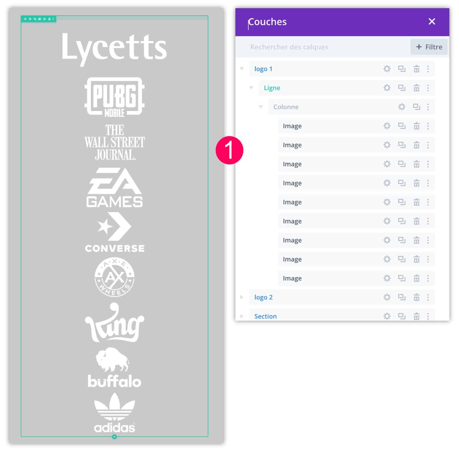
3 - Tutorial: 9 logos on the same Divi line
Let's now use the CSS flexbox module to get what you, or your client, need...
- Insert a 1/1 line in which you place the 9 image modules (it works of course if this number is different). Images are piled up, it's normal.
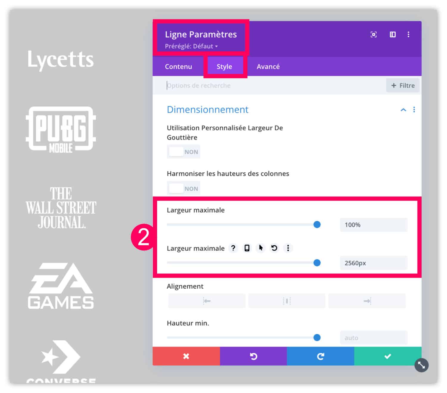
- In line settings (range), go to the tab Style > Dimensioning to increase the maximum values thanks to the two "maximum width" bars, i.e. 100% and 2560px.
- Then edit your image modules. Go to the tab Style > Alignment to align your logos to the center.
- Then on the tab Style > Dimensioning, reduce the size of your logos, for example 150px.
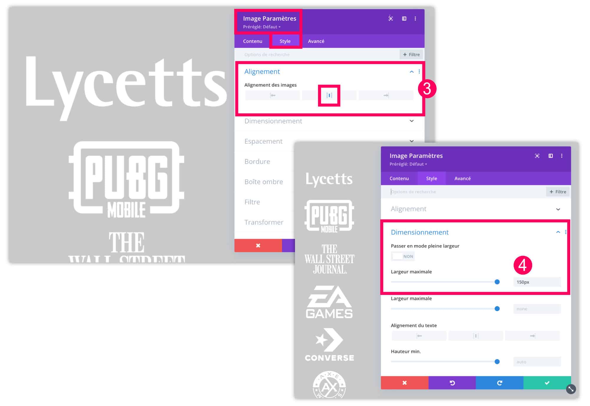
- Then edit the parameters of the column in which the logos are placed.
- Go to the tab Advanced > Customize CSS > Main Element to enter the following code:
display: flex;
flex-wrap: wrap;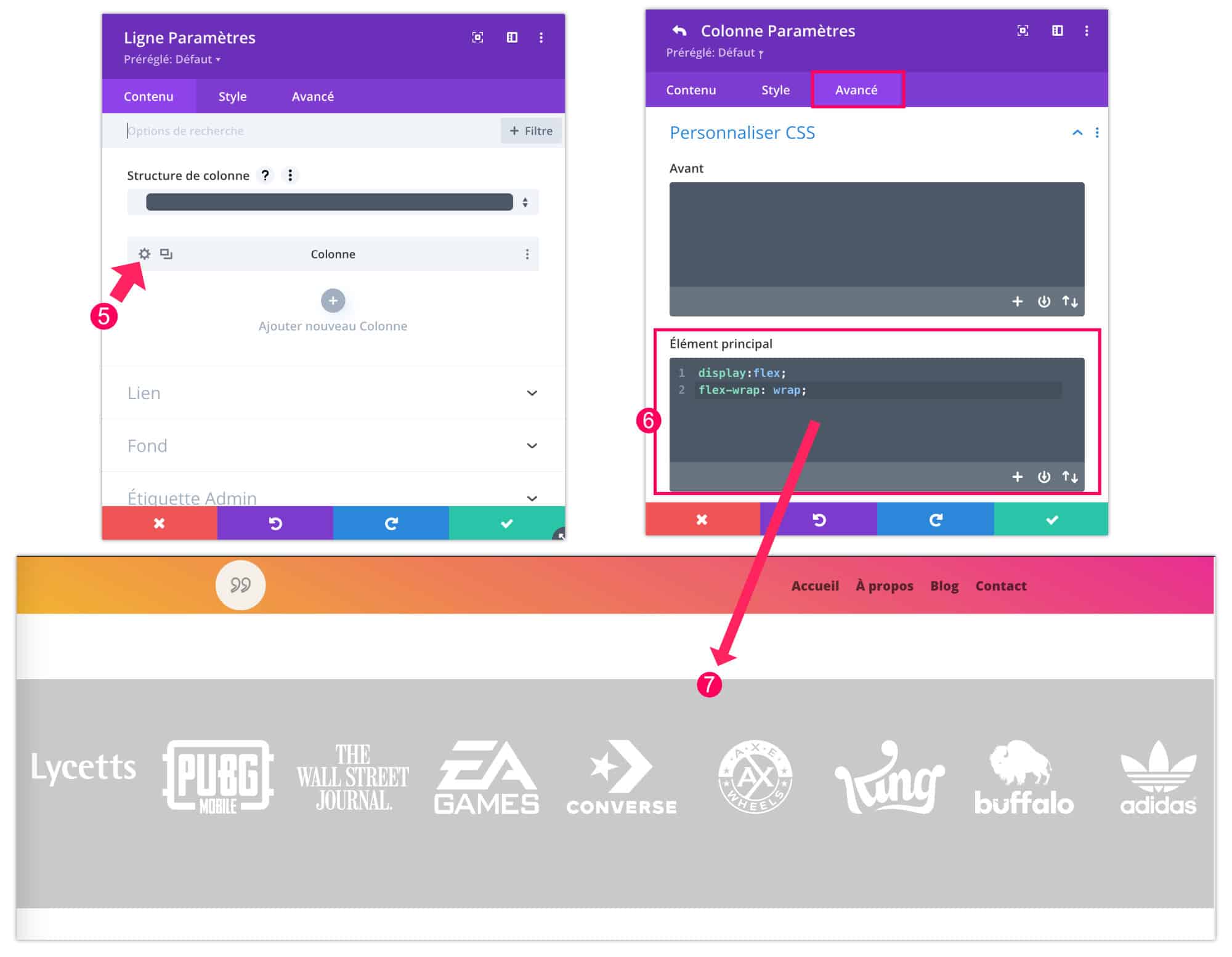
- Immediately, the logos align with the same row, it's magical 🔮.
Need more resources on Divi? Visit ElegantThemes blog full of ideas and tutos! Or learn how to effectively use this theme through my training Divi !
4 - Divi colonage: in conclusion...
I hope this mini-tutorial helped you. It is rather succinct because you have many additional options that you can add thanks to the property display: flex;. My complete guide on Divi Flexbox should help you. Do not hesitate to consult it.
So, do you have any other issues about the Divi columns? Let me know in comment!
C’est très bien, mais il faut faire attention au format téléphone ou tablette. Les 9 logos peuvent ne pas être très visibles.
Merci pour ce mini-tuto.
Exact, il faut toujours vérifier les versions mobiles. Merci Bruno pour le rappel.
Bonjour
Merci pour tous vos tutos
Comment faites vous pour trouver les logos partenaires et les rendre transparents ?
Bonjour Josiane, lorsque les logos n’ont pas de fond transparent, je les détoure avec Affinity Designer, mais vous pouvez le faire avec d’autres logiciels. Si besoin, je propose des mini-formation Affinity.