
You noticed it, and it pisses you off... You'd like to reverse the direction of the columns of Divi in mobile version.
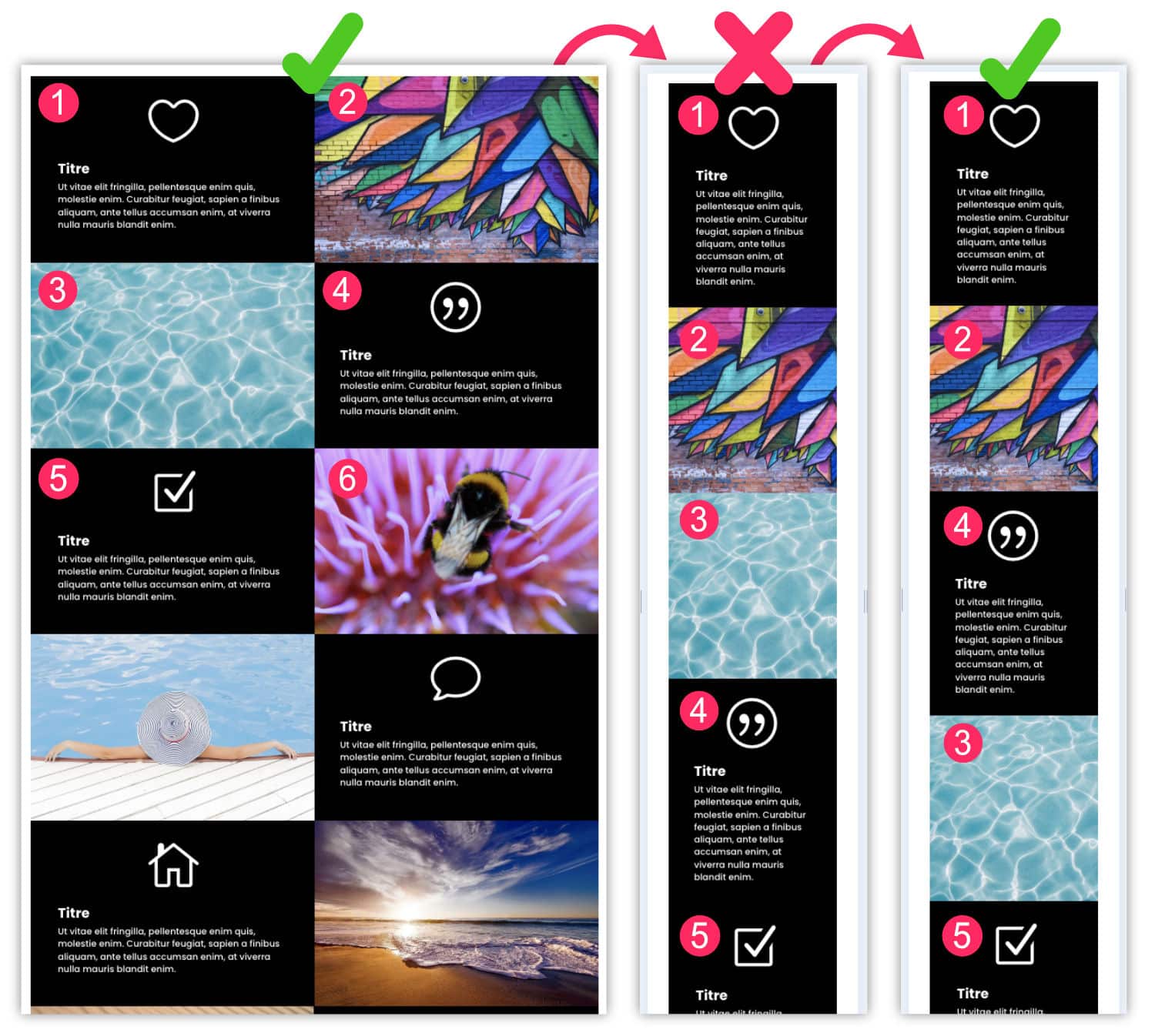
Indeed, when you create a layout with text on the left and an image on the right then vice versa in the next line, the mobile version is shifted and your layout is not optimal.
If it's on your blog, it may pass, but if it's on your client's website, it won't take him long to realize it and to ask you to correct it!
Good news, in this article, you will see that it is very simple to reverse the direction of the columns in mobile version and tablet Hey! Here we go!
1 - Reverse Divi columns: video tutorial
Once it is not customary, let's first watch the video. Thus, you will see directly what you need to do to correct this problem and then we move on to the detailed explanations...
2 - The flexbox: essential CSS property
As you saw in the video, we can easily modify the direction of the Divi columns in mobile version, simply thanks to 2 or 3 lines of CSS !
This is possible thanks to the Flexbox, a project integrated with CSS3 in 2016.
With the property display:flexWe can do a lot of things! We can do anything in fact:
- Change direction with property flex direction
- Change the switch to the line with flex-wrap
- Change horizontal alignment with justify-content
- Change vertical alignment with align-items and align-content
- Change the order of the child elements with order
- etc.
Anyway, believe me, flexbox saves lives. 🤣 Hey! And in the case of this article, flex direction which allows us to change the direction of Divi columns.
To better understand how this works, do not hesitate to consult CSS Tricks article.
3 - The media queries: indispensable for responsive
The other essential element for modify the direction of Divi columns on mobile is the use of media queries.
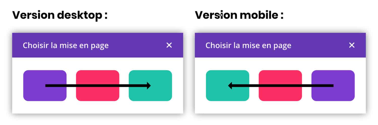
Indeed, you do not want to reverse columns on desktop versions, right? What we want is that it only acts on small screen sizes!
So the media queries are indispensable. It's also CSS, so nothing complicated to understand. If I learned it on my own at more than 30 brooms, you can do it too. 🤪.
The media queries allow to create CSS rules depending on the size of the screens. That's it. base of responsive design.
In our case, here we need to act on small screens, less than 980px. The rule used will therefore be @media screen and ( max-width: 980px ).
To understand how media queries work, do not hesitate to consult the article published on AlsaCreation.
4 - Reverse Divi columns in 3 clicks
As you saw in the video, it's very easy, here are the steps:
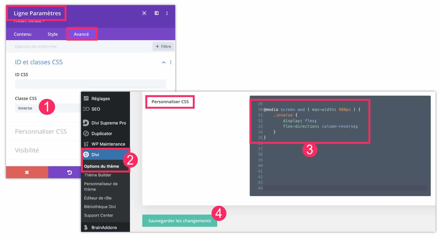
- First, open the settings of the (green) line which contains the columns to be reversed in mobile version. Go to the tab Advanced and add a CSS class named reverse (This is an example, you can name it as you wish).
- Then you go to the tab Divi > Theme Options > Customize CSS (there are several ways to add code in Divi).
- You add the following code:
@media screen and ( max-width: 980px ) {
    .inverse {
        display: flex;
        flex-direction: column-reverse;
    }
}- Save your changes.
There, nothing simpler! Now your columns display the right order when you visit your site in a mobile version.
Of course, as indicated in the video, you will have to add the CSS class reverse in all rows (green) of your site that pose a problem. Those in the right order in mobile version do not need this class.
5 - In conclusion
So what do you say about this easy-to-apply mini-tips?
By doing some research on the web, I found much more complicated tutorials to finally achieve the same result! For example, here are two:
- How to adjust the order of Divi columns on mobile devices
- How to control the stacking order of Divi columns on mobile
What do you think?


Bravo!
Comme d’habitude, clair, simple et efficace!
Super bien, je vais utiliser. En effet, combien de fois je me suis enquiquiné à faire de belles présentations sur Mac pour les retrouver sans queue ni tête sur portable et obligé de recomposer tout ce que j’avais fait pour que cela soit cohérent.
Intéressant d’autant qu’aujourd’hui on ne peut pas se passer du visuel sur portable. Beaucoup de consultations de site commencent sur l’iPhone pour finir sur l’IPad ou le Mac.
Merci Françoise
Merci Denis. Oui tu as raison… moi pour mes blogs c’est surtout sur desktop que vient le trafic mais c’est normal car c’est ma thématique qui veut ça. Pour les autres thématiques, c’est clairement les versions mobiles qui s’imposent.
Trop bien, merci !! 😀
Bonjour Lycia, je voudrais te soumettre un petit problème auquel je suis confronté et pour lequel je ne trouve pas la solution idéale.
Quand tu utilises le module témoignage dans Divi, celui-est relativement bien fait mais lorsque tu en as beaucoup, cela va vite occuper un espace visuel important, tu peux toujours les mettre sur quatre colonnes et cinq rangs, mais ça risque d’être pénible à l’écran surtout sur ton iPhone, une vraie litanie.
Alors, je m’étais dit pourquoi ne pas essayer de faire ça sous mode carrousel, mais les plugins que j’ai testés ne sont pas terrible (wowcarousel -divi people par exemple) et au niveau du responsive c’est la cata.
Aurais-tu une idée comment gérer le sujet ?
Merci par avance de ta réponse
Salut Gransart, non je n’ai pas trop de solution, il faut trouver un autre plugin, mais tu peux essayer des plugins pas obligatoirement conçus pour Divi, sur le répertoire de WordPress, tu en trouveras certainement un qui convient
J’adore !
Lycia, tu es toujours au rendez-vous quand on a besoin de conseil !
un grand merci pour ce tuto qui va m’être fort utile…
Merci Valérie
Bonjour Lycia, encore moi… ce tuto ne fonctionne pas sur les « sections spéciales » avec des colonnes différentes ?
ou bien j’ai mal fait ? Merci de ton retour,
Valérie
J’ai pas essayé sur les sections spéciales, il est possible qu’elles fassent appel à des classes CSS différentes, il faut inspecter le code.
Lycia,
J’ai fait une demande à ET et voilà le css :
@media (max-width: 980px){
.et_pb_section_6.inverse.et_section_specialty .et_pb_row {
display: flex;
flex-direction: column-reverse
}
}
ça peut servir à d’autres personnes aussi… je partage.
A bientôt
Merci Valérie
Très bon tuto qui me sauve lol. A noter que l’affichage responsive mobile sous l’éditeur Divi n’inverse rien, mais si vous le faites depuis la page de votre site avec la console de développeur (F12), cela s’affiche parfaitement.
Oui François, l’affichage mobile ne sert qu’à observer et non à paramétrer
Merci infiniment Lycia !!!
De rien 😉
Bonjour j’aurais aimé savoir à tout hasard si vous sauriez comment inverser des colonnes d’une section spéciale de Divi ?
Bonne question, j’ai pas essayé, il faut certainement changer la classe CSS