
It sounds crazy, but Divi has not yet incorporated the CSS properties of Flexbox into its builder, or at least not in the form of options that can actually be activated for the user. This may be the case in Divi 5, but in the meantime, let me show you another way of create your Divi layouts using the Flexbox. Here we go!
- 1 - What is the Flexbox?
- 2 - The concept of parent-child
- 3 - How to activate the flexbox on Divi?
- 4 - The properties for the flexbox container and their behavior
- 5 - The properties for the child elements and their behaviour
- 6 - Flexbox for Divi: the overview
- 7 - Useful links to go further with the flexbox
1 - What is the Flexbox?
Flexbox is a powerful CSS module which allows you to easily create flexible and responsive layouts. It offers a more efficient and intuitive way of distribute the space and align the elements in a container. This can be a section, line or column of Divi.
For now, it may not be talking to you, but the rest of this article will help you understand. And be reassured, no need to be a web integrator or know the CSS on the fingertips for use Flexbox in Divi. Just understand how it works and use the right properties I will give you (copy/paste).
2 - The concept of parent-child
For Flexbox module The concept of parent-child must be understood.
Indeed, for activate the flexibility of a "box" (container), you must add the property display:flex; on the parent element (container). This will allow us to obtain a lot of flexibility in the behaviour of its children's elements (items).
Look:
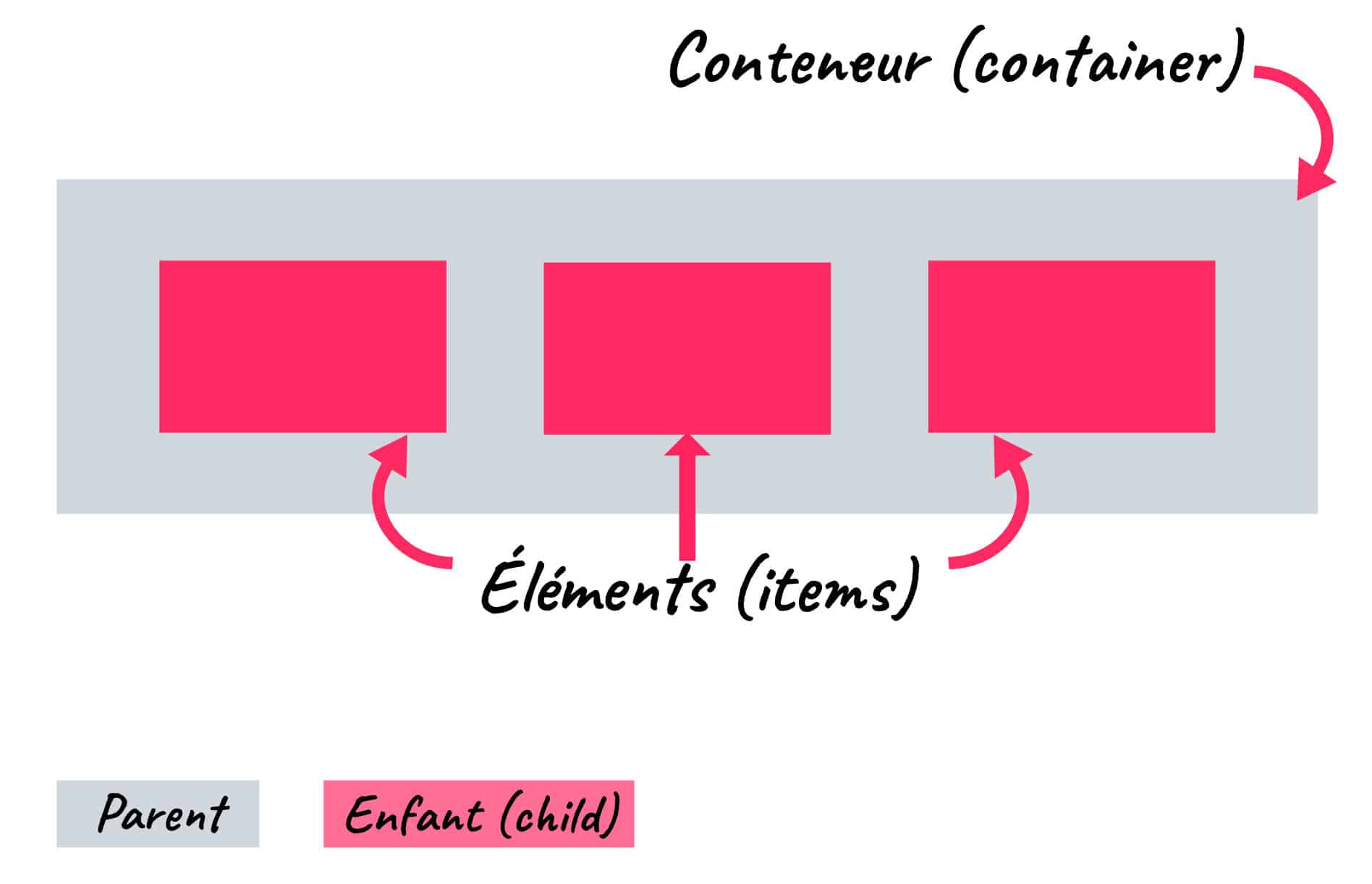
To translate this into "Divi mode," it would be like this:
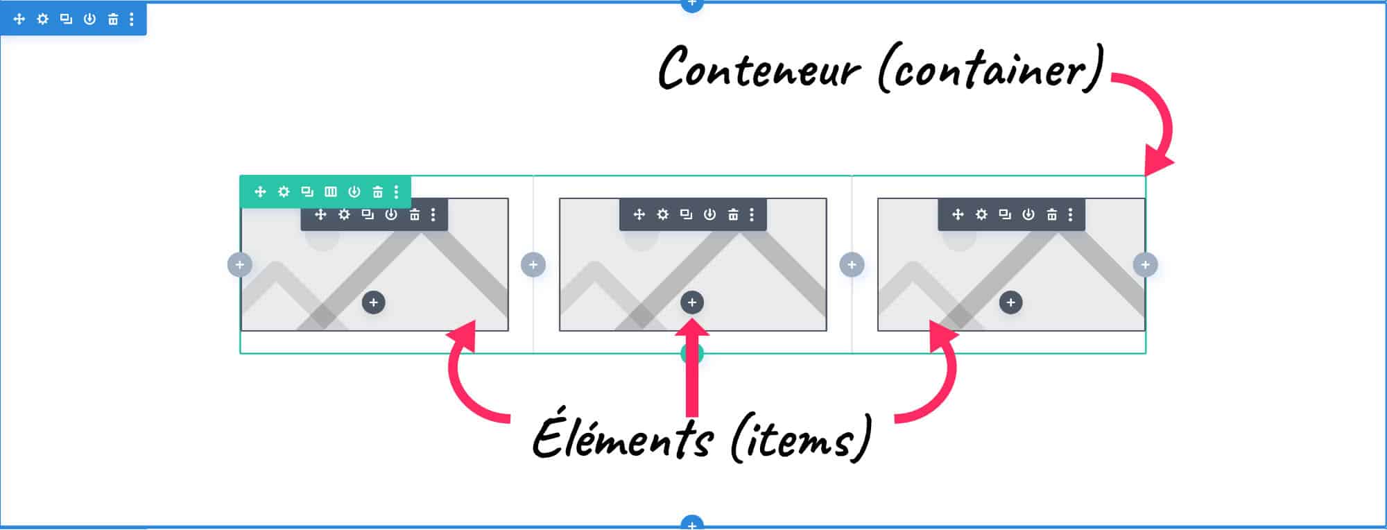
On this screenshot, we see that the line or row (row) in green is the parent elementSo the container. And that the images seem to be the children (items). But don't get me wrong, the children of the row (row) are the columns (columns) and not the modules that are placed in each column.
Look:
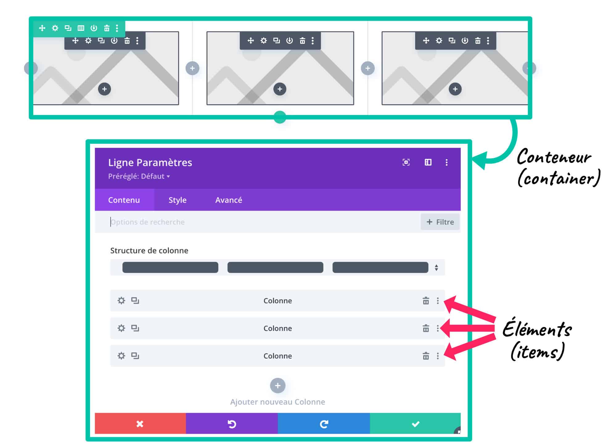
But this Flexbox module can be implemented on any container. For example, it could be activated only at the column level instead of the row/row.
Look:
Therefore, the elements within the same column could be made flexible.
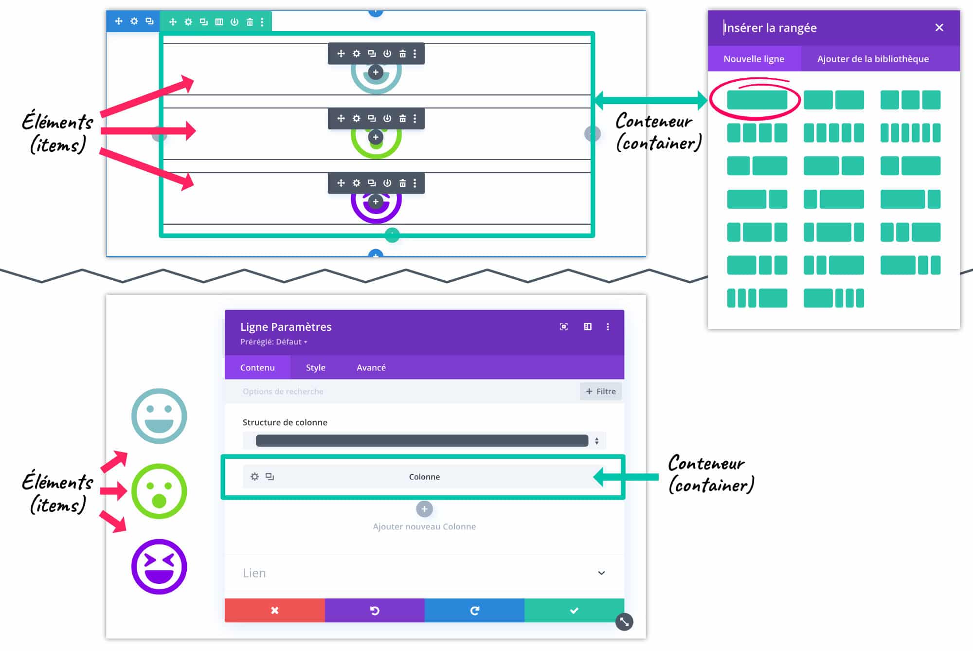
This property display:flex; can therefore be placed on the parent element of your choice. It could be a section of Divi (blue, violet or orange section), even if it is usually used on lines or columns.
Summary:
- If you place the flexbox on a section, the child elements will be lines/ranges
- If we put the flexbox on a line, the child elements will be the columns
- If you place the flexbox on a column, the child elements will be the modules (texts, images, icons, etc.)
I hope I didn't lose you with these little theoretical explanations, but essential... let's go now with more concrete explanations.
Need to master Divi? Discover my training that accompanies you step by step in the understanding and use of Divi! Learn more about Divi training.
3 - How to activate the flexbox on Divi?
As you may have understood, to activate this flexible behavior, you must add the property display: flex; on the right container. And for that, Divi offers us various possibilities in its options for add code All over the place!
3.1. - Manually on appropriate containers
Let's take the example of the 3 icon modules I added in the same column:
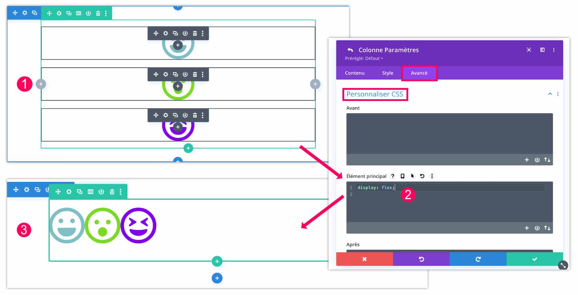
- By default, each icon is placed under each other within the same column.
- Go to the tab Advanced > Customize CSS > Main Element to add the property
display: flex; - Immediately you will notice that the children elements of the column - items - behave fluidly and place one next to the other.
This is a very interesting behavior and you will soon understand why.
3.2. - The particular case of lines/ranges
There is a particular case for which Divi automatically adds the property display:flex;, which prevents us from adding it manually. This is when you check the option "harmonize column heights" within the settings of a line (range).
This option may be used sometimes because it is very useful in some cases. So without knowing it, you use the Divi Flexbox.
For example, when you apply a background color to the various columns in a row and the contents do not have the same size, the visual rendering is not optimal, as can be seen below:
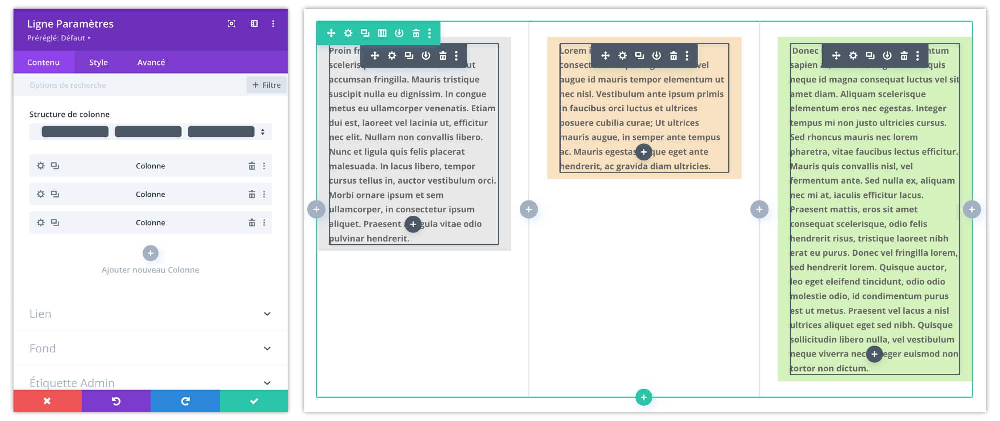
The flexbox also regulates this type of "problem"!
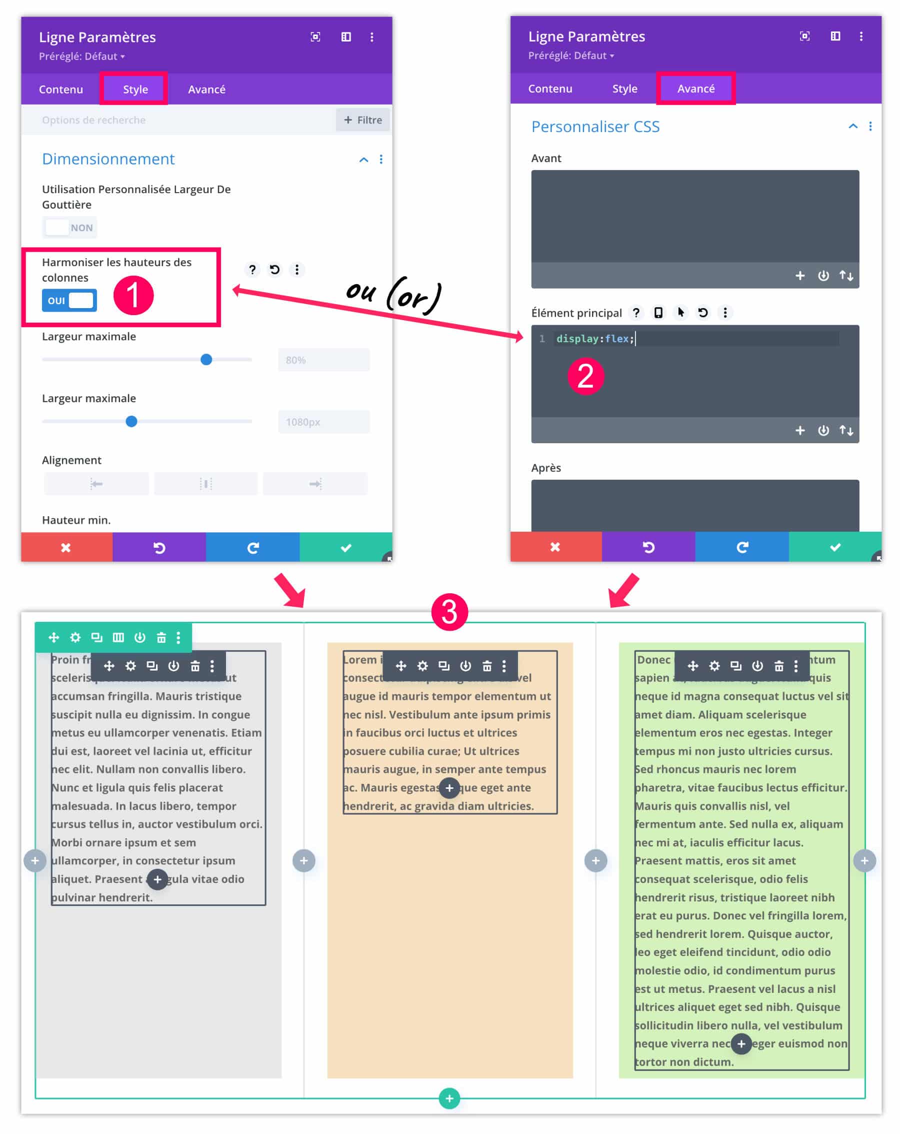
- You can activate the native flexbox from the tab Style parameters of the line (range). Just activate the option "harmonize column heights".
- If this option is not enabled, you can add the property
display:flex;directly to the tab Advanced > Customize CSS > Main Element. - It's either one or the other. In both cases, the height of the columns will be equal, regardless of the size of the content of each column.
Did you know that? You can test Divi for free by visiting on this page and by clicking on "TRY IT FOR FREE"
4 - The properties for the flexbox container and their behavior
But it's not over! The magic of the Flexbox Don't stop there!
Indeed, for now, you may find it difficult to understand the benefit to use Flexbox in Divi. But the rest will delight you!
4.1 - Flex direction
This makes it possible to change the behaviour of the direction of the child elements on two axes and their opposite.
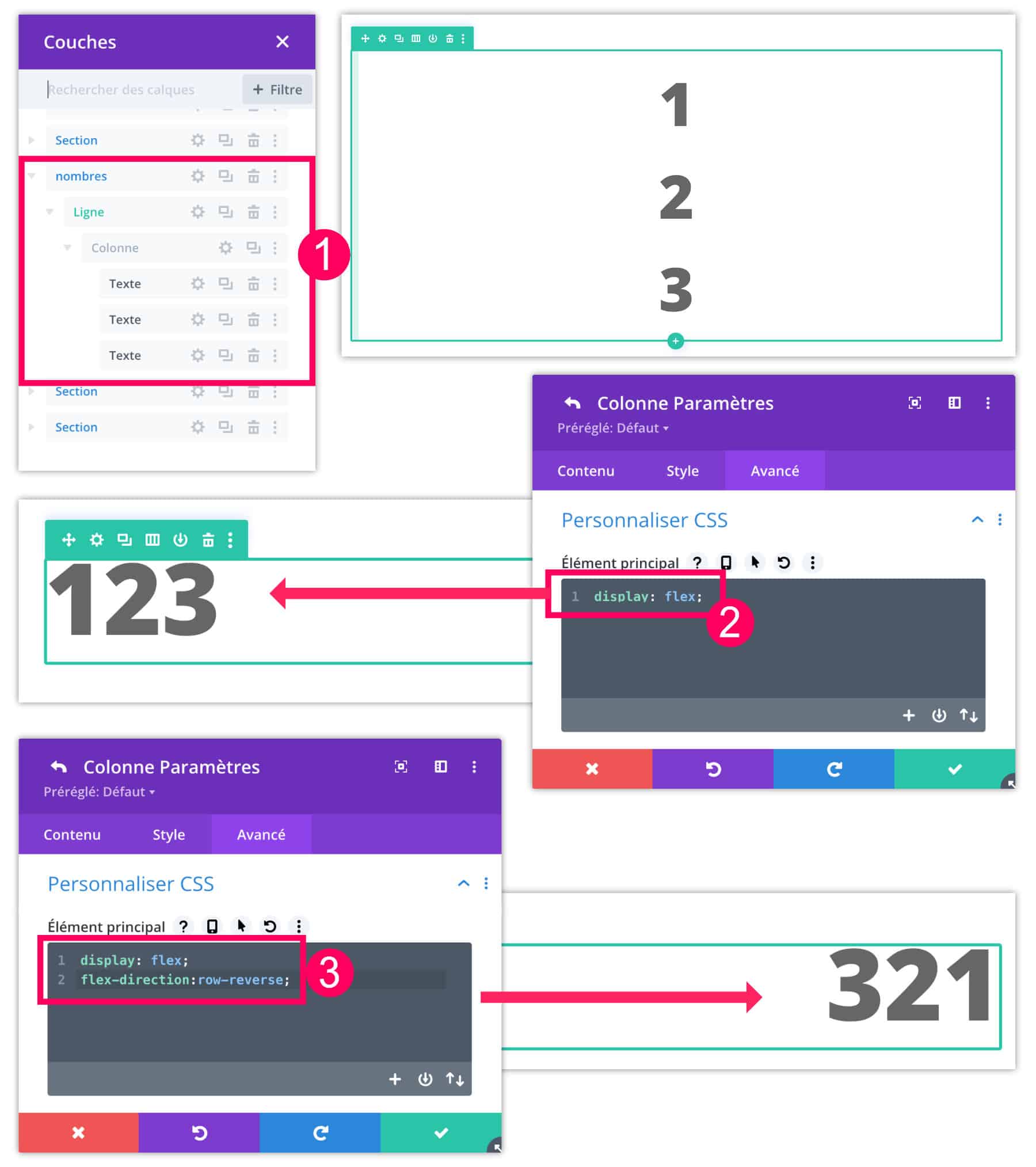
- For example, I added 3 text modules within the same column. By default, the modules pile up.
- If we add the property
display:flex;directly to the tab Advanced > Customize CSS > Main Element parameters of the column (and not of the line), the elements are fluid, you understood it. - But if we now add the property
flex-direction:row-reverse;It is noted that items (child elements) are reversed.
Property flex-direction can use 4 values:
row: default, left to rightrow-reverse: from right to leftcolumn: from top to bottomcolumn-reverse: from bottom to top
row being the default value, you do not need to use this property if you want your elements to be left to right.
4.2 - Flex wrap
Another Flexbox property that can be very useful to you is flex-wrap. If you add this to the container (to the parent), the child elements will be able to change their behavior of crossing the line.
Property flex-wrap can use 3 values:
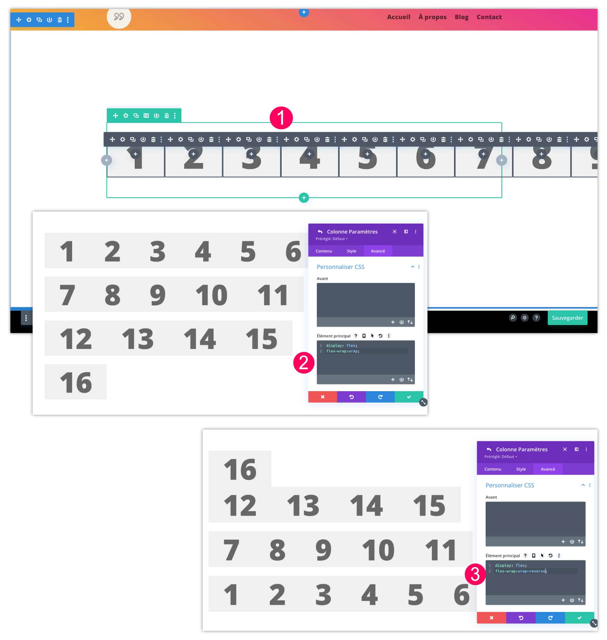
nowrap: this is the default value, all items remain on one rowwrap: the elements go to the line, from top to bottom.wrap-reverse: the elements go to the bottom line to the top.
To use it, simply add the properties you need on the container of your choice. For my example, I edited the column (not the line) and added the following lines to the tab Advanced > Customize CSS > Main Element :
display: flex;
flex-wrap: wrap;
nowrap being the default value, you do not need to use this property if you want your items to stay on a single line.
4.3 - Justify-content
This is certainly one of the properties of the Flexbox that I love most and that can save many situations. Property justify-content allows to align the child elements within the parent on a horizontal axis.
In your code, after adding the property display:flex; on the tab Advanced > Customize CSS > Main Element parameters of your container, you can specify horizontal alignment using the following values:
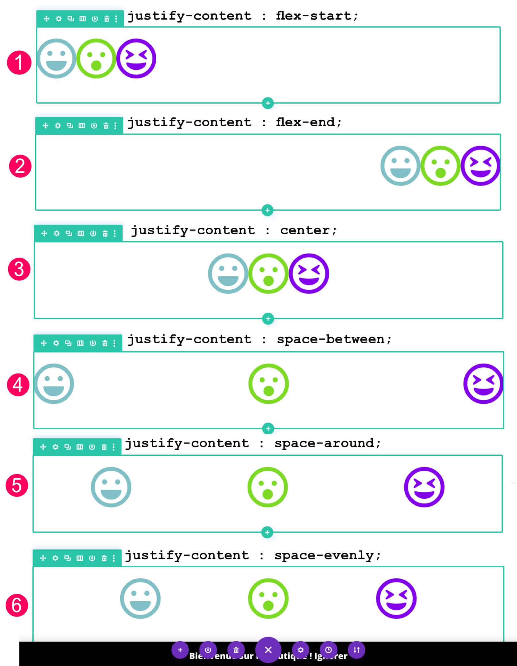
flex-start: this is the default value, you do not have to specify it to align the elements to the left.flex-end: the child elements align to the right.center: the elements are aligned to the center.space-between: the elements are evenly distributed in the parent container. The first element will stick to the left and the last will stick to the right, the other elements will center equally.space-around: the elements are evenly distributed in the parent container with an equal space around them.space-evenly: the elements are distributed so that the spacing between any two elements (and the space at the edges) is equal.
So, for example, center horizontally elements within a container, use this code:
display: flex;
justify-content: center;
4.4 - Align-items
Property align-items allowsvertically align the child elements within the container.
In your code, after adding the property display:flex; on the tab Advanced > Customize CSS > Main Element parameters of your container, you can specify vertical alignment using the following values:
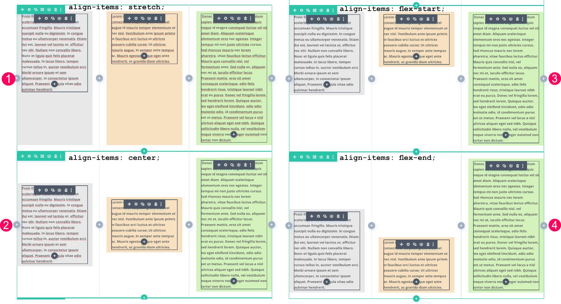
stretch: it is the default value that allows to stretch the elements to fill the container.center: the elements are centered on the vertical axisflex-start: the elements "paste" and align at the top of the container.flex-end: the elements "paste" and align at the bottom of the container.
So, for example, focus vertically elements within a container, use this code:
display: flex;
align-items: center;
4.5 - Gap
Finally, to space your elements within a container, you can use the property gap with a value in pixels. For example: gap:30px;
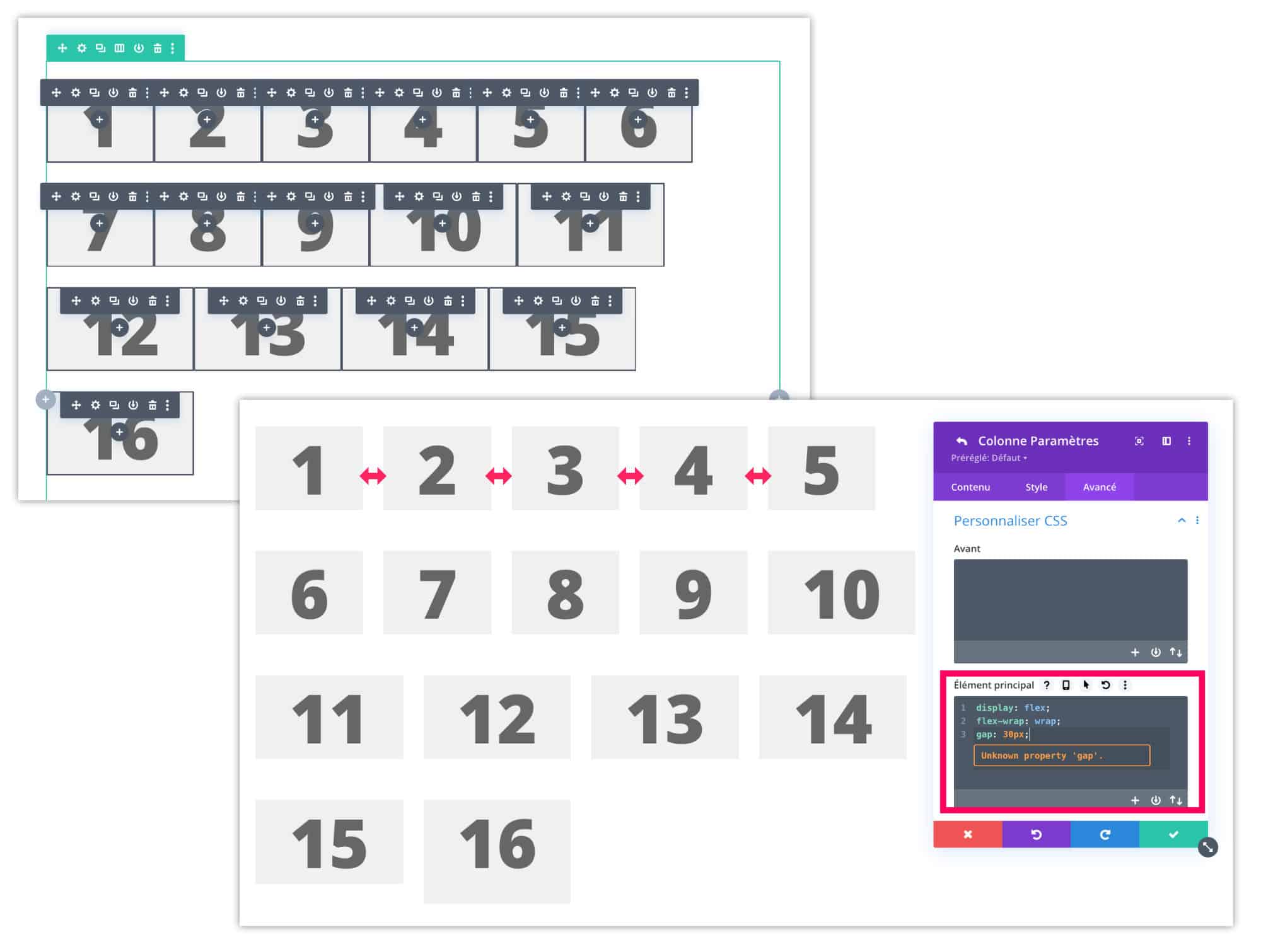
Note: even if Divi indicates that the "gap" property is unknown, it does exist and it works!
So, to space 30px elements that follow the line within the same container, use this code:
display: flex;
flex-wrap: wrap;
gap: 30px;
5 - The properties for the child elements and their behaviour
We have seen that most properties can be used on the parent container. But the flexbox also allows you to use properties on children's elements. This can be useful in a few cases, depending on your needs.
5.1. - Order
Property order allows to define an order among children. By default, the elements are arranged in the order in which they were placed.
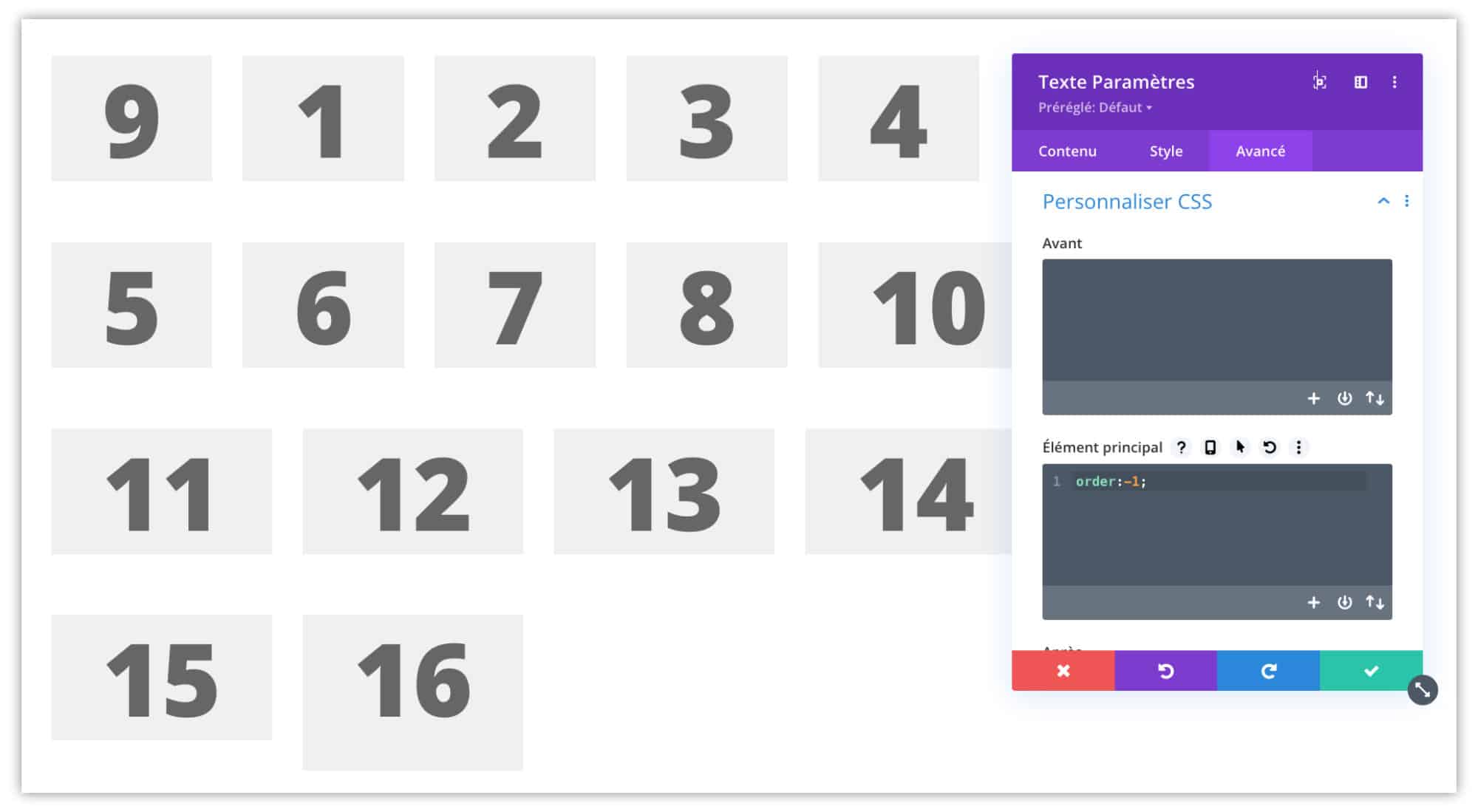
For example, I edited the text module "9" to give it order: -1; As you can see, the 9 came to first position, before all the other text modules.
5.2. - Flex-grow
Property flex-grow allows to "give more space" to a child element.
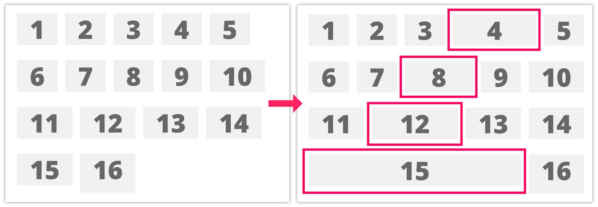
For example, on the above image, I gave a value flex-grow:1; elements 4, 6, 12 and 15. As you can see, these elements with a Flex-grow value are trying to take the entire space available on the line.
If you give an identical value (e.g. "1") to each element in the container, they are share space fairly, by line.
5.3. - Align-self
To vertically align the elements present in a container, the property align-items does the job perfectly. But to make exceptions, you will need to use the property align-self the child element itself.
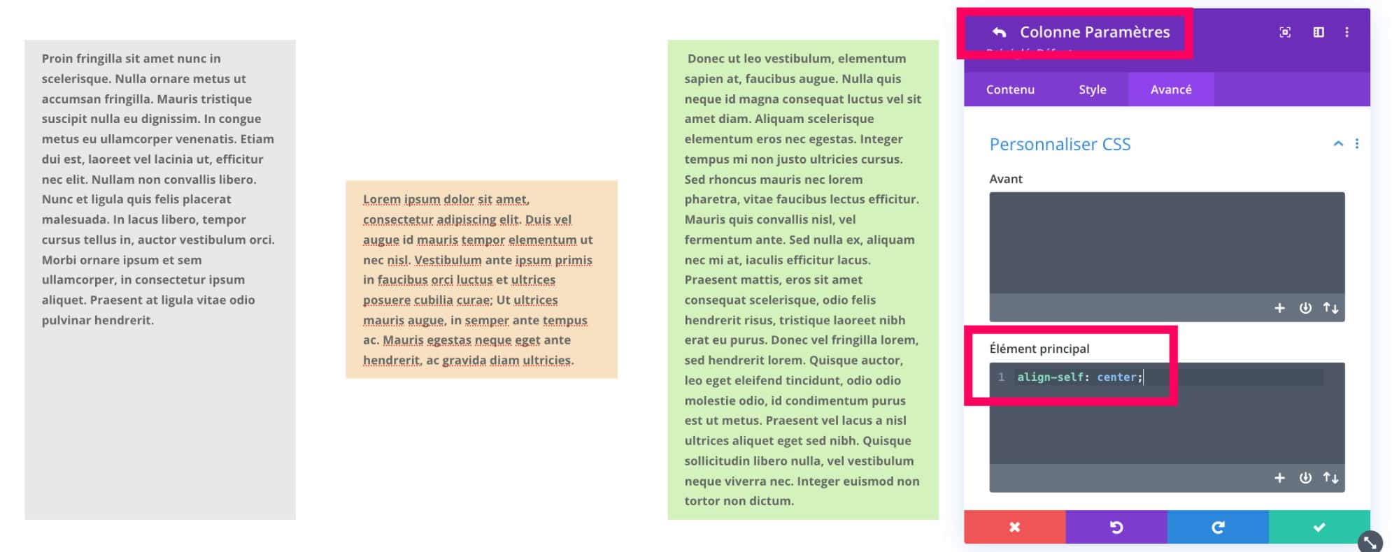
For example, on the above image, I applied the property align-self:center; at the middle column parameters only.
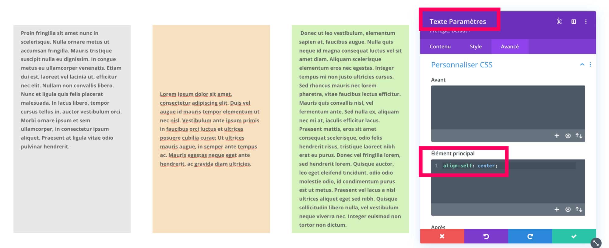
On this other image, I applied the property align-self:center; on the parameters of the text module by ensuring that the display:flex; at column level.
Again, we notice that behavior changes if we don't choose the right containers or elements to apply our properties.
Possible values for the property align-self are:
autoflex-startflex-endcenterbaselinestretch
6 - Flexbox for Divi: the overview
I feel like this article is hard to understand. 🤣especially if you're new. But it's not up to you to copy/paste properties within the Divi Builder to activate the flexbox.
Here is a summary:
| Valid for | Ownership | Available values |
| Container | display* | flex |
| Container | flex-direction | row : default, left to rightrow-reverse : from right to leftcolumn : from top to bottomcolumn-reverse : from bottom to top |
| Container | flex-wrap | nowrap : default valuewrap : the elements go to the line, from top to bottom.wrap-reverse : the elements go to the bottom line to the top. |
| Container | justify-content | flex-start : default valueflex-end : the child elements align to the right.center : the elements are aligned to the center.space-between : the elements are evenly distributed in the parent container. space-around : the elements are evenly distributed in the parent container with an equal space around them.space-evenly : the elements are distributed so that the spacing between any two elements (and the space at the edges) is equal. |
| Container | align-items | stretch : default valuecenter : the elements are centered on the vertical axisflex-start : the elements "paste" and align at the top of the container.flex-end : the elements "paste" and align at the bottom of the container. |
| Container | gap | 30px (e.g. pixel value) |
| Element | order | -1, 1, 2, 3, etc. |
| Element | flex-grow | 0, 1, 2, 3, etc. |
| Element | align-self | autoflex-startflex-endcenterbaselinestretch |
7 - Useful links to go further with the flexbox
I showed you here the main flexbox properties usable within Divi. There are a few more. If you want to explore them, meet here.
Also, I suggest some links/tutorials that may interest you:
- Reverse Divi columns in mobile version
- Vertically Align the elements in Divi
- To go further into the Divi's responsive, it's here.
- Learn more about the "Display" property
- Use more than 6 columns in a Divi line

Merci beaucoup, votre présentation est parfaite, j’ai mieux compris l’intérêt des flexbox !
Merci Stéphane
Merci pour ce très bon article. Je connais et je me sers des flexbox depuis longtemps mais l’article est très clair et bien ordonné. 👍
Merci beaucoup pour cet article. Je pense qu’il faut le faire (s’entraîner) pour bien se rendre compte les avantages de Flexbox.
Voila du bel ouvrage de la réflexion et pour nous de la compréhension, je vais aller explorer cela et tester ces possibilités. Encore merci Lycia…
Encore un article éclairant !
Merci Lycia
Merci Jérôme
Merci Patrick
Merci Cyril