
Personal or professional coaching has the wind in its stern... I see it around me, many people decide to put themselves on their own in order to offer coaching services of any kind such as personal development coaching, health coaching, financial management coaching, coaching to improve human relations, coaching to boost your career and more!
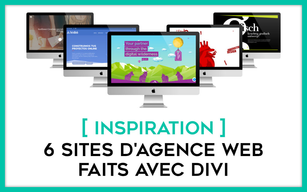
These new professionals then need a window to promote their services and try to find customers directly from the web. If you too want to embark on coaching or one of your prospects calls on you to create its website dedicated to its coaching activity, this list of websites will certainly you inspire and stimulate your imagination. In this article, let's discover 10 examples of coaching sites made with Divi.
Discover all you can do with the theme Divi
1 - ZEN AVION COACHING
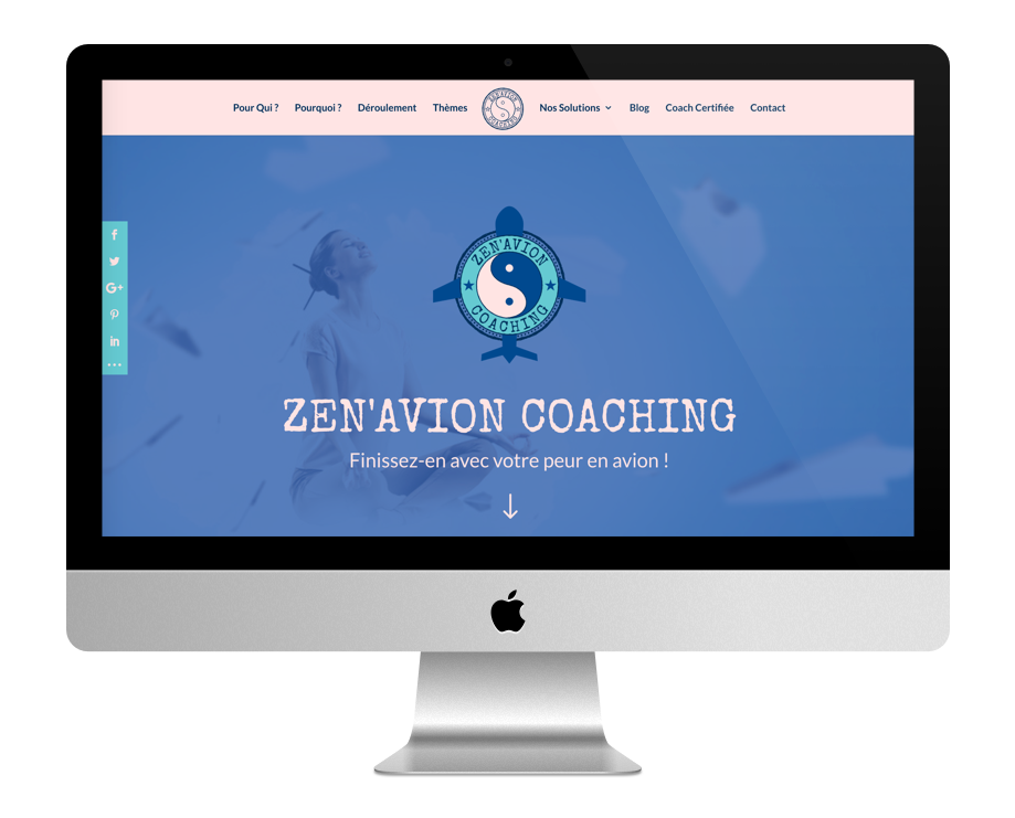
The ZenAvion Coaching website offers a home page composed of a chamaïeu of bruises. To mouse scroll, the color fades to throw itself into a turquoise sea that makes you want to go on vacation. Zen galets overlap two sections of different colours. Then, a background image slightly shows passport stamps. Finally, three postcards are Call-To-Action that lead to the services offered by the site. The colour code, which is available from blue to turquoise blue without forgetting a white-pink that recalls the sand, fits well with the theme.
2 - WE 2 ME
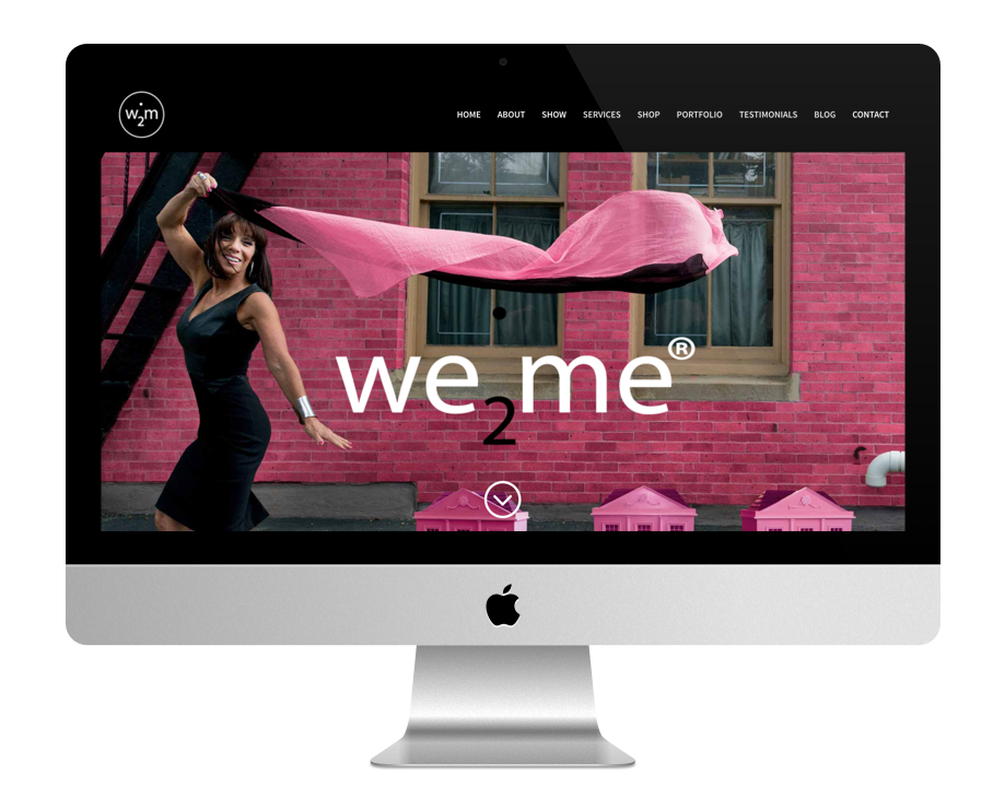
The We2Me site uses a nice fixed image as a Header Hero with a superposition logo that goes with the mouse scroll. Scrolling reveals a quote followed by links to various pages. Each section of the homepage is separated by black and white and full screen images that remain fixed, which also gives a very nice look. The sections use images, text, video, links to press articles, audio, a contact form and Call-To-Actions. The site also offers monthly subscriptions that are managed through the WooCommerce extension. The Fuchsia/Black/White color code is sober and distinguished.
3 - FRIEND MAXINE
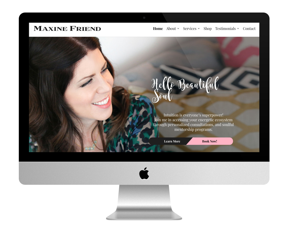
The Maxine Friend website offers a simple but effective home page, we understand from the start what this Coach offers us... The full screen image of the welcome is particularly well chosen because it inspires confidence. The little touch of originality lies in the button split into two calls to action. By scrolling the page, we pass a section with a background image in parallax to get to the services section. What makes the difference with most other websites made with Divi is the footer of this site which is rather well orchestrated and original.
4 - HEIDI ROSE
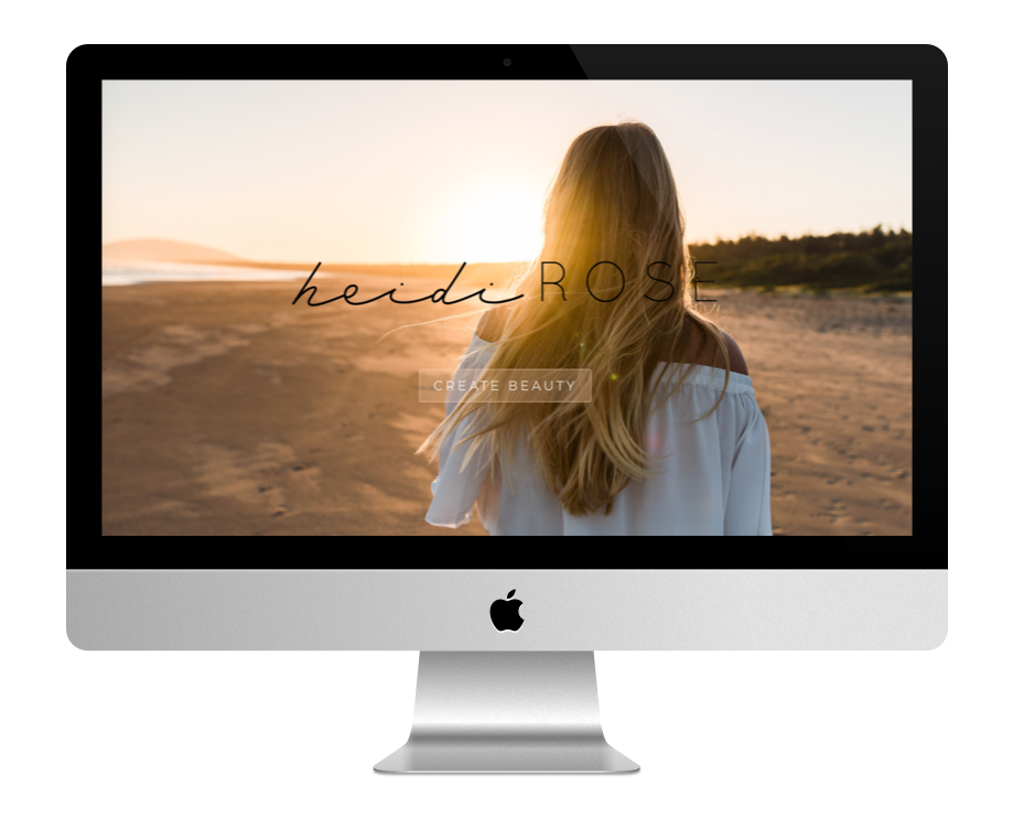
The Heidi Rose website dares a fixed home page with a full screen image and a call to action button. By clicking on the button, you arrive on a sober home page that lets appear images in full screen and sections very stylish by an original font but a little difficult to read. The color code is very elegant with its association of Peach / White / Black.
5 - NO GOGGIN
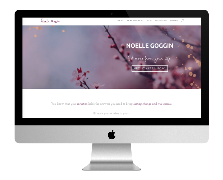
The website of Noelle Goggin does not pay a mine when you arrive on this rather standard home page but when you dig a bit, you see a note of sweetness linked to originality. The footer of the site out of the common. The ABOUT page is also very pretty with many parallax effects.
Also read: 10 site inspirations for restaurants.
6 - WILD SACRED
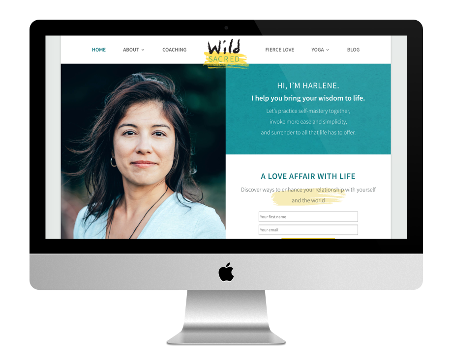
The Wild Sacred site uses the "embedded layout". The structure of the site is divided into two columns with sections that split the page into a very well orchestrated checker game: image on one side and text on the other side then vice versa. What is very successful is also the complete design of the site with these various brush strokes of different colors. The fonts used are sober and the images are beautiful.
7 - INSIGHT COACHING
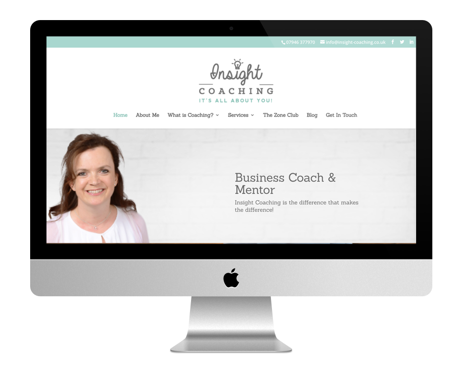
The Insight Coaching website Also uses the "embedded layout" but customised as the lateral margins are thinner than the standard width. A large header with logo is located above the main menu. The continuation of the home page is rather basic but all the other pages of the site are consistent with each other. The color code is sober and reassuring with this soft green as the main note.
8 - AMBER CHALUS
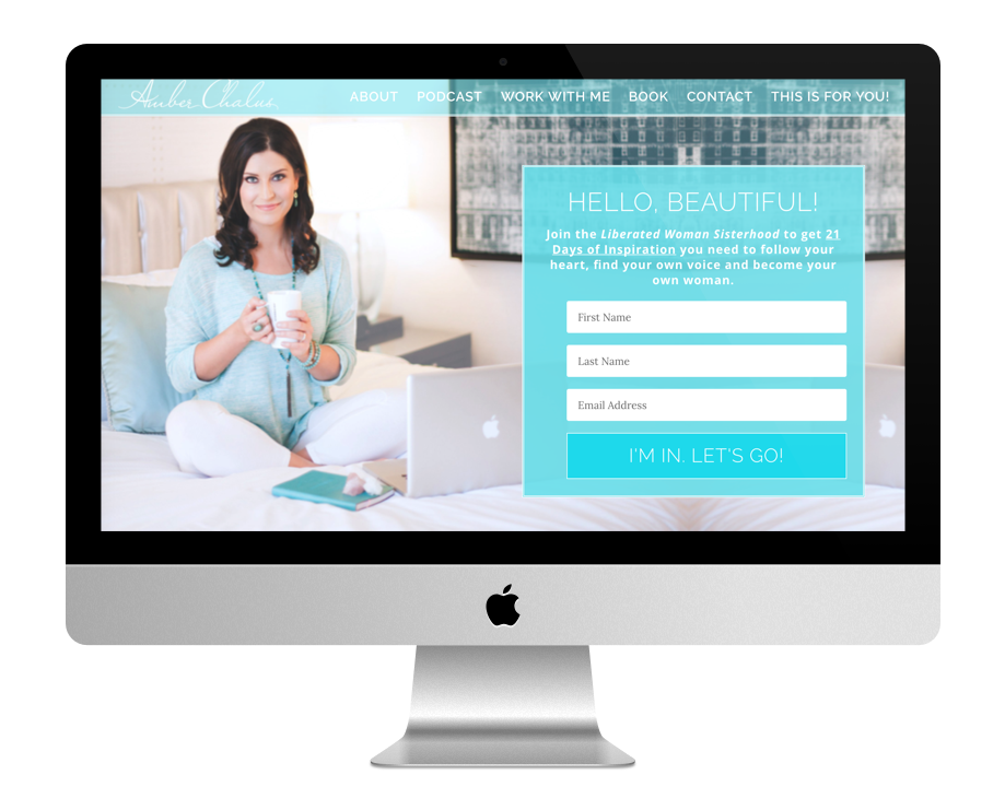
The Amber Chalus website uses a full screen image with a stylish registration form on the right of the screen. The navigation bar uses the main color with an opacity that opens up the background, thus melting into the decor... The layouts of the other pages of the site are rather well designed. The site uses soft blues and elegant fonts.
9 - CORTNEY MCDERMOTT
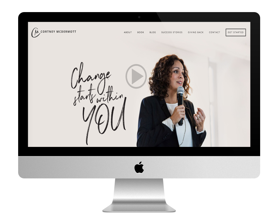
The Cortney Mc Dermott website Embarks a YouTube video as a welcome image, followed by a banner of media icons. Three CTAs (calls to action) align horizontally followed by a full screen image as testimony. The blog section uses three clickable images. At the foot of the page, we find a registration form. The font chosen for the titles is superb, the photos also, and the color code is sober and elegant.
10 - BREATHE AND BLISS
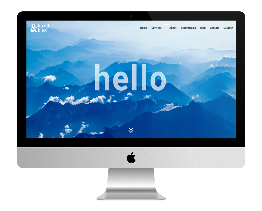
The Breathe and Bliss site uses a full screen background image with a changing message. The brand logo is sought after and brings its touch to the design of the site. The photos used are nice and particularly well chosen. The colour code is from blue to green. The site is multilingual and offers a German version.
To conclude...
The design is very subjective and allows to achieve great things. Each of the sites in this list has its own design, its own keys. Some of them seem more professional than others, but here too it is subjective... What's your favorite?
Note that you can propose your achievements with Divi to be presented in a future publication. Use our submission form.
Bonjour !
Merci pour cette sélection super inspirante !
J’aime tout particulièrement le site de Wild Scared.
Pouvez-vous m’indiquer de quel Layout il s’agit svp (ou s’il existe un tuto pour obtenir un résultat similaire) ?
D’avance merci !
Marie
Salut Marie, je pense que c’est du sur mesure… PS : c’est Marie de Carro ? 😉
Merci pour cette belle sélection inspirantes.
Je vous suis et merci pour le partage que vous faite sur votre site.
Merci Jas 😉 !
Bonjour,
Je viens de tomber sur votre site et c’est une véritable pépite.
J’ai une question, comment peut-on savoir si un layout a été utilisé ou pas ? Et comment lequel a été utilisé ?
Merci 🙂
Hello Sylvie, on ne peut pas savoir quel est le nom du layout utilisé sur un site Divi. Il est aussi fortement possible que la mise en page ait été créée à partir de zéro.