
Many users ask me the question: how to optimize the Responsive Design Divi ?
I want to say: "but it's a child's play" 😉
But to think about it, the options Divi's responsibility Don't look at me. They're here. But a little hidden...
In this article, I suggest you take a look at the Responsive Design at Divi in order better manage your screen sizes and obtain a fully customized website.
Note: Since August 2019, the responsible options for the Divi theme have been improved as shown in this video:
And since November 2020, new features have perfected the responsive design with Divi (see the article here), we will discuss it further in this article...
- 1 - Why optimize the Responsive Design of your Divi website?
- 2 - How can I avoid the problem of responding with Divi?
- 3 - Native Responsive Design Management in Divi
- 4 - Manage default font sizes for the entire site
- 5 - Responsive views in the Divi Builder
- 6 - Responsive management directly in Divi modules
- 7 - Visibility condition according to screens
- 8 - Separate sections for each device? Not recommended!
- 9 - Manage the response of Divi's native menu
- 10 - Options to preview Divi's responsive
- 11 - Improve Divi Breakpoint with Queries Media
- 12 - What is Breakpoint or Breakpoint?
- 13 - What is the Queries Media?
- 14 - The Media Queries principle for accurate management of Responsive Design
- 15 - How do I identify Divi's Queries Media?
- 16 - Concrete case: correct Divi's responsive menu
- 17 - In conclusion: Responsive Design Divi, it's not that complicated!
1 - Why optimize the Responsive Design of your Divi website?
With more 9.5 billion mobile devices in the world, you'd have to be crazy not to optimize the responsive design of its siteRight?
This is a good reason for create a site that is as readable on tablet and mobile as on desktop !
Users are increasingly navigating from their mobile devices, whether during breaks or on public transport, and this is very important!
Your visitors may even discover your site via a mobile screen! It is therefore crucial that they have a good impression in order to return later to visit it from their computer.
Do you know how many visitors to your site come from mobile terminals?
You can check this from your data Google Analytics, on the tab Audience > Mobile > Overview.
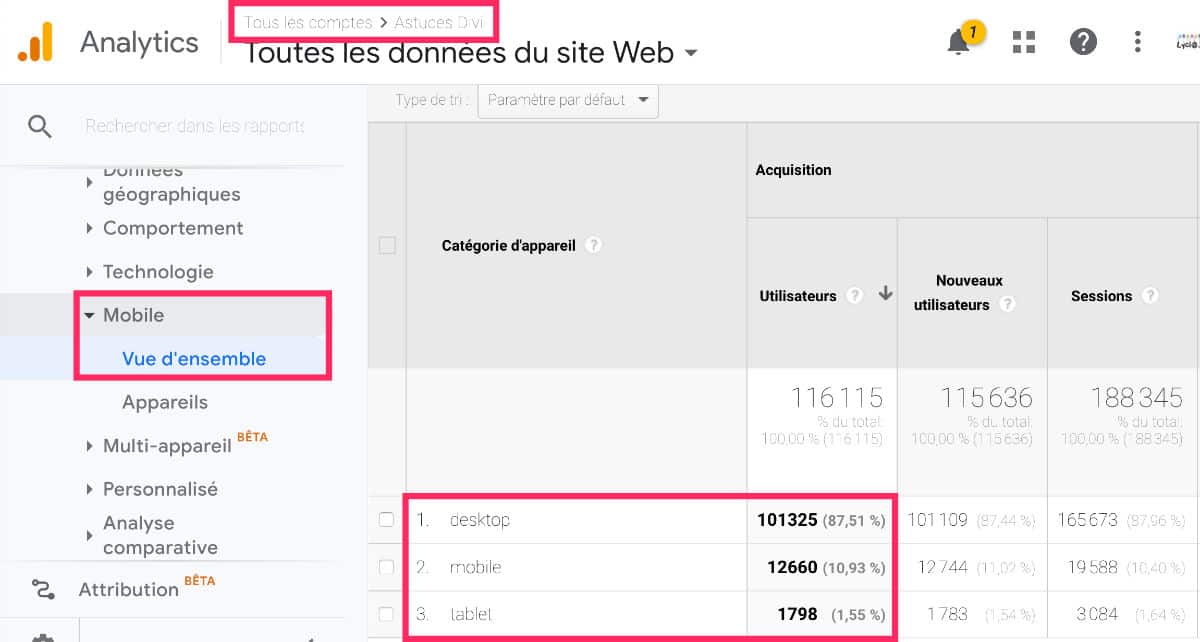
For example, in 2019, 12.5% of Divi's Tip traffic came from mobiles and tablets.
This is a small percentage due to the theme: Divi tutorials are mainly used from desktops. That makes sense.
But if the theme of your site is suitable, it is highly likely that most of your traffic comes from mobile screens. This is often the case with news sites or lifestyles...
Discover all the resources on responsive on the official blog of Elegant Themes.
2 - How can I avoid the problem of responding with Divi?
Before going further in this article where everything is explained about responsive design options, I would like to highlight a very VERY important point: few are responsive errors with Divi if you use this tool in the right way.
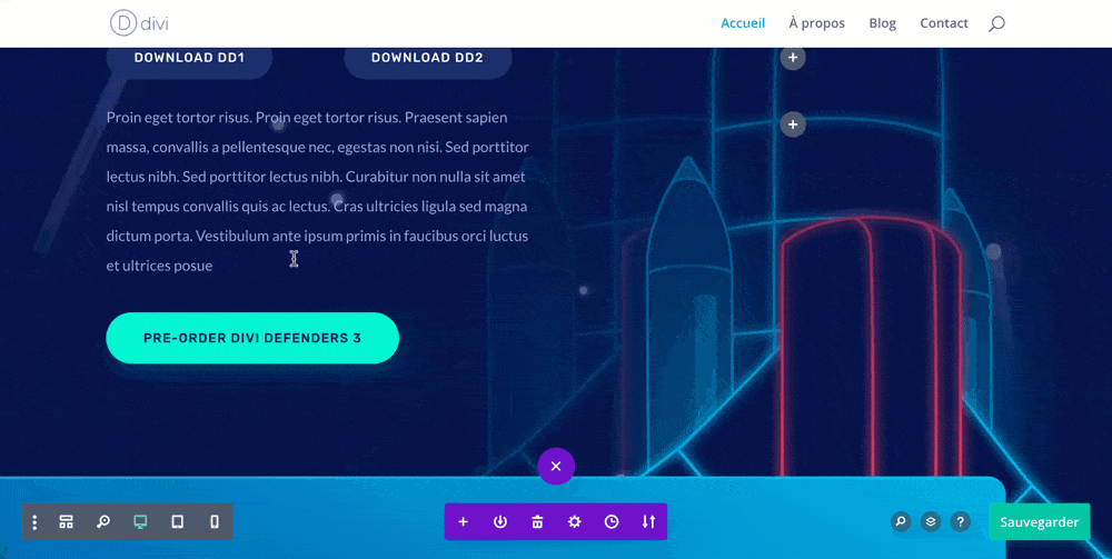
What I mean by that is that I accompany many users every year and I have been able to detect a common mistake: changes in margins in an untimely manner.
Of course, the Visual Builder is super well made, it allows you to make changes to WYSIWYG (What You See Is What You Get) which allows you to modify your layout in real time. But this has consequences: if you create a perfect layout for your screen, know what might not be on other screen sizes. And that's when the Responsive errors.
The current error is draw on margins (margin or padding) "view from eye" using your mouse. You then think that this is the best way to place this or that element in the desired place, but it is a big mistake! In this way, you may get negative margins or "folle" margins that will pose a problem on tablet or smartphone.
I'll give you my little secret, the one I give to all my clients or students: I never touch the margins (internal margins or external margins) except when I really need it! And most importantly, I never "shoot" them with the mouse as shown below:
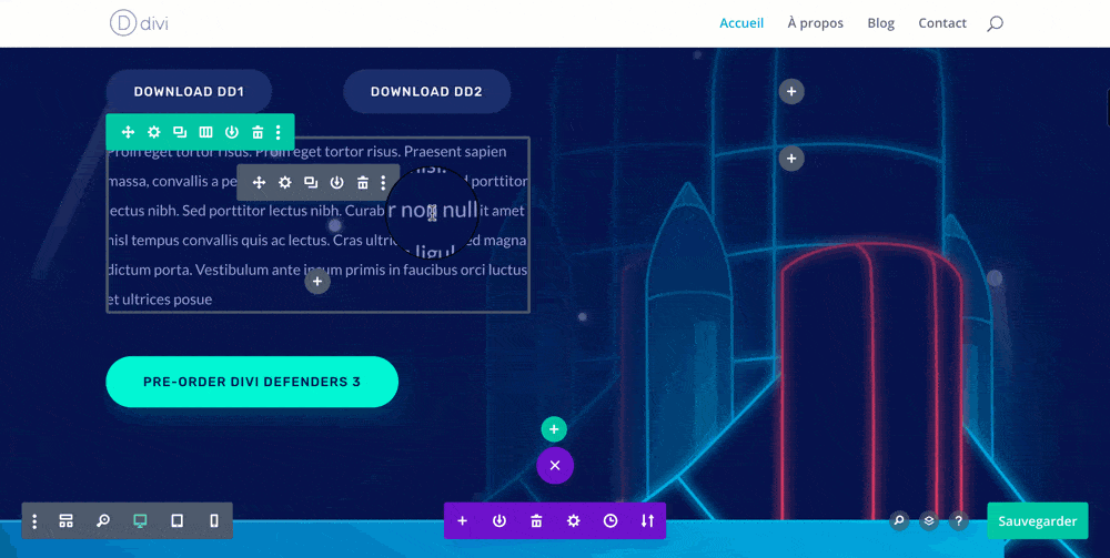
I prefer to go through the options of each module I need to change the margins, via the tab Settings > Styles > Spacing. So I master the margins to pixel and it takes me off work afterwards.
In this way, you will not have any surprises or worries about other screen sizes.
If you use the Visual Builder in the way I advocate it (this one above) and you still encounter problems of responsive, you can continue this article where you will certainly find answers.
If, on the other hand, you have "drawn" the margins with your mouse, you can already check if the problems are resolved by resetting the margins to 0px. This is the first lead to explore...
3 - Native Responsive Design Management in Divi
It may be necessary to clarify that the theme Divi is a responsive WordPress theme. Although this is the case for most WordPress themes today.
It is also for this reason that WordPress has had a great success.
The old HTML sites of the 2000s were dumped and inappropriate for a small screen reading. WordPress and its Responsible themes have offered site creators a quick and simple solution for adapt to all screen sizes.
However, today there are hundreds of screen sizes on the market. Which was not the case at first. There are Android screens, tablets, iPhones, etc. And with every new smartphone put on the market, we discover a new screen size... Again!
It is therefore likely that the site you have just realized with Divi today, displays some Responsive errors In a few months... yes!
And maybe in a few days, when your boyfriend, that uses a smartphone out of behind the fagots"The menu on your website is weird on my phone"...
You did check it out. all versions of your site with all the terminals you had in hand but you're not a phone store either. 🙂
Anyway. This reinforces me in the idea that a site is never really perfect... The important thing is to make it evolve!
Exactly, Divi offers us lots of responsive options in various places, which we will discover below:
4 - Manage default font sizes for the entire site
The first of the things you can do to optimize the Responsive Design by Divi, it is to set the font size according to the size of the screens.
Divi offers this option in its customizer customization options:
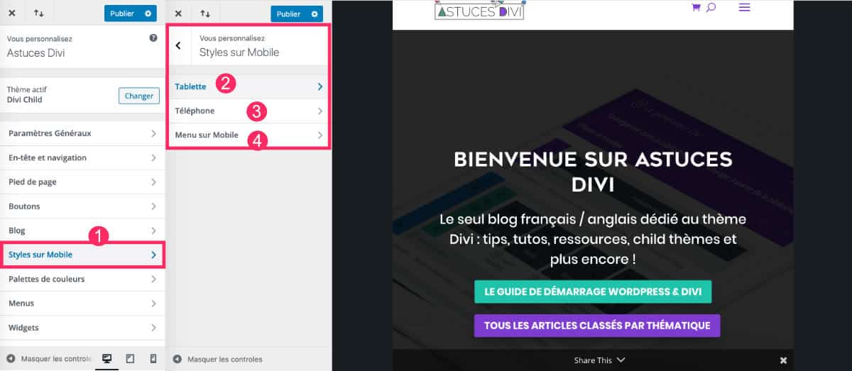
- Go to the tab Appearance > Personalize > Styles on Mobile.
- Set the tablet view
- The phone view
- The "Mobile menu" tab can only set the color but in no case the font size.
For mobiles and tablets, you can act on:
- Height of section
- Height of the line
- Text body size
- Size of securities
The options stop there and do not allow to define a font size according to the H1, H2, H3, etc. tags. We'll handle this differently.
But in the meantime, you can already define the "default" here, in this tab, it costs nothing 😉 ...Then you will refine.
5 - Responsive views in the Divi Builder
Another interesting feature is the simple option you've already noticed: Responsive views from the Divi Builder.
When you activate the Visual Builder on one of your pages, you can control the appearance of the design according to 3 screen sizes:
- Desktop
- Tablet
- Mobile
You can easily switch from one view to another by opening the small purple button at the bottom of the screen and clicking on the desired icon:
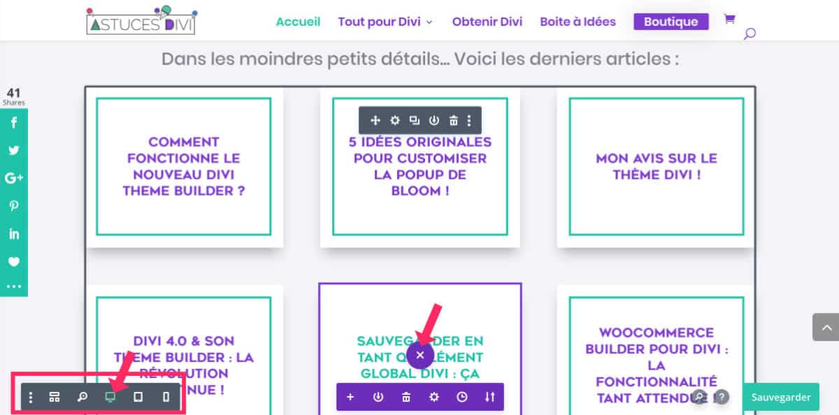
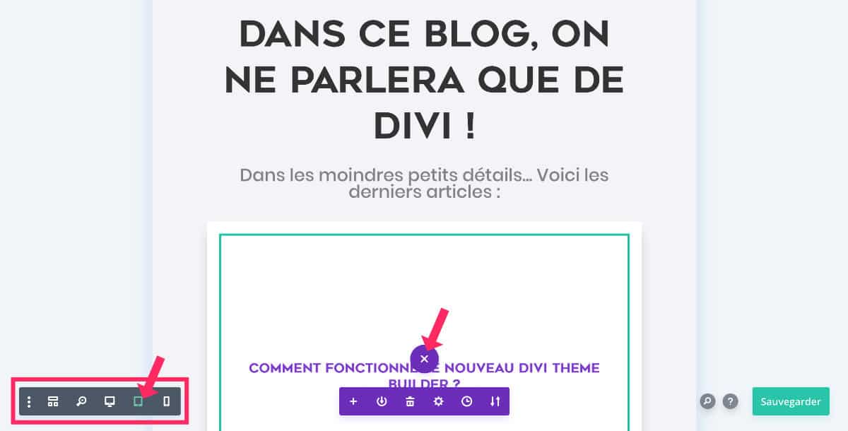
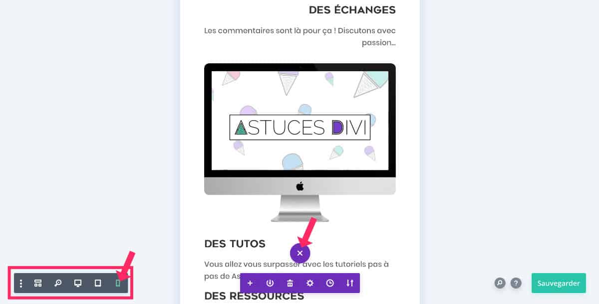
These display options only to check the visual rendering in the 3 versions. But here, you won't really control the various versions. I suggest you managing this type of response directly from Divi modules concerned.
You're not using Divi yet? Do you hesitate? Discover the theme Divi here !
6 - Responsive management directly in Divi modules
Unless you develop your site in "mobile first", the version you will develop first will be the desktop version. All sections, lines and modules of Divi that you insert into your layout will therefore be optimized for the desktop version.
The Divi CSS Embeds a style sheet to optimize, by default, mobile versions.
For example, if you insert a line 4/4 within a section, it will automatically pass in 2/2 in tablet version and in 1/1 in mobile version. So on this side you have nothing to deal with with Divi.
However, where you need to pay particular attention, it is within your modules.
If you wish your site fits perfectly to different screen sizes, you will need to correct certain elements as you create your site.
You will therefore need to edit certain elements in order to make them fully compatible in "small screen" version...
6.1 - Make the text responsive with Divi
The size of the titles and the body of the text are elements that deserve special attention.
Readability is an important criterion for improving user experience.
Here is how to change the font size according to the screen size:
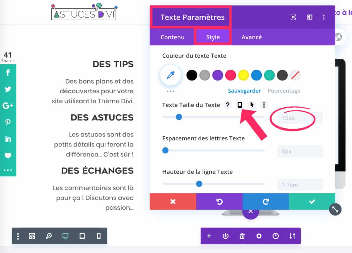
- Edit the module that contains your text.
- On the mouse over the size of the text, you will see a small mobile icon
- Click on this icon...
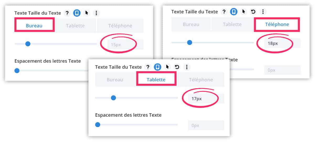
- The 3 screen sizes appear as tabs.
- Select tab Tablet or tab Telephone to act on this size
- Set a pixel value according to the screen size.
Important: this small mobile icon to act on the responsive is available in most of each option of each module.
Note, also, that there is another way to manage these font sizes once and for all: set the Publish Content module (Post Content Module) available in the Builder theme.
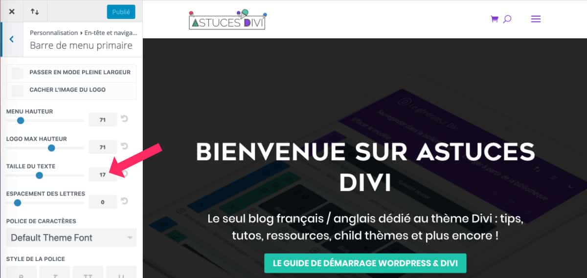
6.2 - Play on colors depending on screen size
Since this responsive feature is available in almost every option in each module, you can also use it for other purposes. For example, you could set a different title color for each version of your site!
This works the same way as setting the size, except that you will act on the color.
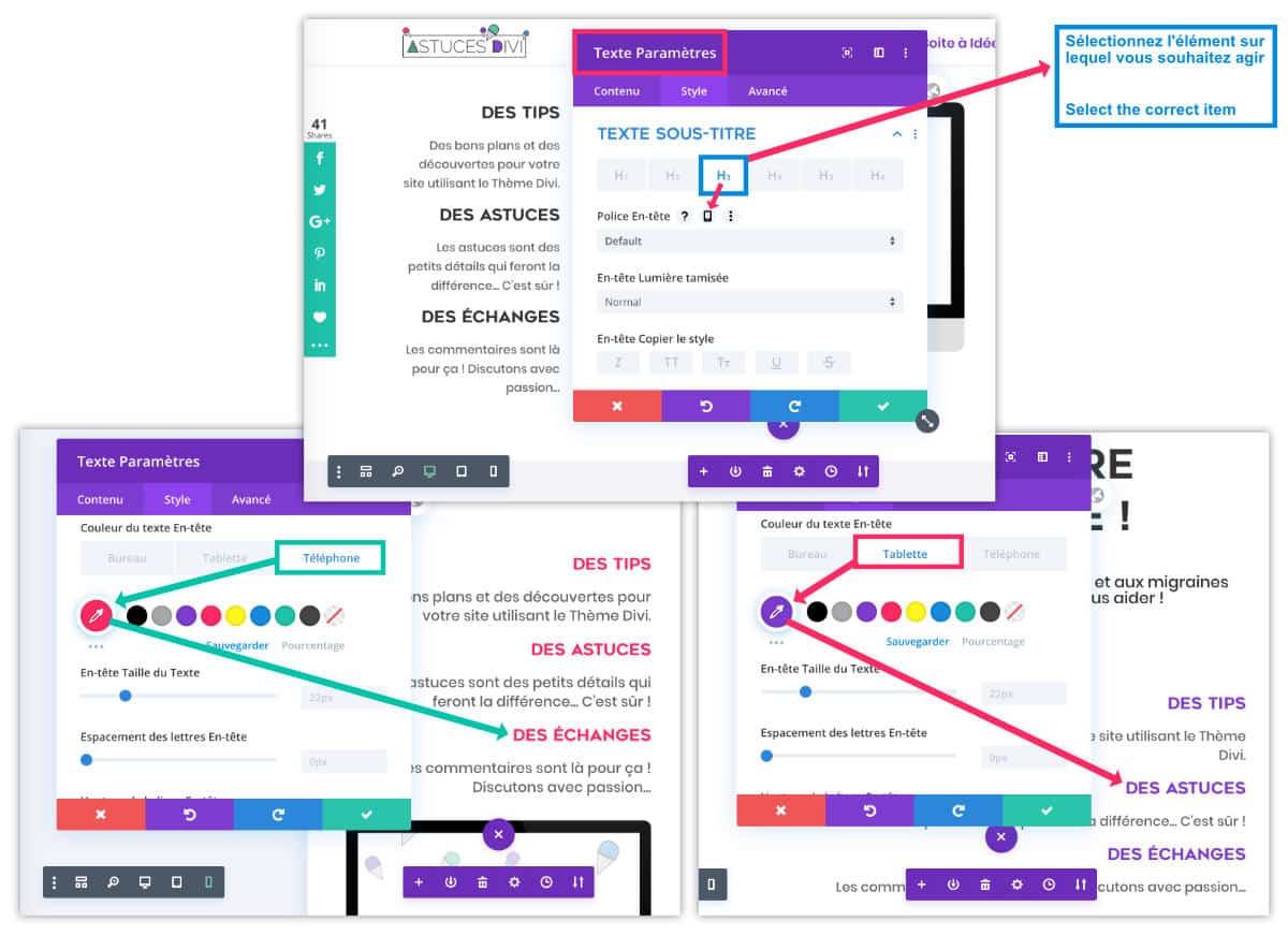
In the above screenshot, you can see that I set:
- a black color for titles in desktop version
- a pink color for titles in tablet version
- a purple color for titles in mobile version
Note, however, that you will have to be careful to select the item on which you want to act. In the example of this screenshot, you can see that I selected the Title H3 before defining its color.
This is just an example but you understand it, there will be no limit in terms of customization and optimization depending on screen sizes.
7 - Visibility condition according to screens
In some cases, you might decide to display some items on mobile and others on desktop... but not both. Good news, too!
This is often the case with a "call" button. It is only relevant on mobile (although some desktop may make calls).
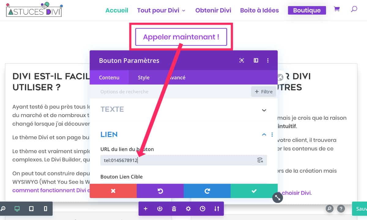
Divi then allows you to set a visibility condition depending on the screens.
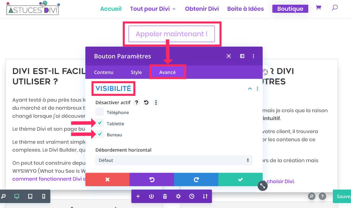
- Edit module to optimize
- Go to the tab Advanced > Visibility
- Check which versions your item should not appear on. In the example above, I hid my call button on the versions Tablet and Office so that it is only available on the version telephone.
- Save.
The Responsive Design, it's not just visual optimization Hey! It must also take into account optimization of user experience.
8 - Separate sections for each device? Not recommended!
With the visibility option we have just seen, some users might be tempted to develop a section, or even a section. layout, different for each version, within the same page...
Ouch, don't do this!
You can use the visibility options sparingly, like a call button for example, but this should not go further, for various reasons:
- This is not optimal for SEO Even if these "hidden" sections are not visible to a human, Google robots will see them. They may not understand why the content is duplicated.
- With each update, you will need to modify all the section versions: what a waste of time!
- If you use CSS ID In order to create internal links within the same page, they will no longer work because an ID must be unique.
- This is a not very pro way of managing the Responsive Design Divi.
So, for all these reasons, prefer the native Divi options rather than the duplication of your sections depending on the size of the screens. And if this is not enough, that you still note mistakes in responsive, it is that the problem comes from the breaking point and Media Queries.
Note: a few years ago, I published an article about a specific responsiveness concern with Divi and iOS. This article still seems relevant in some cases.
You can test Divi for free: go to this page and click on "TRY IT FOR FREE"
9 - Manage the response of Divi's native menu
Earlier in this article, I told you that "Mobile icon" to optimize the responsive was available for most of the options in each module.
However, if you do not use Theme Builder and that you use a site header Divi classic, with a navigation menu created from the Customizer (menu Appearance > Customize), these responsive optimization options are not available.
As you can see in the above capture, the menu text size does not offer options for mobile and tablet versions. So by default, all versions of your site will have a font of the same size for your main menu.
It is often for this reason that readers of Divi Tips contact me by telling me "My Divi menu is not correct on mobile". Hey, yeah, we're gonna have to change that with CSS, the famous Media Queries...
10 - Options to preview Divi's responsive
Since November 2020, it is easier to see what your website will look like on different devices and screen sizes.
You can manually adjust the preview size, change the default preview widths of your phone and tablet, and switch between presets of common devices.
This video summarizes the main features:
You can change view preview widths by default telephone and Tablet so that every time you enter a preview mode, or every time you switch between the responsive options, the size of your window reflects the desired width.
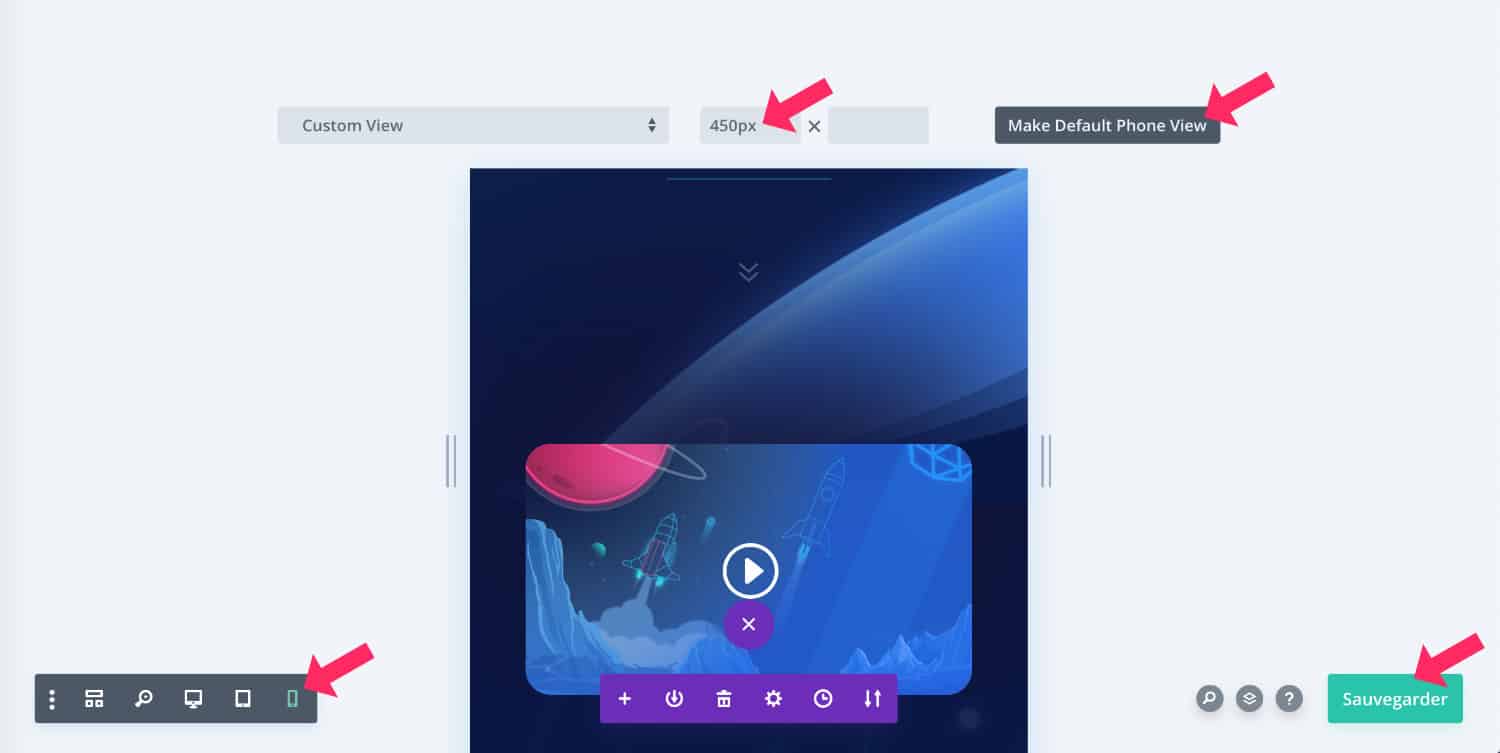
Change the size of your screens and simply click the button "Make default view" so that the next time you switch to this display mode, your custom preview size will be reflected.
For more information, see the official article on the Divi Reactive Preview System.
11 - Improve Divi Breakpoint with Queries Media
Some WordPress themes allow to define the breaking points (the breakpoint), which allows to really adapt the site design to current screen sizes. But Divi does not propose this option as a native.
The Divi CSS breakpoint (or Divi Breakpoint) and the Media Queries are closely related to Responsive Design.
If you wish to obtain a Divi site fully responsiveYou will have to go through these decisive steps.
Although Divi natively manages almost the entire responsive website - as we have seen throughout this article - it is possible that some elements of your layout are not yet fully optimized for all screen sizes...
You will then need to add some CSS to correct this. But don't panic! We're talking CSS and not Javascript or other complicated language! Let us say that the continuation of this article should help the novices to correct some Responsive bugs with Divi.
12 - What is Breakpoint or Breakpoint?
When a WordPress theme is coded to be responsive, the developers of the theme define CSS rules that may be different depending on the size of the screens.
These CSS rules are therefore issued differently according to a pixel size. That's what we call Breakpoint or Breakpoint.
This breakpoint is therefore the transition from one screen size to another.
Once these breakpoints are defined, just use the Media Queries to issue rules per screen size.
The Divi theme would have 6 break points (as explained in this Official article) :
- Large office : 1405px and more
- Standard office: between 1100px and 1405px
- Laptops and large tablets: between 980px and 1100px
- Tablets: between 768px and 980px
- Smartphones and small tablets: between 320px and 768px
- Smartphones: between 320px and 480px
Responsive worries that you may sometimes encounter may come from one of these sizes. For example, the transition between the computer version and the tablet version is too early or too late.
To start with Divi, discover all the articles to start calmly!
13 - What is the Queries Media?
The Media Queries are multimedia queries that can be used within CSS style sheets to define rules that will apply under certain conditions.
The Media Queries can affect printing, accessible contents intended for visually impaired people (braille...), small screens, large screen projections, TV projections etc.
But above all, Media Queries will serve mark certain screen sizes, regardless of destination, using the value ALL or SCREEN.
14 - The Media Queries principle for accurate management of Responsive Design
It's fine theory but let's go to practice... Here are 3 types of syntax of Medias Queries that will allow you to act on responsive design :
14.1 - Responsive design up to a certain screen size
Here is the syntax for CSS rules applicable up to a certain screen size:
@media screen and (max-width: 980px) {
Placez votre CSS ici
}
In this example, the CSS rules that will be used will apply on screens ranging from 0px to 980px.
It's the prefix. max- which indicates the maximum size value. From 981px, the CSS rules issued here will no longer work.
Small variant:
@media all and (max-width: 980px) {
Placez votre CSS ici
}
In this snippet, the value ALL replaced the value SCREEN. This means that the rules will apply to all types of media (not just screens). In both cases, you will act on the responsive design of your Divi site. Value ALL will be wider than the value SCREEN.
14.2 - Responsive design from a certain screen size
Conversely, you can also use Media Queries to act on the design from a certain screen size. In this case, here is the syntax:
@media screen and (min-width: 980px) {
Placez votre CSS ici
}
or
@media all and (min-width: 980px) {
Placez votre CSS ici
}
All CSS rules that you issue here will only apply to screens over 980px.
It's the prefix. min- which allows define minimum value from which CSS rules will be taken into account by the browser.
14.3 - Responsive design between two screen sizes
Thanks to Media QueriesIt is also possible to issue CSS rules for a screen size between two values. Here is an example of syntax:
@media screen and (min-width: 980px) and (max-width: 1100px) {
Placez votre CSS ici
}
The CSS rules you will place here will only be taken into account for screens with a size between 980px and 1100px.
To go further with the Media Queries, I recommend this excellent Alsacreation article.
15 - How do I identify Divi's Queries Media?
You have now understood that Divi Breakpoints have been defined according to certain screen sizes and that Media Queries allow you to act on it...
You can group certain screen sizes and act globally on the responsive design of your Divi site, in two sizes:
/* Écrans de plus de 980px */
@media all and (min-width: 980px) {
  Placez votre CSS ici
}

/* Écrans de moins de 980px */
@media all and (max-width: 979px) {
 Placez votre CSS ici
}
But if you want to refine the display of certain elements of your site and be very precise in the size of the screens, you can use "official" screen sizes identified earlier in this article, namely:
- Large office : 1405px and more
- Standard office: between 1100px and 1405px
- Laptops and large tablets: between 980px and 1100px
- Tablets: between 768px and 980px
- Smartphones and small tablets: between 320px and 768px
- Smartphones: between 320px and 480px
Here's a Divi Queries Media Dryproof Sheet according to these screen sizes:
/* Desktop de plus de 1405px */
@media all and (min-width: 1405px) {
  Placez votre CSS ici
}

/* Desktop compris entre 1100px et 1405px */
@media all and (min-width: 1100px) and (max-width: 1404px) {
  Placez votre CSS ici
}

/* Ordinateurs portables et grandes tablettes comprises entre 980px et 1100px */
@media all and (min-width: 980px) and (max-width: 1099px) {
  Placez votre CSS ici
}

/* Tablettes comprises entre 768px et 980px */
@media all and (min-width: 768px) and (max-width: 979px) {
 Placez votre CSS ici
}

/* Smartphones et petites tablettes comprises entre 320px et 768px */
@media all and (min-width: 320px) and (max-width: 767px) {
 Placez votre CSS ici
}

/* Petits Smartphones de moins de 480px */
@media all and (max-width: 479px) {
 Placez votre CSS ici
}
But this remains only theory and it is best to inspect your site using a browser (Firefox or Chrome) to define which break points pose a concern for responsiveness.
To understand better, I propose a concrete case...
Want to customize Divi as a pro? Discover all the tutorials!
16 - Concrete case: correct Divi's responsive menu
Most responsive design optimizations can be settled natively within Divi modules options to this effect, as explained in this article.
But sometimes, parts of the site may not respond positively to the passage from one screen to another. This can be due to the size of your font, the size of your logo, etc.
Part of the site that can be delicate is the Header. Your site header may be suitable on mobile and desktop, but not on tablet. Of course, this is an example among so many others...
To better explain how to manage the different screen sizes and level to certain bugs, I propose a concrete example from a bug present on Divi...
16.1 - The browser inspector: your best ally!
Before you start anything, know that the inspector of your web browser favorite will become your best friend in search of a website more responsive !
If you read this sentence, you think I speak Chinese, don't worry! I too, a few years ago, didn't know what an "inspector" was (except Colombo, LOL!).
So let's start from the beginning: you have a response problem on your Divi site ? Get together. your website and a web browser like Firefox or Chrome.
Make one right-click anywhere on the page of your site... Options are available to you:
- Review Element : for Firefox
- Inspect : for Chrome
Cool! The code of the page appears in a window that looks pretty much like this:
Here, from here, we'll be able to start!
16.2 - Identify the size of the screen that poses a responsive problem
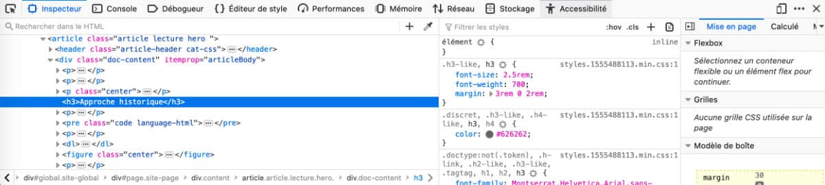
Thanks to your favorite browser inspector, you will be able to activate the option Responsive Design and check screen sizes in pixel:
- Open your website in Firefox or Chrome.
- Make one right click, anywhere on your site (where the responsive bug exists).
- Click "Review the element" or on "Inspect" depending on your browser.
- Click mobile/tablet iconlocated to the right or left of the inspector's menu.
- Drag the window to determine the Breakpoint by Divi and raise the size in pixel.
This video will better explain how to identify the screen size to be fixed:
In this video, you certainly noted:
- Divi's mobile menu arrives as soon as the screen measures less than 980px.
- So the normal menu appears at 981px.
- Between 980px and 1160px, the menu is on 2 lines, the logo is outsized, the elements overlap.
- From 1160px the main menu of Divi becomes correct.
With these identified elements, it will be simple to correct the attention to responsive design on the main menu.
It will be necessary to change the CSS rule which "says" that the mobile menu only occurs on screens of less than 980px. The idea is to increase this value so that the mobile menu occurs as soon as the screens are below 1160px.
16.3 - Correct the response with a new Media Querie
To issue a new CSS rule, you will need a Divi child theme or simply use the option adding native CSS :
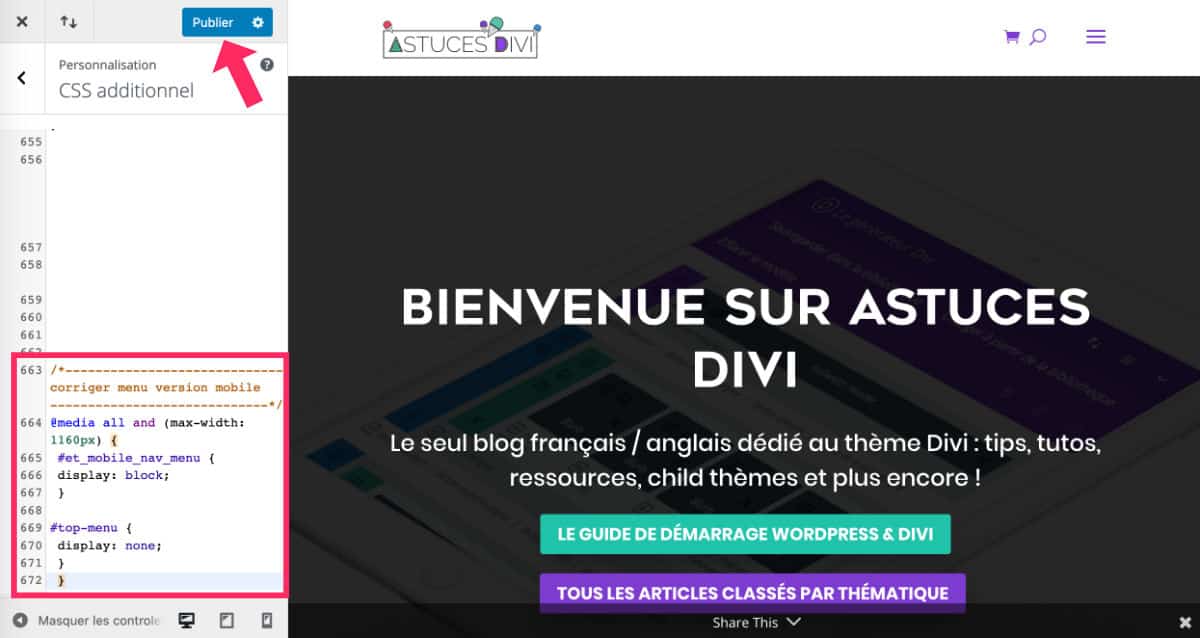
- Go to tab Appearances > Customize > Additional CSS
- Enter the Media Querie that rewrites Divi's basic CSS rule. This new request must look like this:
/* Faire apparaitre le menu mobile jusqu'à 1160px */

@media all and (max-width: 1160px) {
 #et_mobile_nav_menu {
 display: block;
 }

#top-menu {
 display: none;
 }
}
This new rule orders: "up to 1160px, displays the mobile menu and hides the normal menu". So, by default, beyond 1160px, the normal menu will be displayed.
Remember to click on "Publish" to save your changes.
However, a lot of other options could have been considered... For example: reduce the font of the menu and the size of the logo on the screens between 980px and 1160px (size where the menu had a problem with responsiveness).
/* Corriger le responsive du menu pour les écrans compris entre 980px et 1160px */

@media all and (min-width: 980px) and (max-width: 1160px){

#logo {
    max-height: 40%;
}

#top-menu li a {
    font-size: 14px;
}

#et_search_icon {
    display: none;
}

.et-cart-info {
    display: none;
}
}
All these values are indicative because, of course, it depends on several criteria that will change depending on the sites:
- The size of the police,
- The police used,
- The size of the logo,
- And above all, the number of items that make up your menu.
So the idea is not really to copy-paste the codes on this article but rather to adapt them to your needs.

17 - In conclusion: Responsive Design Divi, it's not that complicated!
I am very curious: did you know all these options of Responsive Design Divi ? And do you use Media Queries to correct certain CSS rules based on screen size?
In this article, you could see that it is quite easy to correct some responsive errors, simply with the native options of Divi. And if that's not enough, Media Queries will come to your rescue...
Finally, I propose a reading list on the Management of Responsive under Divi :
- Make the parallax possible in mobile version!
- How to use Divi's custom CSS for advanced responsive editing
- Reactive and hover editing with Divi
- Using Divi's new height and width options to create a responsive design
- Divi Breakpoint and Media Queries.
Super article ! J’ai pu approfondir les méthodes pour rendre mon site responsive ! top merci
Salut Lycia,
Je désespère un peu…tu comprendras ma détresse quand tu verras le site que je tente de faire correctement : http://www.ast-arles.com/ast …je sais que énormément de choses sont à revoir d’après les commentaires de la page FB de Divi Community dont je fais partie…Je me rends compte que je ne maitrise…quasi rien, ne serait ce que la base pour faire en sorte que mon site soit regardable…Bref, je suis en train de bosser tout cela en « confinement » pour que, à la base, le design soit correctement centré, avec les marge etc…sans oublier le côté responsive…pour le design de « base » sur PC « maison », je ne trouve pas de tuto valable (j’ai suivi la formation MAK mais qui ne répond pas à mes questions) mais je me doute maintenant que tout est lié, que ce soit PC, ou tablette etc…Suis je sur le bon tuto ici même? Sinon, si tu as une piste ailleurs je suis preneur..Merci à toi!
Salut David. Pour l’instant je n’ai regardé que la version smartphone et effectivement, il y a de gros soucis… J’irai voir la version desktop. En fait il faudrait savoir si tu as touché des options de marges, padding, dimensions… car c’est le pire à faire ! Plus on met des « valeurs au hasard » plus on a des chances d’avoir des résultats de ce genre. Honnêtement, si j’étais toi, je recommencerais de zéro les pages qui ont de gros soucis, en touchant peu les marges et tailles. Partir de zéro quelque fois c’est mieux que de chercher des heures pour trouver les erreurs… Enfin, la dernière solution : pourquoi ne télécharges-tu pas un layout tout prêt sur ta home page ?
Salut Lycia, tu as raison je vais repartir de zéro……Et je n’ai pas trouvé de layout tout prêt qui corresponde à ce que je voudrais faire sur ma home page…..
Ok ! C’est certainement une bonne idée ! Par contre il y a 1300 layouts disponibles, il y en a bien un qui pourrait correspondre à tes besoins. Mon conseil : il ne faut pas que tu regardes la thématique du layout mais plutôt sa disposition. Tu pourrais utiliser un layout d’agence web pour ton site d’art par exemple ! Il suffit juste d’imaginer ce que ça pourrait donner avec tes propres photos, ton propre teste, ta propre police, etc… et les sections qui ne te conviennent pas, tu les supprimes ! Aller, courage !
C’est ce que je fais, je suis en pleine recherche et motivé!! Merci Lycia!!! Prends bien soin de toi et de ta famille 🙂
Tu auras en exclusivité le super nouveau site que je vais faire 🙂
Super !
Bonjour Lycia,
Je suis actuellement en train de faire la refonte d’un site avec DIVI. Tout le contenu a été réalisé pour l’affichage desktop. Cet affichage est parfait. Néanmoins, un problème m’est survenu : l’affichage responsive (tablette/smartphone) n’est pas « adapté » car j’ai le fond de couleur de mon site qui est apparent à droite. C’est à dire que la taille de l’écran n’est pas « optimisé ». Je te laisse le lien de mon site : https://ehpad-saint-joseph.net
Tu comprendras par toi même lorsque tu le verras (c’est plus simple que par des mots haha).
J’espère que tu pourras me guider pour résoudre mon problème.
Merci d’avance 😉 Bonne journée.
Salut Maxime,
De mon côté, sur iPhone, tout est bon. Tu as trouvé une solution finalement ?
A bientôt
Lycia
Bonjour à tous !
J’ai quasiment fini tout mon site sous divi, mais j’ai quelques soucis de responsive dessus..
Je ne m’y connais pas énormément en code, et j’ai essayer de faire la partie 12 de ce tuto, mais en vain…
Quelqu’un pourrais-t-il m’aider ? 🙂
Salut Dylan, normalement, en utilisant correctement les options Responsives de Divi, tu n’as même pas besoin de toucher au code. La subtilité est de ne pas trop toucher aux marges et aux marges internes. Au plus tu trafique les valeurs, au plus tu peux avoir des soucis.
Bonjour à tous,
Peut on mettre ces lignes de codes dans le css enfant? Si oui, où?
Merci beaucoup!
Salut David, si tu as du CSS à ajouter, tu peux le mettre dans le fichier style.css de ton thème enfant, effectivement, mais c’est bien plus simple et pratique de le faire directement dans ton back-office, à l’onglet Apparence > Personnaliser > CSS personnalisé
Merci Lycia pour ton aide précieuse…et rapide!!
Je vais essayer ça!
David
ouah !!! tout ça c’est bien compliqué!!
j’etais hyper contente d’avoir reussi un tout petit diaporama (oui je sais c’est plus la mode!)! mais mes amis du club aiment bien avoir leurs photos lauréates qui tournent sur la page d’acceuil (il y en 4 )j’ai galéré avec les formats !!! et super contente d »avoir réussi avec smart slider et ensuite lmis le shortcode sur Divi
et alors quel désespor !! sur le mobile ca donne rien
je voulais changer cette section par une image mais non c’est déconseillé !!heureusement que je lis tous les posts et le livre jour et nuit !!!!
alors quoi fais -je ?? eh ben tant pis y aura une plage blanche sur le mobile et je désactive
c’est le mieux non ??
PS je trouve tjs les reponses sur ce site c’est fou même qd elles ne me plaisent pas
bonjour
hier soir ca n’etait pas responsive
ce matin sur mon ecran de tel tout est clean
par contre l’aperçu dans Divi au survol ne marche pas
donc mon post d’avant ne compte pas
merci pour ce site ultra génial et complet
Merci Michèle.
Fais attention car les navigateurs mobiles mettent souvent en cache ton site. Du coup, tu peux croire que ça ne marche pas, alors que ce n’est qu’une question de mise en cache. Si tu as un plugin de cache, pense à le vider lorsque tu fais beaucoup de changement.
Bonjour merci pour ce tuto mais n’étant pas un expert en code je ne sais pas si cela va pouvoir résolutionner mon problème j’ai mis une image en plein écran avec divi et j’aimerai qu’elle remplisse sur tout type d’écran la page en entière (qu’on n’ait pas besoin de scroll ou que mon contenu en dessous soit visible sans scroller)
Sauf que soi mon image est trop grande soit cela me la rogne (je ne pense pas que ce soit du media quieries puisque la taille sera différente en fonction de chaque taille d’écran (15,6 pouces; 23 pouces…)
Merci à vous pour votre aide
Salut Adrien,
J’ai du mal à comprendre. Par exemple, si ton image est en format portrait, il y a de grandes chances que tu sois obligé de scroller. Il n’y a aucune possibilité que ce soit un souci de responsive, je pense. C’est une histoire de format. Du coup, est-ce que j’ai bien compris ta question ?
Oui mon image est en portrait cela doit être la raison, bon et bien tant pis merci en tout cas
Bonjour, j’ai un souci avec le menu en mode tablette ou mobile, je ne sais pas pourquoi, mais le logo se mets au dessus du menu, du coup impossible de cliquer sur les différents sous menu. je le doute que c’est une bêtise, mais je ne trouve pas. http://www.mrib.be
Salut Olivier,
Ton menu est fait avec le thème builder ? On dirait une histoire de taille ou de Z-Index. Tu peux chercher de ce côté-là.
Le menu est fait avec wordpress > Apparence > Menu
Peut-être faut-il réduire la taille du logo ? Mais je pense plutôt que le bouton rouge de droite est peut-être le coupable. Essaye de le déplacer pour voir ?
Tu avais raison, c’est le Z-index, par contre je n’ai pas compris à quoi çà sert. On en parle dans le PDF que tu vends sur le site ?
Salut Olivier. Le z-index sert à donner une valeur de « superposition ». Un peu comme des couches que tu superposes. 0 = en dessous et 9999 et au plus haut de la pile. Tu as finalement trouvé le problème et corrigé ?
Oui, c’est résolu, un grand merci à toi, j’ai également commandé ton pdf a vie, il est super
Super Olivier, je suis ravie et j’espère que mon Ebook va t’aider 🙂
Bonjour,
Impossible pour moi d’avoir le résultat voulue en mode responsive et j’ai donc un affichage juste horrible sur tablette et mobile.
Si possible d’avoir un coup de main 🙂
Mon site : http://www.photographe-elisabeth-mazet.com
Salut Lycia,
super article très bien expliqué. Je me suis servi de ton CSS pour afficher le menu mobile à partir d’une certaine taille.
Je me demandais comment on peut faire pour que ce soit tout le design pour mobile qui apparaisse jusqu’à 980px ?
Passe une top journée.
Stephane.
Stephane, l’article sur les médias que ries devrait t’éclairer
Bonjour
Tout d’abord merci pour toutes les informations cela est d’une grande aide.
J’ai un soucis, j’ai créé un menu avec le Divi builder avec seulement le logo centré, sur destok tout est ok, mais sur tablette et mobile le logo ne ressort pas, j’ai juste la bande de menu vide, je galère depuis plusieurs jours pour essayer de trouver une solution mais impossible.
Pourriez-vous m’aider, pour infos je ne suis pas experte
Merci encore
Salut Sabrina. C’est bizarre, il y a peut-être un conflit ?
Bonjour Lycia !
J’ai un soucis sur mon site avec le menu. J’ai essayé la manip comme expliqué sur la vidéo mais rien à faire, rien ne bouge. Une solution à me proposer pour m’aider ? Merci infiniment !
Salut Julie, c’est quoi le problème ? Tu as le lien de ton site à partager ?
Bonjour Lycia,
Le site que j’ai conçu s’affiche correctement sur mon écran, mais sur d’autres (plus grands), il y a des blocs de textes qui se surperposent… voir qui disparraissent derrière des images ou qui passent au-dessus… Sais-tu d’où ce problème peut provenir ?
Merci beaucoup !
Salut Mathilde, c’est bizarre… As-tu touché à des marges ? Il vaut mieux éviter la plupart du temps…
Salut Lycia, ton site m’a été d’un grand secours pour dénicher des p’tits secrets intéressants, mais le monde n’étant pas parfait, DIVI ne l’est pas non plus! Pour les soucis quand on étirent les marges à la souris, j’ai galéré souvent car divi se fige et il faut recharger la page pour débloquer, j’ai fini par moi même, par le faire via des propriétés. Par contre, pour ce qui est du responsive à l’aide des 3 écrans sur certains paramètres, comme les marges, et bien parfois, ça ne fonctionne pas du tout ! parfois, il ne mémorise pas la valeur que j’attribue, ou au contraire, l’attribue à tout les écrans, ce qui ne convient pas évidement. Il faudrait une mise à jour de Divi avec une réelle mémorisation dans les fichiers CSS. Je ne les modifies pas moi même, car je suppose qu’a chaque enregistrement de page, le CSS est écrasé. Même si ce n’est pas une bonne méthode de cacher, je vais essayer de l’utiliser avec les modules récalcitrants. je tente de réalister mon 1er site avec WP-Divi.
PS: Chez l’hébergeur Infomaniak.com Tu as DIVI gratuitement ! 😉
Bonjour Lycia,
Merci pour ton blog truffé de super conseils, je fais mon site toute seule sous Divi et il m’a aidée à débloquer pas mal de problèmes. Merci mille fois !
Toutefois, il reste un point que je n’arrive toujours pas à saisir : pourquoi certaines modifications CSS réalisées dans le thème enfant ne modifient pas les données du thème parent ? Par exemple, le logo de mon menu n’apparaît pas sur mobile et tablette et quand je clique sur « Inspecter », je vois qu’une fonction .et_hide_mobile_logo est configurée dans le thème parent. Quand j’apporte des modifications dans le thème enfant pour corriger cela, rien ne bouge… le logo ne s’affiche toujours pas. Et pourtant, dans la Divi Toolbox, la case « cacher le logo » est bien décochée…
Sais-tu si cela est récurrent et d’où cela peut provenir ?
Merci de ton éclairage,
Belle journée à toi,
Gwladys
Salut Gladys, il peut y avoir plusieurs raisons : soit ton thème enfant ne fonctionne pas, soit le code que tu ajoutes dans le thème enfant n’appelle pas les bonnes classes. Sinon, as-tu essayé avec « !important » des fois ça règle le problème
Bonjour Lycia, en effet, le problème venait des marges ! Grâce à toi, j’ai tout remis à zéro et j’ai tout recommancé sans y toucher et en me concentrant sur la taille des modules. Merci !!
Super Mathilde !
Tu dois être très très très optimiste ou cacher certaines vérités, chez moi, ça bug à mort surtout le responsive.. je deviens fou avec ça. quand tu écrit une valeur de de marge en desktop, et que tu vas régler les autres vues, le desktop se met alors comme le tablette ou le phone. il faut revenir dessus et recommencer, c’est fréquent, puis tu n’as pas le même résultat dans les navigateurs par rapport à ce que tu as dans l’environnement divi, ça fonctionne pas mal en relatif, mais quand tu veux fixer un menu en place, tout se casse dans tous les sens, parfois même sans pouvoir y remédier.. Régler les marges à la souris, je n’essaye même plus, ça fige le curseur de la souris 9X sur 10 .. et j’en passe.. C’est moi qui suit super con ou Divi ne fonctionne pas vraiment comme on veut??
Salut Alain, tu dois passer par l’icône du téléphone qui se trouve dans chaque module pour régler les marges. Si tu par les icônes du builder en bas à gauche, cela te génère un aperçu mais ce n’est pas là que tu dois saisir les valeurs car effectivement ça change pour toutes les vues. Tu comprends ?
Bonjour Lycia,
Merci pour ton blog que j’ai lu.
Les boutons de navigation à l’intérieur des pages de mon site ne fonctionnent plus au dessus du breakpoint 980px (Desktop) : identifié sous inspection Firefox ou Chrome. Je ne sais pas pourquoi DIVI a inséré un max-width sur le fonctionnement des boutons. Comment contourner cette règle avec un media query CSS ?
Merci.
Au plaisir,
Patrick
Salut Patrick. Alors là tu m’en poses une belle ! Il faudrait regarder. C’est quoi les « boutons » de navigation ? Tu parles des éléments de menu ?
Bonjour Lycia,
Je vois que tu as répondu très rapidement, et moi j’ai laissé passer … dsl …
Mon site pas très compliqué est : https://allosoft.fr et tu peux voir par toi même. Les boutons sont ce qu’il y a de plus classique (En savoir plus, double flèche descendre, Accueil, etc) en pleine page et permettent des raccourcis rapides dans une page surtout en format smartphone. Mais je souhaiterais qu’ils fonctionnent en responsive quelque soit le terminal (desktop, ipad ou terminal). Or lorsque l’on dépasse une largeur d’écran au dessus de 980px (dont la valeur, je pense, est la largeur max Desktop programmée par DIVI), ils deviennent inactifs, et là est ma question de quel media query CSS il faudrait utiliser.
Merci.
Au plaisir,
Patrick
Bonjour Lycia,
Cela fait la 3ème fois que je poste et ma réponse disparaît … je ne sais pas pourquoi.
Regarde mon site allosoft.fr, au delà de 980px de largeur d’écran les boutons de navigations deviennent inactifs.
Je souhaiterais conserver le responsive quelque soit le type de terminal.
Merci.
Au plaisir,
Patrick
Il est manifestement impossible de te répondre sur ce site …
Salut Patrick, j’ai regardé le code. Il y a des valeurs bizarres, et même quand le les désactives, le menu n’est pas visible. Du coup, tu as dû utiliser des options qu’il n’aurait pas fallu, j’imagine. As-tu utilisé le thème Builder pour ton header ? Je serais toi, je referai un header de zéro (tu enregistres l’existant au cas où tu veux revenir en arrière) et tu coches le moins d’option possible dans les options de ton module Menu. Si le problème est toujours là, c’est que ça vient d’autre part. Il faut investiguer 😉
Désolée Patrick, tes messages arrivent très bien, c’est moi qui ai pris beaucoup de retard dans mes réponses. désolée…
Non Patrick, la réponse ne disparaît pas 😉 je ne l’avais juste pas encore validée… Je ne travaille pas sur Astuces Divi 100% de mon temps, malheureusement. J’aimerais pourtant, crois-moi, mais pour ça il faudrait que je rende l’accès à ce site payant ;-( Vous êtes très nombreux à m’envoyer vos demandes d’aide, mais pas toutes peuvent être résolues en quelques lignes… J’ai bien regardé ton site, j’ai pris 10 minutes pour faire cela (gratuitement) et je n’ai pas trouvé de réponses. Il faut que j’investigue davantage mais cela est impossible : je ne vis pas d’amour et d’eau fraiche 😉 Crois-moi que quand je trouve une réponse en moins de 5 minutes, je réponds à vos commentaires et vous donne la solution avec plaisir. Ton code est bizarre, il peut y avoir diverses raisons : as-tu désactivé la visibilité dans les options de ta section/ligne/module. Utilises-tu le menu natif ou le Theme Builder, as-tu ajouté du code personnalisé… Tu comprends bien que je ne peux pas trouver de réponses quand je n’ai que la partie visible de l’iceberg sous les yeux. Comme dit précédemment, je jetterais et je recommencerai, souvent le problème est réglé comme ça. C’est souvent plus rapide que de chercher pendant des heures.. Tiens-moi au courant.
Bonjour Lycia,
Ne te méprends pas et ne culpabilise pas, je ne te fais aucun reproche, c’est déjà très sympa que tu répondes :). C’est que sur AstucesDivi, il est perturbant de ne pas avoir toujours la même visibilité selon l’url que l’on choisit. On pense avoir posté, puis non, puis oui. Encore une fois 1000 excuses :).
J’utilise le Theme Builder, je n’ai pas rajouté de code et j’essaie de toucher le moins de paramètres possible.
Je vais investiguer et je te tiendrai au courant.
Merci encore.
Patrick
Y’a pas de souci Patrick 😉
Pour info, si tu utilises le theme Builder, c’est plus facile. Il suffit de jeter ton Header et de le reconstruire. Si l’erreur est partie, c’est que ça venait des paramètres. Si l’erreur est toujours là, c’est que ça vient d’ailleurs.
Bonjour Lycia,
Comment faire pour que lorsque que la taille de l’écran change tout ne se bascule pas et cause un réel désordre entre les différentes lignes et sections stp ? J’ai compris qu’il existe les breakpoints et media queries mais je n’ai rien compris en pratique.. Merci d’avance.
Bonjour, j’ai besoin d’un renseignement : Je souhaite avoir un logo responsive, en clair que le logo sur la version ordinateur ne sois pas le même que la version mobile.
J’ai tout essayé à mon niveau..
Quelqu’un a une solution ?
Merci
Salut Lara, il n’y a pas de solutions, sauf coder à la main ou utiliser un plugin qui propose cette fonctionnalité.
Bonjour, excusez moi de vous déranger, je vous contacte car je rencontre un problème avec mon menu déroulant hamburger pour la version gsm. Lorsque je suis sur la version ordinateur mon menu principale est classique avec les différentes rubriques étalées de gauche à droite (cela me convient très bien de la sorte), mais une fois sur téléphone pour une question de praticité (j’imagine), celui ci passe en type « hamburger ». Seul hic il n’est entièrement déroulant, que lorsque la page sous lui est suffisamment longue, sans quoi le menu déroulant se bloque en fonction de la longueur de la page +- tôt. Par exemple, sur une page comprenant beaucoup de contenu, je pourrais dérouler mon menu jusqu’à voir la boutique et le panier apparaitre dans la liste, mais si je suis sur la page de « remerciement » très maigre en contenu, je ne pourrais pas atteindre plus de la moitié de ma liste. En espérant, que vous pourrez peut-être m’aider (idéalement sans que je doive me défaire de ces 2 types de menu que je trouve fort bien plaisant pour chacune des versions..). Un grand merci à vous !
J’ajoute un commentaire de plus pour remercier Lycia qui a trouvé la solution au sujet de l’en-tête qui disparait dans le menu apparence-personnaliser. Pour tout ceux qui rencontrent cette problématique, la raison est bien un conflit existant entre une entête globale existant dans le divi thème builder et la création d’une entête dans la section apparence-personnaliser. La solution était donc de supprimer l’en tête dans le divi thème builder, afin de laisser réapparaitre la partie entête dans la section apparence-personnaliser.
Un grand merci pour votre aide !
Salut Arnaud, il n’y a pas vraiment de solution pour régler le problème… il faut bidouiller… soit tu supprimes quelques éléments de ton menu, soit tu ajoutes du contenu pour les pages « maigres ». Sinon, tu pourrais aussi ajouter de la marge en pixel en bas de tes pages uniquement sur la version mobile, ce qui remplacerait le manque de contenu et permettrait à ton menu de se dérouler correctement.
Oui Arnaud… en fait ce n’est pas réellement un conflit, les développeurs ont juste supprimer les options de menu dans Apparence > Personnaliser car c’est l’entête globale qui prend le dessus et donc ces options ne servent plus à rien dans ce cas…
Bonjour,
Avec DIVI, Elegant themes, je rencontre un problème de responsive dont je ne trouve nulle part la solution.
Dans mon header (fond + titre), je crée une section « normal » que je divise en deux colonnes, à gauche le texte et à droite une image png 200*200. Or cette image ne se réduit pas pour les sections tablettes et mobiles.
Le résultat est qu’en mode mobile, l’image (énorme) sort du cadre…
Une indication ?
Par avance, merci.
Bonjour,
Comment modifier la taille par défaut des H1 et H2 dans Divi child pour la version mobile et Desk ?
Merci par avance,
Sophie
Bonjour,
Je n’arrive pas à avoir le même affichage sur tous les types de téléphones…lorsque je fais les modifications pour une catégorie de téléphone par exemple et bien ça n’enregistre pas les autres catégories… Comment faire ?
Merci pour l’aide
Salut Manon, c’est normal, il ne faut pas agir sur les « vue responsive » mais il faut éditer les options responsives de chaque module que tu dois modifier (icône du téléphone au survol de la souris)
Salut Mathieu, normalement, Divi gère nativement le responsive mais si dans l’onglet « Dimension » tu as donné des valeurs en pixel « stictes », c’est normal que l’image ne se réduit pas. Il ne faut jamais toucher à l’onglet « Dimension » que ce soit pour les modules, les lignes ou les sections, sans connaitre les conséquences. Donc ton problème vient peut-être de là ?
Bonjour, tout d’abord je vous remercie pour le partage de vos connaissances, aujourd’hui je vous écris car je ne parviens pas du tout à régler ce point de rupture : entre 768 et 1013px, une partie des liens (dans la partie ‘Nos Derniers Articles’ en bas de la page d’accueil sont invisibles sur format tablette. Je ne connais pas le codage, je copie colle des codes css néanmoins. Mais là, je ne sais pas du tout comment faire, peut être pourrez-vous m’aider ? Je vous remercie par avance !
Bonjour,
Merci pour vos tutos qui me sont très utiles. J’ai fait énormément de progrès grâce à vous sur la taille des textes.
En revanche, je ne parviens pas à modifier le layout de certains encadrés en lecture sur téléphone ce qui me pose problème.
Si toutefois vous avez une astuce, je suis preneur !
Bonne journée
Thierry
Bonsoir Thierry. Regarde dans l’onglet « dimensionnement » tu peux augmenter le pourcentage de 80 à 100% par exemple, ça peut venir de là
Merci Lycia, tellement clair et précis !
Sur ma version mobile j’ai à droite et à gauche un espace blanc qui apparaît quand je bouge vers la droite ou la gauche.
Je ne sais pas comment rendre « fixe » (ou plein écran?) mon site, auriez-vous une piste ?
Merci infiniment
Il doit y avoir un élément dans ta page qui pose souci. Par exemple une vidéo ou un élément embed. Essaye de le supprimer et regarde si le souci disparaît
Il faudrait regarder, effectivement, c’est au cas par cas 😉
merci pour votre explicaton et j’aimerais savoir quel role joue l’unité de mésure vw dans l’adaptation des site au lieu du pixel
Le vw est une mesure en fonction du viewport (en fonction des écrans), un peu comme le %. C’est mieux que le px qui lui reste fixe.
Bonjour, je rencontre un soucis et je ne sais pas si quelqu’un connaîs la solution 🙂
Quand je cherche à modifier les séctions de ma page de manière responsive, dès que je clique sur le format « telephone » l’apperçu remonte tout en haut de la page et je dois modifier la section qui est plus bas à l’aveugle…
Quelqu’un saurait d’où vient de bug ?
HELP ^^
Bonjour, merci pour cet article très bien expliqué.
J’ai tout de même une question concernant les images d’arrière plan. Je m’explique, j’ai créé une section avec une colonne dont le fond est une image. J’ai insérer un module texte caler parfaitement à l’image d’arrière plan. Pour la version mobile aucun souci, mais pour la version bureau je n’ai pas le même rendu. Comment je peux faire pour que mon image soit positionne pareil sur tous mes écrans ? Merci
Bonjour Lycia,
Lorsque j’ajoute du CSS, notamment pour faire varier les break points de mon menu primaire, que l’ajout soit fait dans mon thème enfant ou dans le CSS additionnel de Divi ; cela ne fonctionne pas.
Le fait que le menu soit construit avec le thème builder, peut-il y avoir un lien ?
Cordialement.
Oui, il faut vérifier de s’appuyer sur les bonnes class CSS
C’est impossible, un site web est fluide, les images le sont donc aussi 😉
Bonjour Lycia,
merci encore pour tout ce que vous faites et aussi de répondre à ma question 🙂
Quand je créé un module texte en version Ordi (grande taille écran)
et que je fait ensuite des changements différents sur la version téléphone dans l’onglet Contenu, ensuite
quand je met à jour mon texte sur la version ordi, il ne prends en compte mes changements (texte, image, etc) dans la version tél !
Comme ci il manquait une synchro entre les 2 !
Est-ce parce qu’il ne faut pas toucher à la partie téléphone au niveau du Contenu (dans la boite de dialogue DIVI)
Y a t il une solution de synchronisation ? Faut-il en faire un élément global (même si ça ne servira pas…) autres…
Merci pour la réponse, bonne continuation
7hilippe
Salut 7hil ! Je vois très bien ce que tu veux dire ! La solution est toute simple : tu dois activer le petit icône du téléphone et donner des valeurs différentes pour les tailles d’écran. Visualiser la version téléphone ne te permet pas de donner des valeurs pour cette taille d’écran. Cela est corrigé dans Divi 5, ouf !
Bonjour
Oui sur le papier c’est un jeu. Mais mais ça arrive souvent que quand on modifie en utilisant la fonction par exemple smartphone ça modifie aussi sur la version PC et vice-versa. Notamment avec le menu.
Mecnun
Bonjour
Rien à voir avec le sujet . Lycia mais est-ce que tu pourrais me donner le lien de l’article où tu parles de tous les extensions à télécharger lorsqu’on crée un site ainsi que toutes les premières choses à faire qui sont essentielles stp. Je n’ai pas réussi à le retrouver.
Mecnun
Coucou Mecnun est-ce celui ci : https://la-webeuse.com/extensions-indispensables-wordpress/
Merci
Merci