It is among the sites of photographers made with Divi which we find among the most beautiful examples of what can be achieved with this tool. Obviously, for a photographer, the visual aspect of a site is very important. That's why it's not uncommon for their site to call on Divi because this theme allows you to create completely personalized layouts.
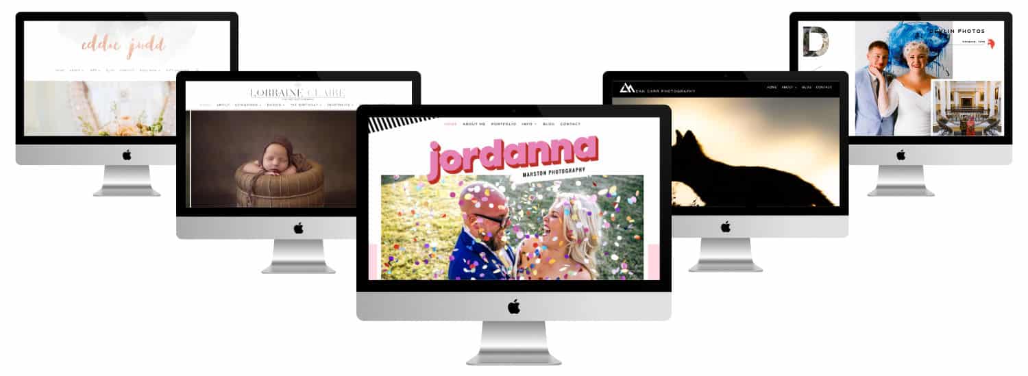
Most of these sites focus on portfolios and services. Some include products while others provide related services.
Most of these photographers use their blogs to describe their photo shoots. Others use their blogs more variedly and include photography advice.
Most focus on Wedding photography but they also provide other photographic services. All are perfect to stimulate imagination.
These are all excellent examples that can be inspired. I'll tell you what I love most about each one of them. I hope you enjoy them as much as I do!
- Photographic Sites Divi #1 : Megan Kelsey Photography
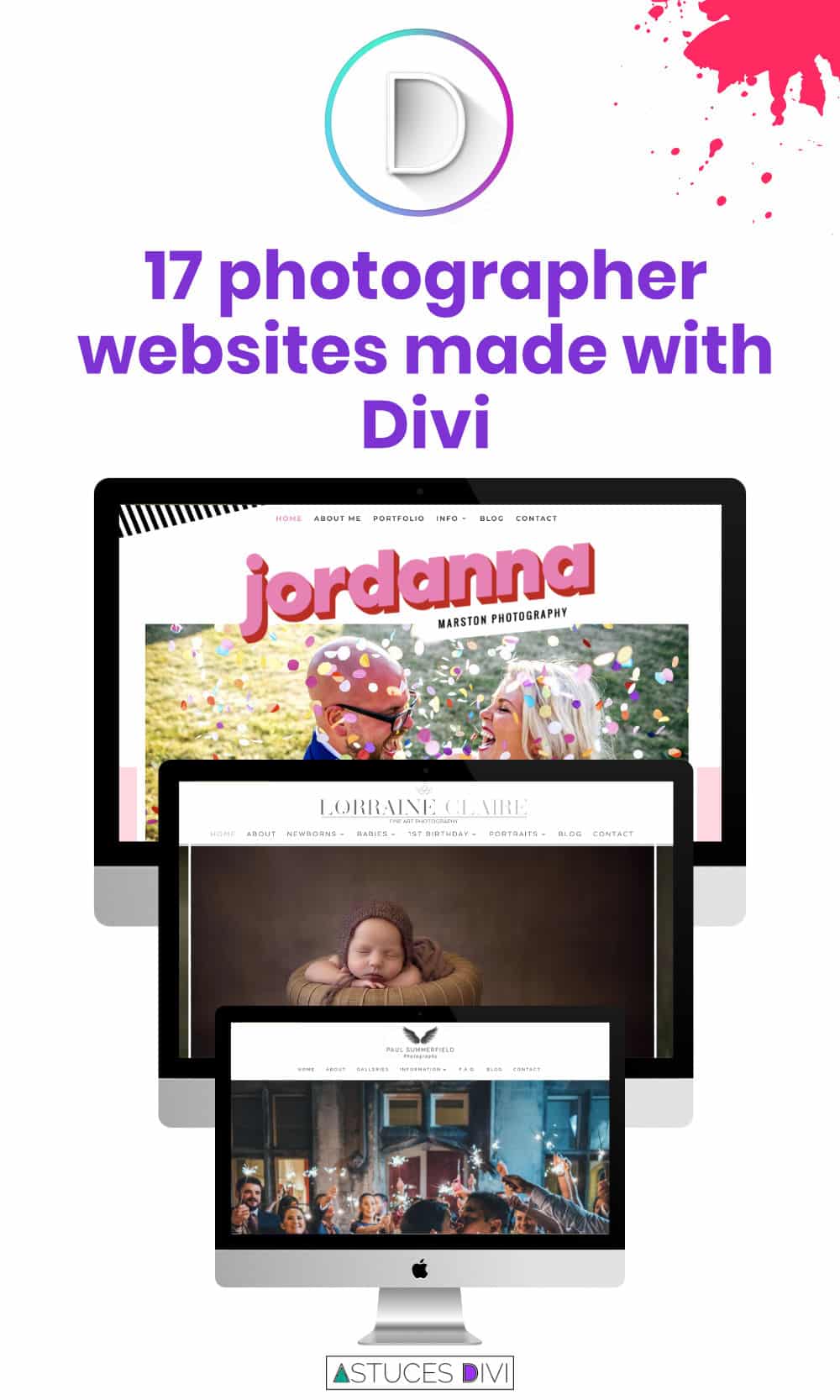
- Photographer sites Divi #2 : Paul Summerfield Photography
- Photographer website made with Divi #3 : Dann Carr Photography
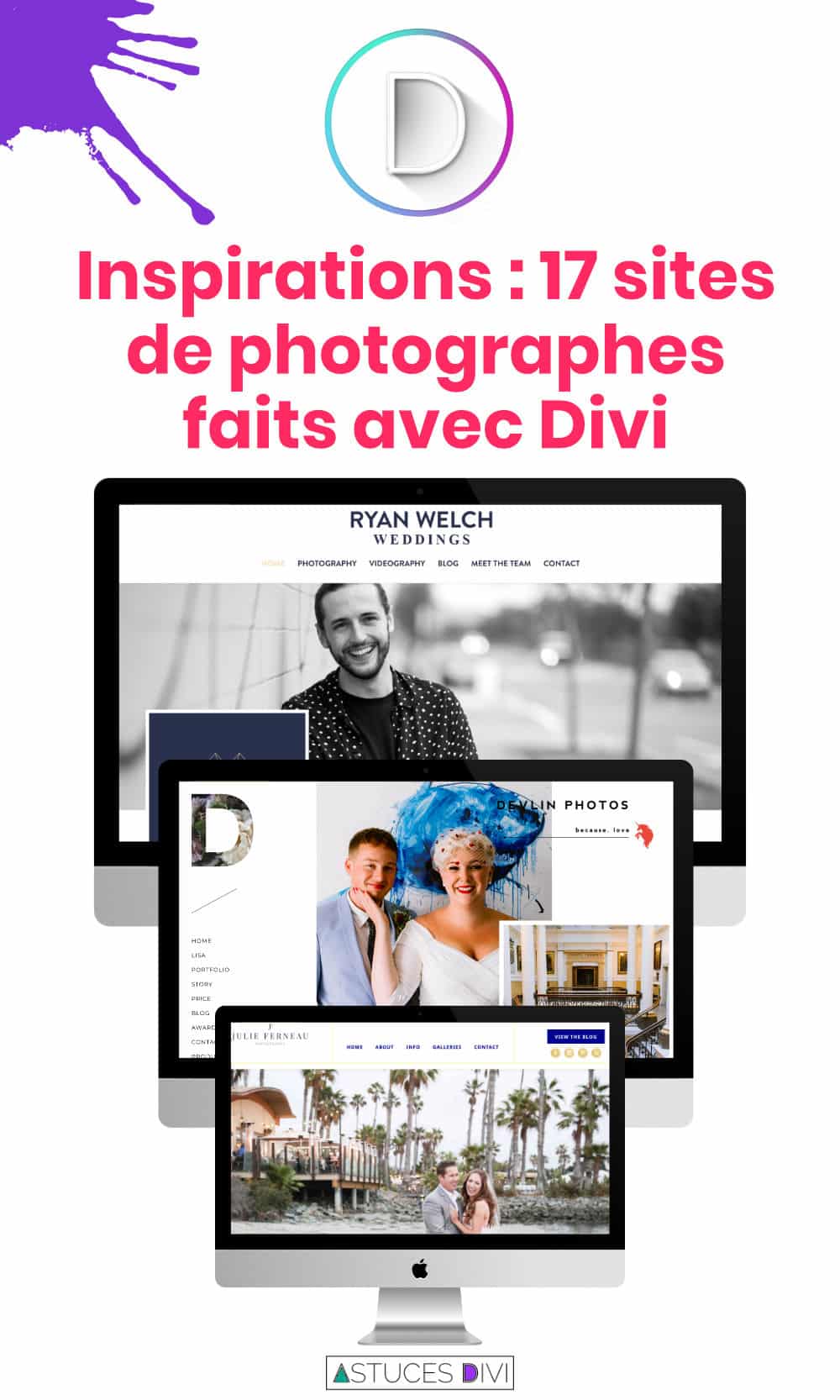
- Photographic Sites Divi #4 : Devlin Photos
- Photographer's website Divi #5 : Jordanna Marston
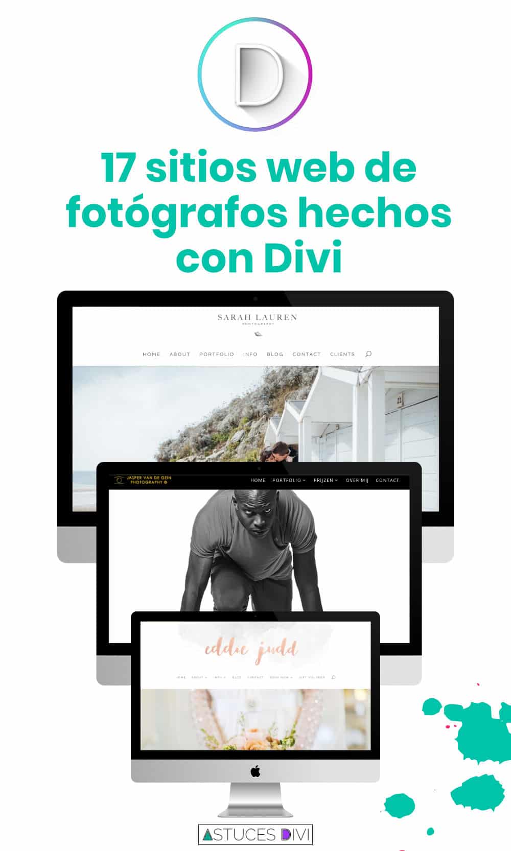
- Photographer's website Divi #6 : Jasper Van de Gein Fotografie
- Photographer's website Divi #7: Florida Museum of Photography
- Photographer's website Divi #8 : Araujo Photo
- Photographic site made with Divi #9 : Eden Photography
- Photographic Sites Divi #10 : Ryan Welch
- Photographer's website Divi #11 : Eddie Judd Photography
- Photographer's website Divi #12 : Brett Florens
- Photographer's website Divi #13: Sarah Lauren Photography
- Photographer's website Divi #14 : Julie Ferneau
- Photographic sites Divi #15 : Lorraine Claire
- Photographic site Divi #16 : Jeebs Media
- Photographer's website Divi #17 : Dawn Martin Newborn and Family Photography
- In conclusion...
Photographic Sites Divi #1 : Megan Kelsey Photography
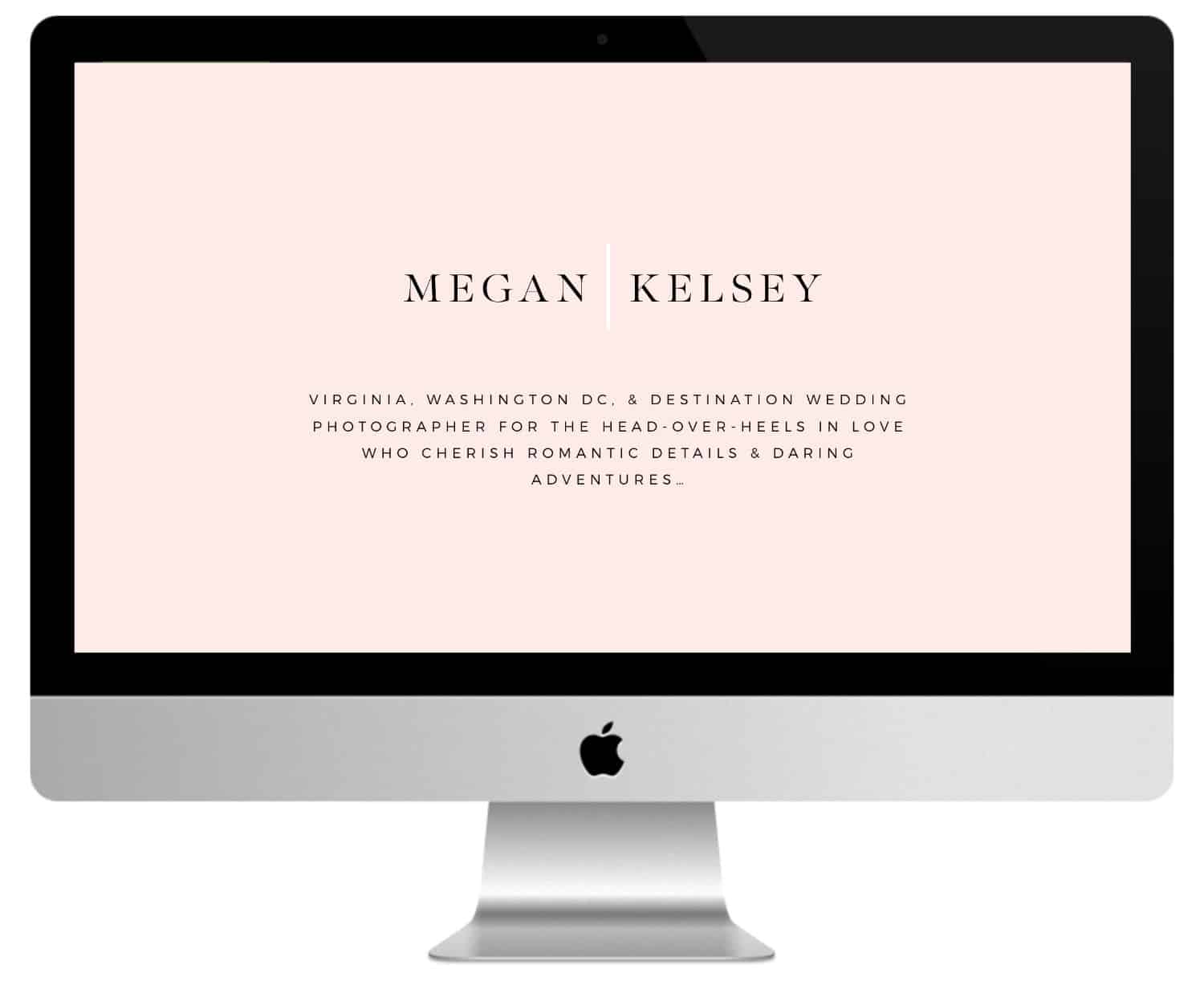
Let us start this overview of the sites of photographers made with Divi with the photographer Megan Kelsey.
It displays a fullscreen image with logo, slogan and soothing background. The top of the menu can be seen in this image. The menu is a block that overlaps the first two sections.
Following a large image, a section of about two columns with text and an elegant welcome message handwritten, an interesting collage of image with CTA (call for action), a full screen testimony with a background pattern, a full screen message cursor with a message extract that covers the image (using Master Slider) and a personalized footer with slogan and logo.
The blog is very stylish and corresponds to the elegance of the site. This site uses layouts, colors and interesting fonts.
Photographer sites Divi #2 : Paul Summerfield Photography
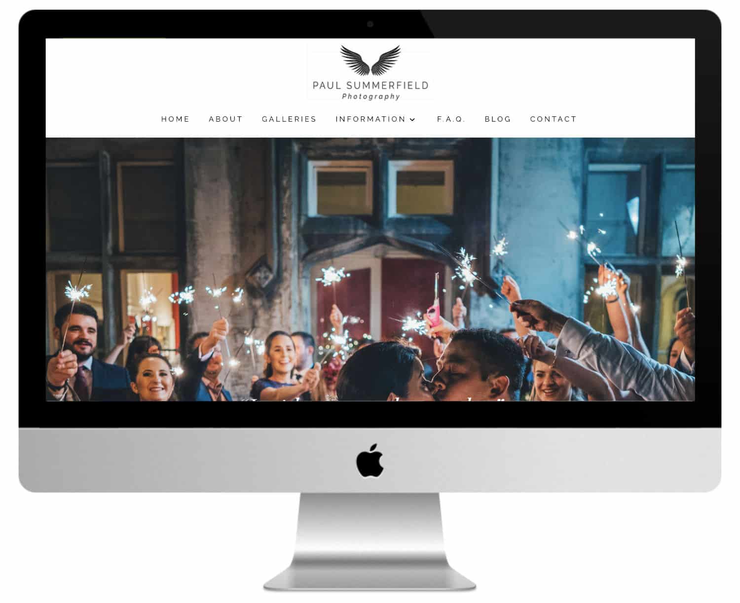
Paul Summerfield Photography displays a fullscreen image cursor followed by a slogan and company quote, a small text section with numbered links to the pages, a section about with text and image, links to the portfolio with alternating text and images, a blog section, a testimony section in parallel axis and a footer with contact information.
The portfolio is displayed with a gallery in a grid layout. A contact form is used for the reservation. The Blog includes a grid with categories above the blog section.
Did you know that? You can test Divi for free by visiting on this page and by clicking on "TRY IT FOR FREE"
Photographer website made with Divi #3 : Dann Carr Photography
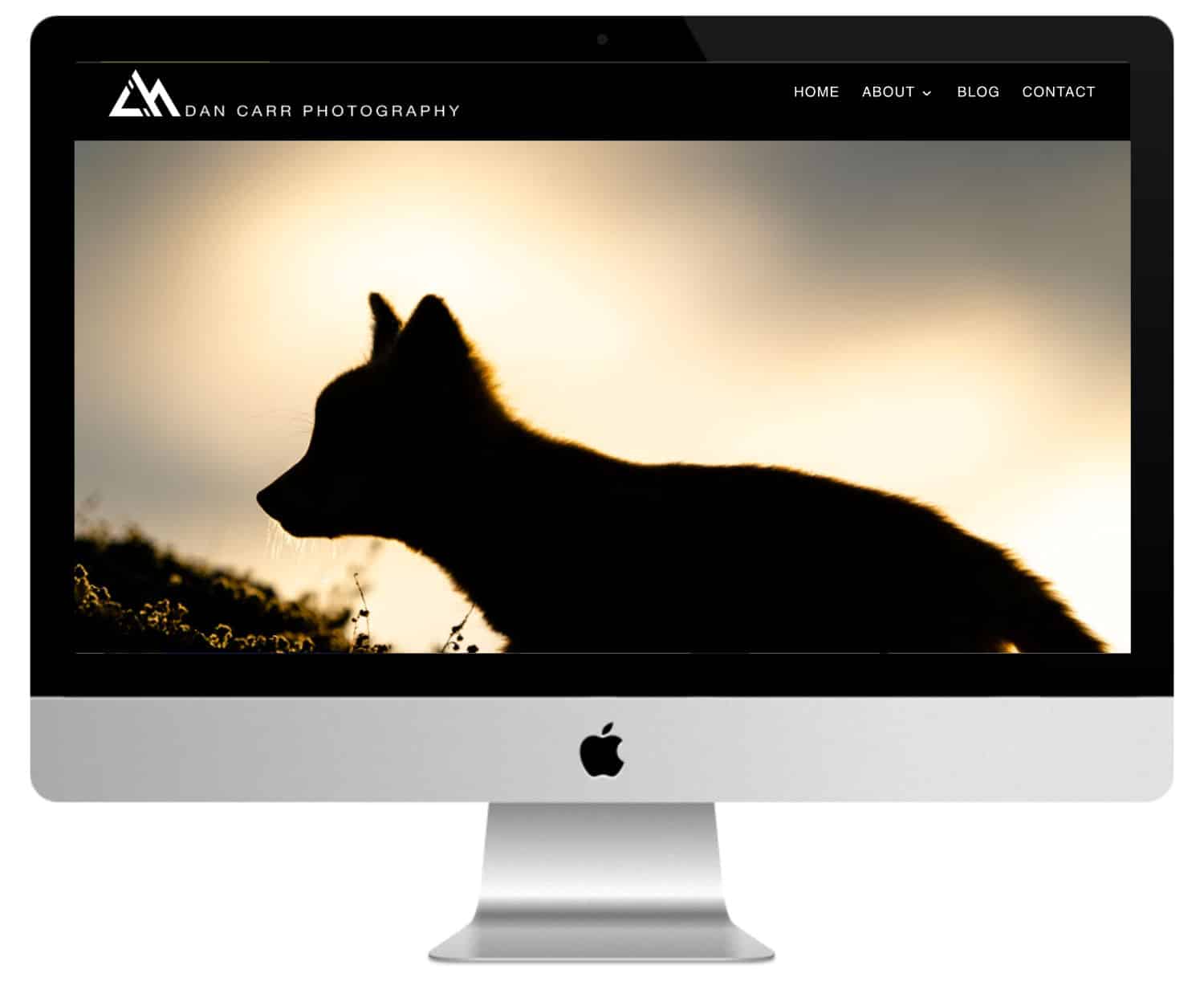
Another photographer's website visually stunning, and this time it's Dan Carr's turn. We have already presented two photographer websites, each with a completely different aspect, proving that Divi can be used in many different ways.
Dan Carr opts for an impressive fullscreen photo, with additional images displayed in a grid organized below the page. This website also uses several of Divi's more advanced modules – it offers parallax effects, blog articles in the form of a grid and a stunning image gallery. Certainly one of my favorites!
Photographic Sites Divi #4 : Devlin Photos
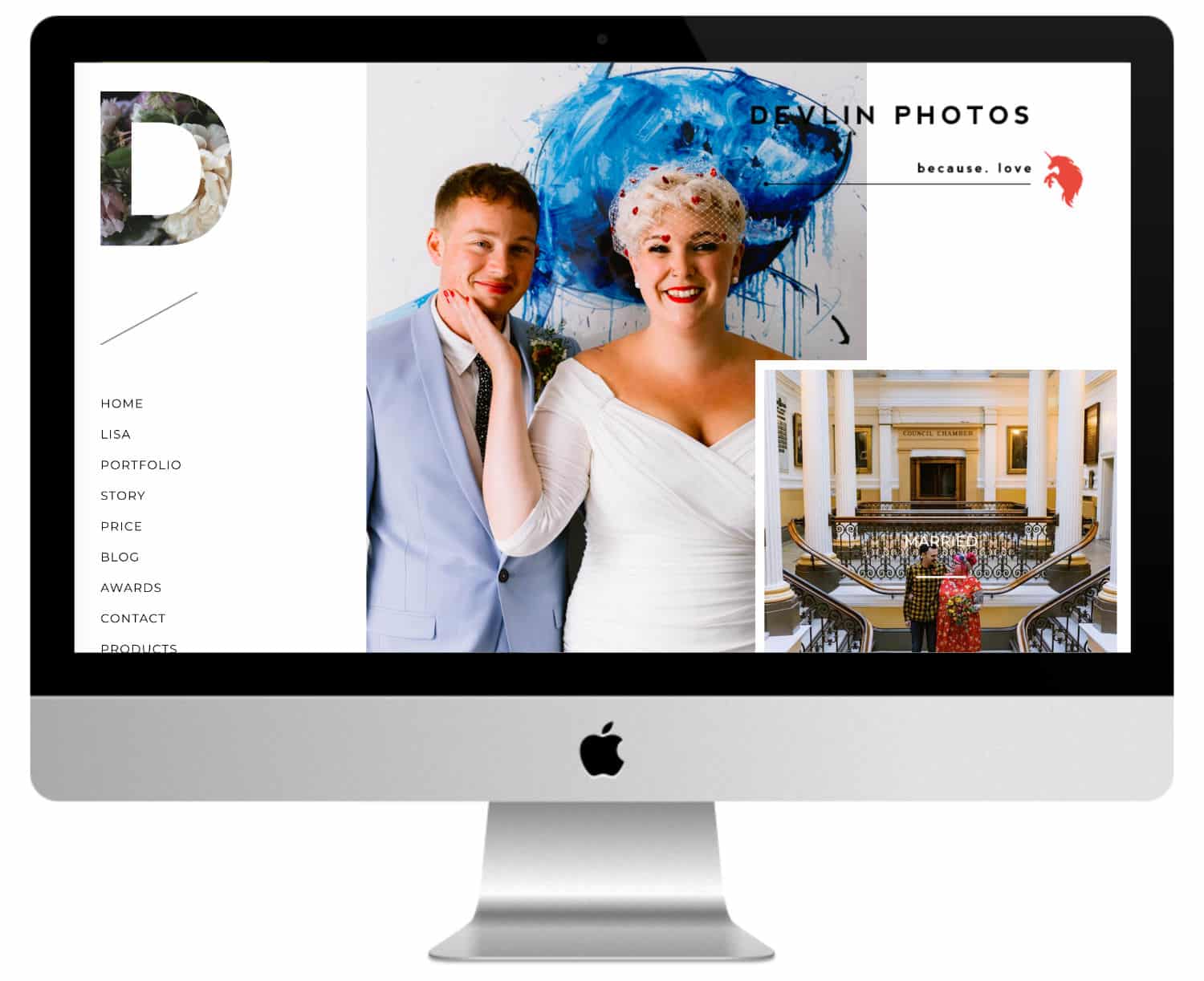
Another photographer website made with Divi, and another example of how a creative mind can put this tool to work so as to attract attention. This time, the owner of the site is Lisa Devlin, a Wedding photographer United Kingdom.
The design is exceptional, with images of different sizes bouncing together to create an original result. The home page also includes video slides and image slides, which gives the entire site a sophisticated, elegant and dynamic look.
Photographer's website Divi #5 : Jordanna Marston
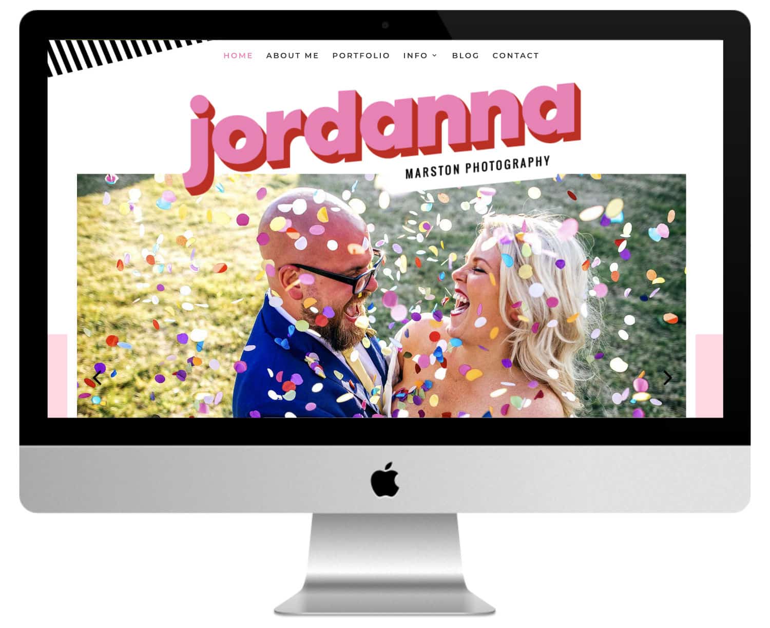
This one uses colors and patterns fun and flashy throughout the site. It also uses several overlapping effects; two sections for photos, overlapping images, etc.
Line patterns and bubbles are interesting. I also like the design of the blog, which displays photos in a mosaic with the title in a superposition that appears on the fly.
Photographer's website Divi #6 : Jasper Van de Gein Fotografie
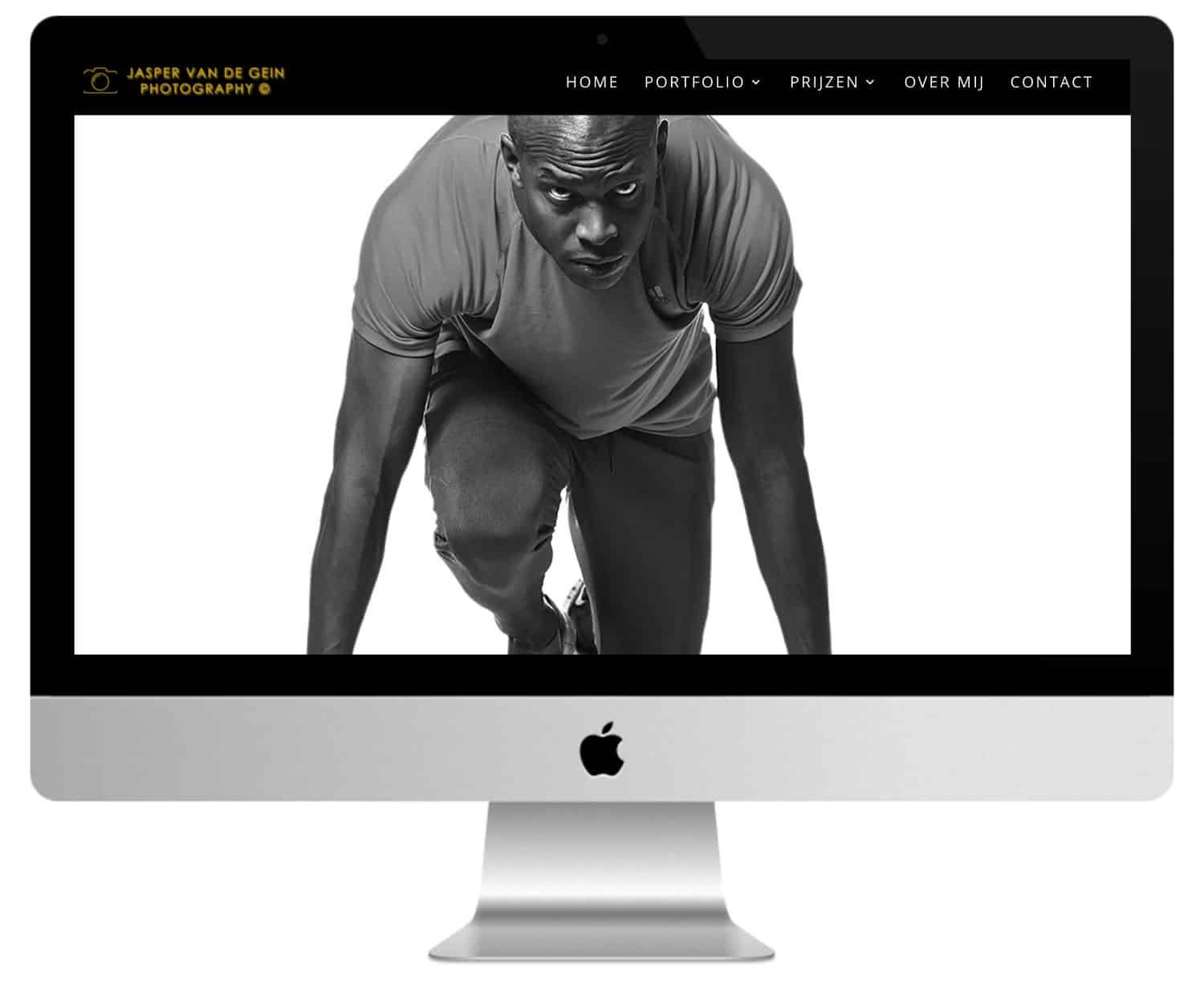
Jasper Van de Gein Fotografie is a web site one page design that includes a full screen cursor, a blurry section showing services and CTA, a section about , several sections with image galleries that display images in several sizes and presentations, price tables with reservation, shooting information and contact form. The site makes an interesting use of the layout of the images.
Photographer's website Divi #7: Florida Museum of Photography
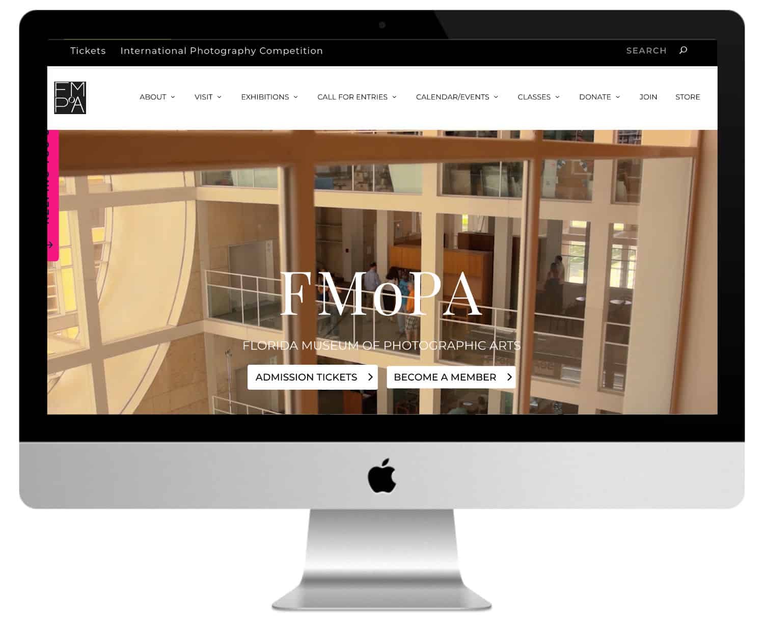
This site has the particularity of using the Theme Extra and not the theme Divi. However, the layouts are actually done using the Divi Visual Builder, which is the page builder also embedded in the theme Extra (a cousin of Divi).
It is the site of a photography museum. It includes a full screen header section with background video, logo and slogan in the overlay.
The current exhibitions are presented in a slideshow followed by the last two blog posts. It makes great use of the mega menu. You will notice the simple and ingenious layout and use of drop-caps, which makes it one of the photography sites Divi the most worked.
Photographer's website Divi #8 : Araujo Photo

This site uses soft colours and elegant fonts that match the theme of marriage (a must for many pro photographers).
The image cursor displays large images with the same height but different widths. It uses one of my favorite ways to use CTAs to show services: square photos with stylized borders and a button stylized in the center like a label.
The testimoniesThe toggles, contact form and blog follow the same elegant style.
Don't delay! Discover the theme Divi here !
Photographic site made with Divi #9 : Eden Photography
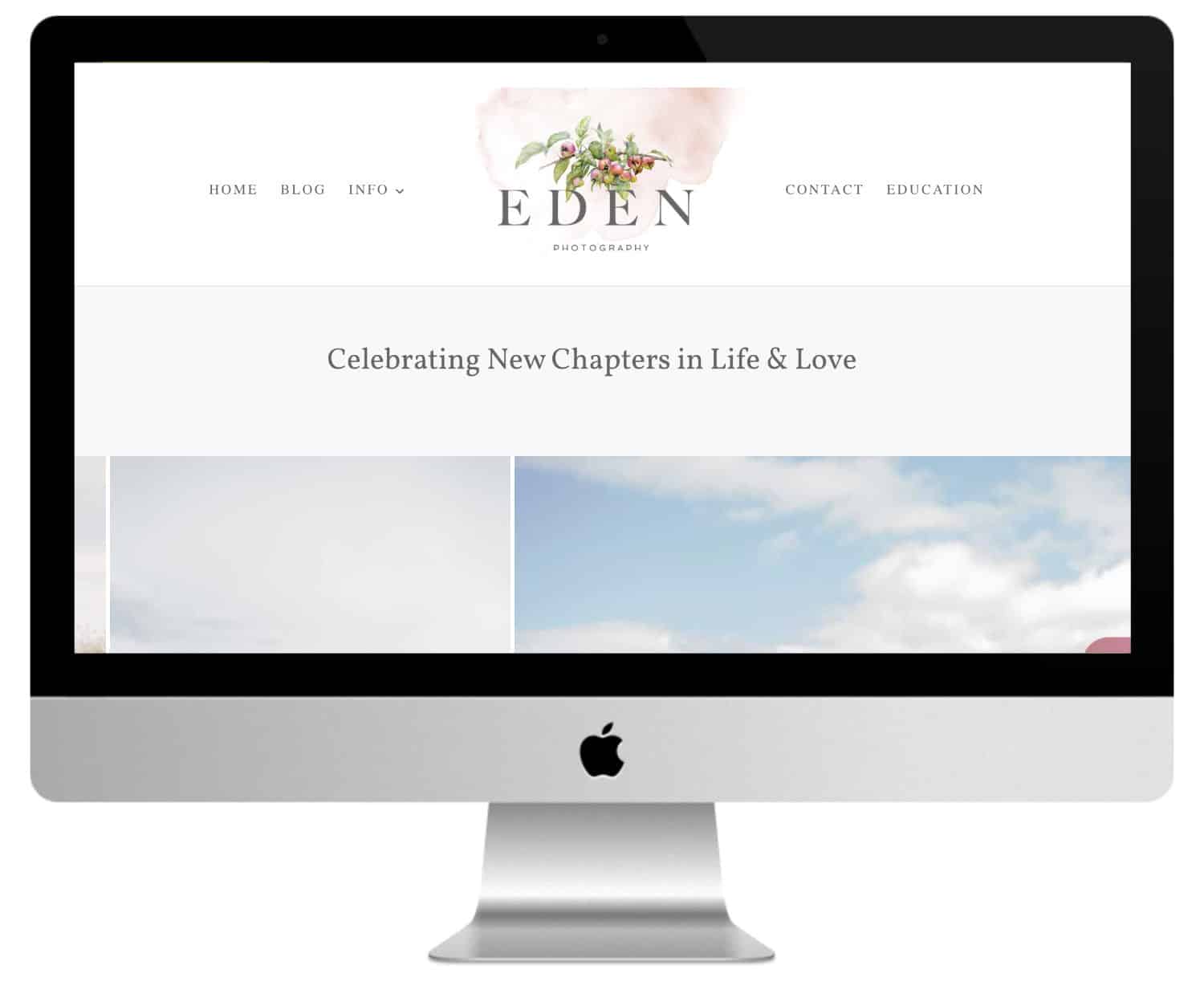
Eden Photography displays a slogan followed by a carousel images that scroll constantly until you fly over an image.
Scrolling reveals an information section, a section with icons and links to pages, a section about it, a full screen testimony in parallel, a featured gallery, a quote in the form of superposition and a contact and tracking section using an interesting background image (corresponding to the logo) that is perfectly suited to pass behind the form and buttons.
The galleries are displayed in a grid. The shop is powered by WooTrade. The elements of the blog are stylized according to the site.
Photographic Sites Divi #10 : Ryan Welch
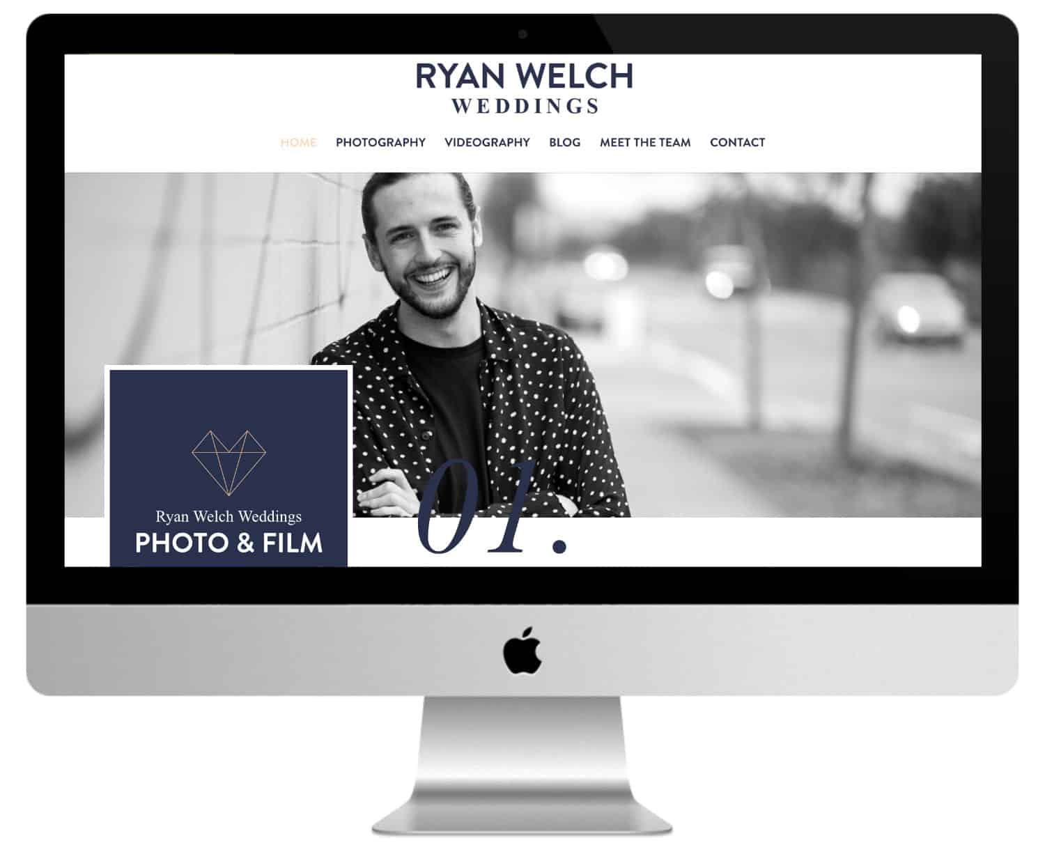
This site uses dark blue for many fonts of title and background, and beige for other fonts. A color block with numbered clickable labels displays the sections of the home page. Each section includes a block with a title and the same numbers, all of which overlap the image of the section and the next section.
Photographer's website Divi #11 : Eddie Judd Photography
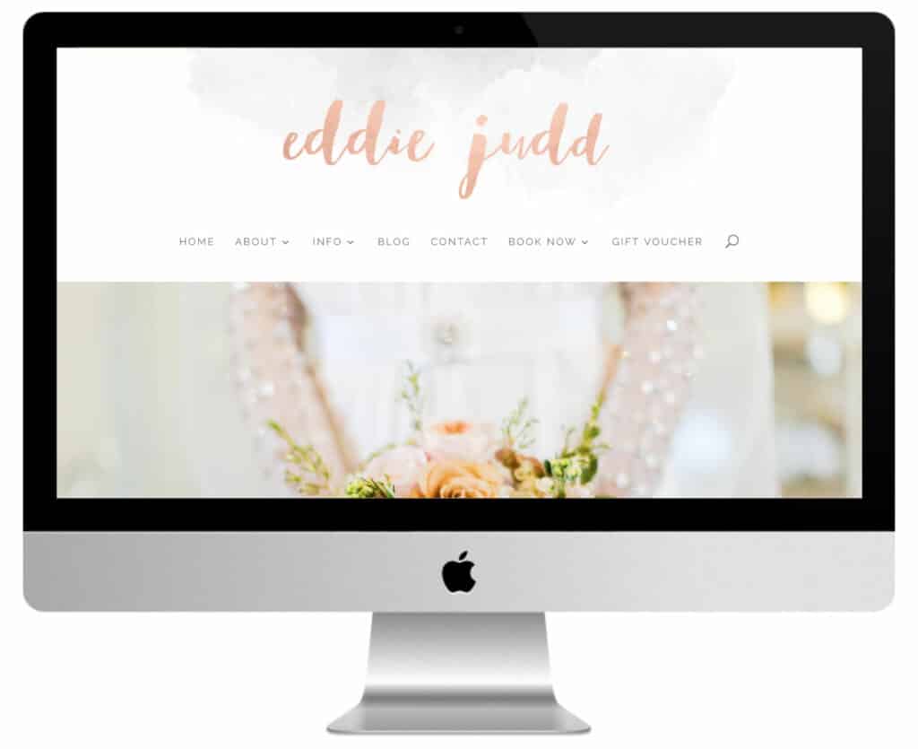
Eddie Judd Photography displays a full screen image cursor, a superimposed emblem that is used in other sections, an image section with links to various pages, a very stylish section with the latest blog post with an elegant background image, a section with media logos, and a section with an Instagram feed. The blog has an elegant style. The site makes great use of elegant fonts and colors.
Photographer's website Divi #12 : Brett Florens
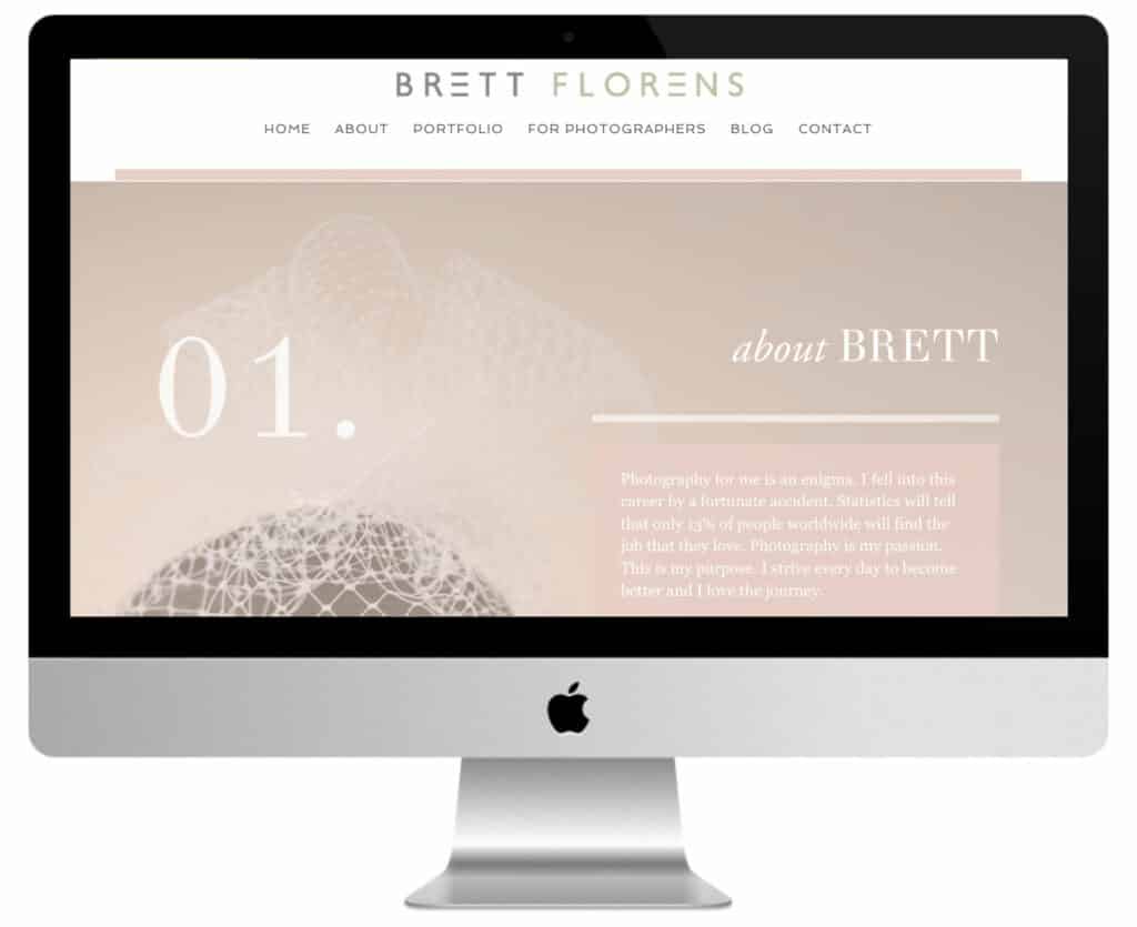
Brett Florens uses a fullscreen image cursor with a menu that is revealed by scrolling. Then there is an elegant slogan, a section about it that uses a numbered system to show the information with CTAs, a portfolio with alternating images and text, an CTA, a blog section and an contact form on an image.
The information section uses image effects and elegant style. The Blog page displays a three-column information section with search, topic and categories. The portfolio displays images in a carousel. The site makes excellent use of soft colors and style.
Photographer's website Divi #13: Sarah Lauren Photography
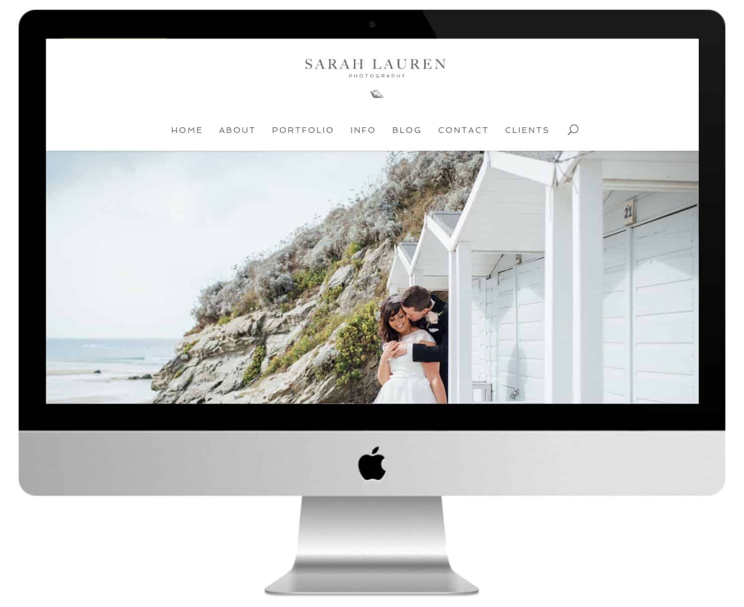
Sarah Lauren Photography uses a design one page (except the blog) displaying a full screen cursor, a numbered section with icons and links to pages, a section Abouta section portfolio is displayed in a multi-directional grid, a section info with links, a section blog and a contact form. The portfolio displays the images in a cursor. The Blog page uses a full-width image, a two-column blog grid and a stylish sidebar.
Photographer's website Divi #14 : Julie Ferneau
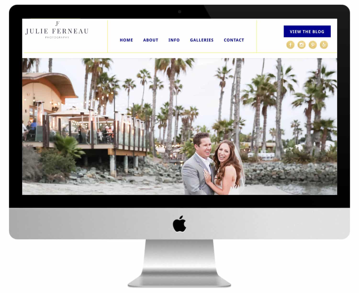
This site includes a header and a footer interesting with a border to divide the sections. The images overlap sections and include white borders to stand out from the sections in which they evolve, while blending with the sections they overlap. The buttons are decorated with a gold leaf pattern. Gold is also used for high lights, including social buttons and border in menus. The portfolio displays the images in a full screen cursor, which reveals a part of the next image.
Photographic sites Divi #15 : Lorraine Claire
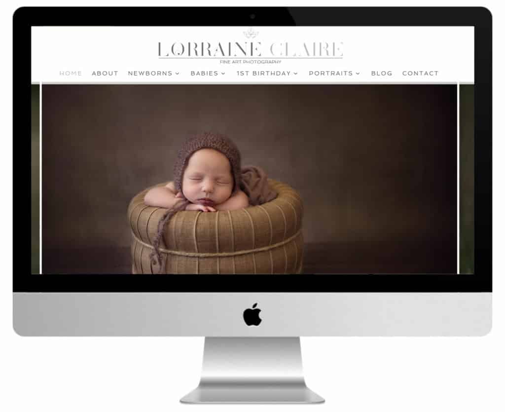
Lorraine Claire's site stands out from the others photographer sites made with Divi with its full screen image, a section with numbered links to pages, a personal quote in a transparent superimposition on an image, a stylish blog section with icon and social tracking buttons.
The Portfolio pages display full-width images, text, images in the sidebar, links to PDFs and alternate FAQs. The layout of the text is elegant and uses capitals.
The Blog page displays the latest posts in a stylish cursor. Blog articles are used as image galleries and display large images with multiple grid layouts.
Photographic site Divi #16 : Jeebs Media

Jeebs Media displays a full screen video background with a superimposed slogan, an animated logo, a full screen menu and CTA. Pages use full-width images and built-in Instagram sliders. The portfolio uses Overflight effects to display topics. Photos are shown in light galleries and use an additional loading function (using an AJAX grid). The site uses high contrast and saturation to create the atmosphere.
Photographer's website Divi #17 : Dawn Martin Newborn and Family Photography
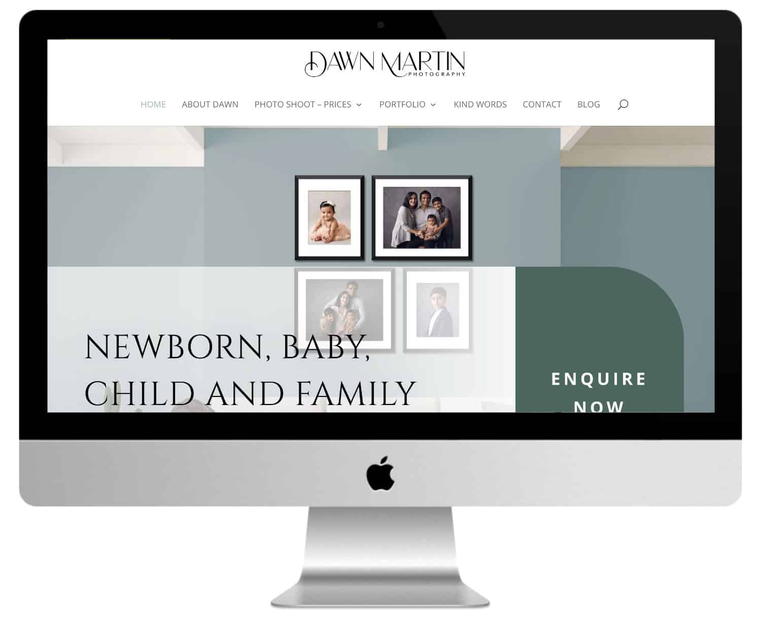
The last of these photographer sites made with DiviBut not the least! Dawn Martin's site uses a single section with a background image and CTAs. The image uses soft focus and lighting to match the colors of the site.
CTAs are built with white blocks that include a stylized border, circular images, title and description. The portfolio section uses circular images with stylized borders and buttons. I love logo illustrations and site highlights.
In conclusion...
That concludes our tour of the most beautiful sites of photographers made with Divi Hey! You have seen the variety of these, which illustrates the visual possibilities of the tool quite well.
So, which one did you like most? For my part, I admit I have a weakness for those of Jordana Marston, Dann Carr and Julie Ferneau.
If you are yourself a photographer (amateur or pro) and use Divi for your site, don't hesitate to talk about it in the comments!
This article was written by David Albert, freelance editor who helps entrepreneurs publish quality content. More information on its website.

10 Comments