
You use the theme Divi but you write your articles with Gutenberg? Perfect! Discover, in this article, Divi feature list for Gutenberg.
These are hidden tricks that nobody uses or knows!
After a rigorous search, no articles on the web are available on this subject - neither in French nor in English...
Are you ready to discover these Divi features for Gutenberg to boost your productivity when creating your next content?
Note that you can also use these features within others Divi modules, not only in Gutenberg !!!
Here is the program:
- Insert "alert box" with Divi Shortcodes
- Add buttons anywhere with Divi Class
- Insert a dropcap at the beginning of the paragraph
- Insert a stylized testimonial (blockquote)
- Insert "tabs" (tabs)
- Show an "author bio"
- Download the complete list
1 - Insert "alert box" with Divi Shortcodes
The alert boxes are common currencies within websites. They allow to highlight messages in order to attract the attention of the user.
They are often used to send an important message like "Please note that ..." but you can very well divert them from their primary utility in order to use them in other circumstances.
Of course, you can also use a CSS class and create this from every room. That's what I do when I insert an insert "promo" or "info" Like this one:
Do you know you can test Divi for free? See you on this page and click on "TRY IT FOR FREE"
The above insert is simply a paragraph to which I applied a CSS class, previously created in my style sheet.
But I could have used it. a shortcode that Divi makes available to me...
He proposed 5 different shortcodes in order to easily insert "Alarm Box" :
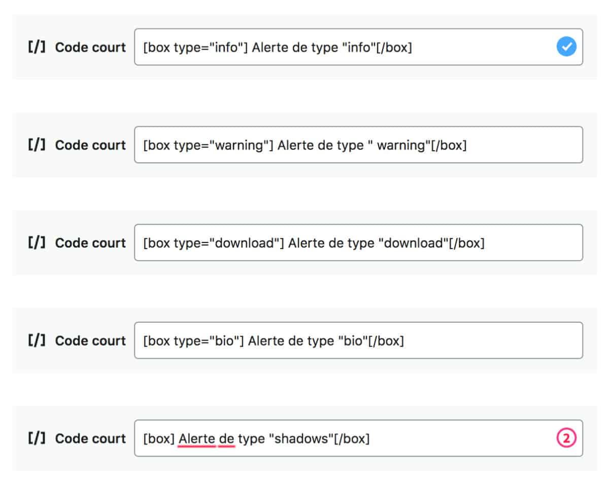
These shortcodes, you can use them within "Short Code" blocks from Gutenberg or within any Divi module using text.
Without change, Divi's alert box looks like this:
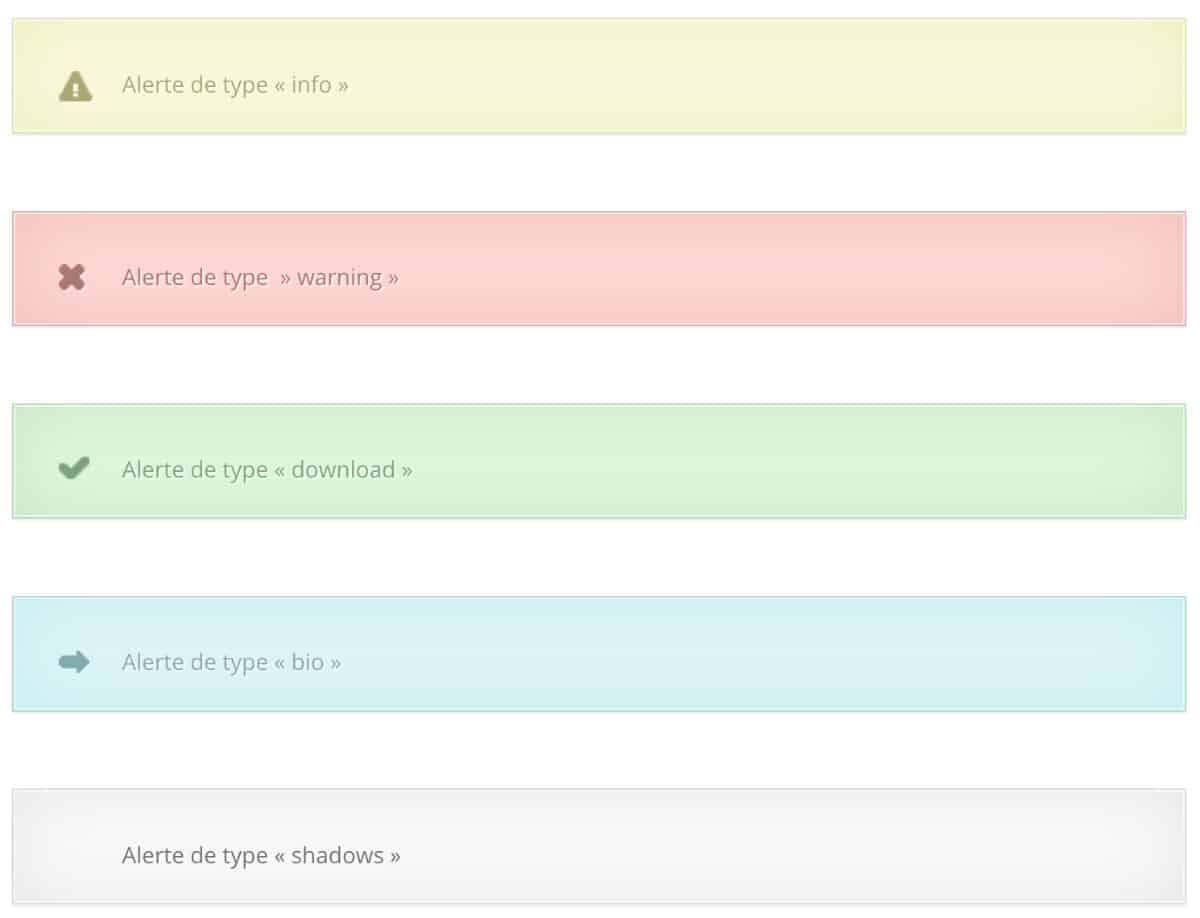
That's not great, is it? So I prepared some CSS to optimize the design and give you an idea of what you can do with these shortcodes.
Here's what they look like now:
To get this design, I just modified the CSS of these boxes by adding the code below in the tab Appearance > Customize > Additional CSS.
Do not hesitate to modify the code below as you wish (it is also available for free download at the end of the article):
/*-------------------- SHORTCODES DIVI : BOX -------------------*/

/* BOX : supprimer vieux icônes */

.et-bio::before, .et-download::before, .et-info::before, .et-shadow::before, .et-warning::before {
  position: absolute;
  top: 28px;
  left: 28px;
  content: "";
  background: none;
}

/* BOX : changer les icônes des différents types de box - emoji à récupérer : https://getemoji.com/ */

.et-bio::before {
    content: "😘";
}

.et-download::before {
    content: "😜";
}

.et-info::before {
    content: "😎";
}

.et-shadow::before {
    content: "👉";
}

.et-warning::before {
    content: "🚀";
}

/* BOX : changer la taille et la police du texte - supprimer l'ombre du texte */

.et-box {
  font-size: 25px;
	font-family: 'Raleway', sans-serif;
}

.et-box-content {
    text-shadow: none;
}

/* apparence box : supprimer bordures - ajouter des marges et ombres */
.et-bio, .et-download, .et-info, .et-shadow, .et-warning {
    border: none;
    box-shadow: 5px 5px lightgray;
    margin: 30px 0px;
}

/* apparence box info */
.et-info .et-box-content {
    border: 1px solid #1fc3aa;
    color: #fff;
    background: #1fc3aa;
    -webkit-box-shadow: none;
    -moz-box-shadow: none;
    box-shadow: none;
}

/* apparence box warning */
.et-warning .et-box-content {
    border: 1px solid #7d3bd0;
    color: #fff;
    background: #7d3bd0;
    -webkit-box-shadow: none;
    -moz-box-shadow: none;
    box-shadow: none;
}

/* apparence box bio */
.et-bio .et-box-content {
    border: 1px solid #fc2f65;
    color: #fff;
    background: #fc2f65;
    -webkit-box-shadow: none;
    -moz-box-shadow: none;
    box-shadow: none;
}

/* apparence box download */
.et-download .et-box-content {
    border: 1px solid #188bdc;
    color: #fff;
    background: #188bdc;
    -webkit-box-shadow: none;
    -moz-box-shadow: none;
    box-shadow: none;
}

/* apparence box shadow */
.et-shadow .et-box-content {
    border: 1px solid #f7f7f7;
    color: grey;
    background: #f7f7f7;
    -webkit-box-shadow: none;
    -moz-box-shadow: none;
    box-shadow: none;
}
2 - Add buttons anywhere with Divi Class
We must admit, the Gutenberg button block is really basic. He can't do much, not even open the link in a new window !!!
And then, if you use the Divi button module, you will only be able to use it as an independent module.
Yet you can easily insert a button anywhereeven within your text (inline button)... Like this button that allows return to summarywhile within a paragraph. Click on it, you will see 😉
To get this, you just have to d'ajouter une classe CSS à votre balise <a> (the HTML tag for links).
Here is a classic link:
<a href="ajoutez l'adresse URL ici">Here is a link containing two CSS classes allowing it to appear as a "button":
<a class="small-button smallpurple" href="ajoutez l'adresse URL ici">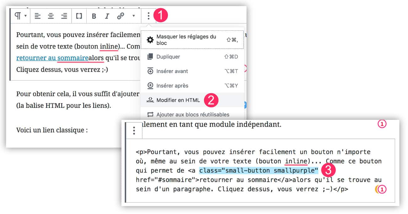
- Click on the "3 small points" above the paragraph block of Gutenberg
- Choose "Edit to HTML"
- Add the 2 CSS classes to convert your link to "inline button".
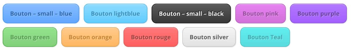
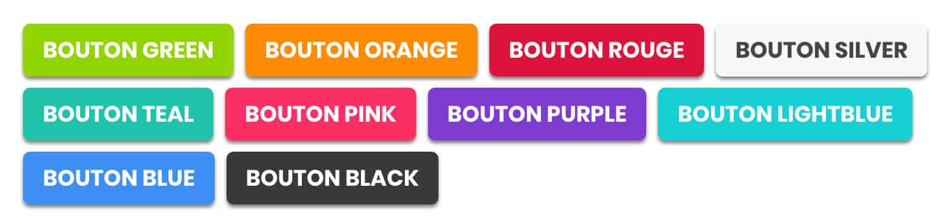
Divi offers 10 CSS classes to get 10 different buttons. You have enough to do...
Les classes sont à ajouter au sein de la balise <a>. Il faut toujours ajouter la classe "small-button" ainsi que la classe associée à la couleur, comme par exemple "smallblue"

Voici les 10 classes qui sont disponibles :

Bouton bleu :
<a class="small-button smallblue" href="ajoutez l'adresse URL ici">Texte Bouton</a>

Bouton Lightblue :
<a class="small-button smalllightblue" href="ajoutez l'adresse URL ici">Texte Bouton</a>

Bouton black :
<a class="small-button smallblack" href="ajoutez l'adresse URL ici">Texte Bouton</a>

Bouton pink :
<a class="small-button smallpink" href="ajoutez l'adresse URL ici">Texte Bouton</a>

Bouton purple :
<a class="small-button smallpurple" href="ajoutez l'adresse URL ici">Texte Bouton</a>

Bouton green :
<a class="small-button smallgreen" href="ajoutez l'adresse URL ici">Texte Bouton</a>

Bouton orange :
<a class="small-button smallorange" href="ajoutez l'adresse URL ici">Texte Bouton</a>

Bouton red :
<a class="small-button smallred" href="ajoutez l'adresse URL ici">Texte Bouton</a>

Bouton silver :
<a class="small-button smallsilver" href="ajoutez l'adresse URL ici">Texte Bouton</a>

Bouton teal :
<a class="small-button smallteal" href="ajoutez l'adresse URL ici">Texte Bouton</a>
But honestly, these buttons are ugly... really! Look what they look like:
That's why I suggest you give them a little lift and give them some peps! Here's what your buttons will look like:
To get this, here is the code to add to your style sheet (on the tab Appearance > Customize > Additional CSS), do not hesitate to modify this CSS as you wish:
/*-------------------- CLASS DIVI : BUTTON --------------------*/

/* modifier l'apparence globale des boutons */
a.big-button, a.icon-button, a.small-button {
    -webkit-border-radius: 5px;
    -moz-border-radius: 5px;
    border-radius: 5px;
    -webkit-box-shadow: 0px 2px 2px gray;
    -moz-box-shadow: 0px 2px 2px gray;
    box-shadow: 0px 2px 2px gray;
    text-shadow: none;
    line-height: 26px;
	color: #fff !important;
	text-transform: uppercase;
	font-size: 16px;
}

/* modifier bouton bleu */
a.bigblue, a.smallblue {
    border: none;
    background: #3e8ff4 !important;
}

a.bigblue:hover, a.smallblue:hover {
  color: #fff !important;
	box-shadow: none;
}

/* modifier bouton bleu clair */
a.biglightblue, a.smalllightblue {
    border: none;
    color: #fff !important;
    background: #18cfd3 !important;
}

a.biglightblue:hover, a.smalllightblue:hover {
  color: #fff !important;
	box-shadow: none;
}

/* modifier bouton noir */
a.smallblack, a.bigblack {
    border: none;
    color: #fff !important;
    background: #393939 !important;
}

a.bigblack:hover, a.smallblack:hover {
  color: #fff !important;
	box-shadow: none;
}

/* modifier bouton rose */
a.smallpink, a.bigpink {
    border: none;
    color: #fff !important;
    background: #fc2f65 !important;
}

a.bigpink:hover, a.smallpink:hover {
  color: #fff !important;
	box-shadow: none;
}

/* modifier bouton violet */
a.smallpurple, a.bigpurple {
    border: none;
    color: #fff !important;
    background: #7d3bd0 !important;
}

a.bigpurple:hover, a.smallpurple:hover {
  color: #fff !important;
	box-shadow: none;
}

/* modifier bouton vert */
a.smallgreen, a.biggreen {
    border: none;
    color: #fff !important;
    background: #90d500 !important;
}

a.biggreen:hover, a.smallgreen:hover {
  color: #fff !important;
	box-shadow: none;
}

/* modifier bouton orange */
a.smallorange, a.bigorange {
    border: none;
    color: #fff !important;
    background: #FF8C00 !important;
}

a.bigorange:hover, a.smallorange:hover {
  color: #fff !important;
	box-shadow: none;
}

/* modifier bouton rouge */
a.smallred, a.bigred {
    border: none;
    color: #fff !important;
    background: #DC143C !important;
}

a.bigred:hover, a.smallred:hover {
  color: #fff !important;
	box-shadow: none;
}

/* modifier bouton silver */
a.smallsilver, a.bigsilver {
    border: none;
    color: #454545 !important;
    background: #F7F7F7 !important;
}

a.bigsilver:hover, a.smallsilver:hover {
  color: #454545 !important;
	box-shadow: none;
}

/* modifier bouton teal */
a.smallteal, a.bigteal {
    border: none;
    color: #ffffff !important;
    background: #1fc3aa !important;
}

a.bigteal:hover, a.smallteal:hover {
  color: #FFFFFF !important;
	box-shadow: none;
}3 - Insert a dropcap at the beginning of the paragraph with a shortcode
The Lettrins, also called Dropcaps, are very trendy, especially in paper magazines.
But do you know that you can easily reproduce and stylize them within your web content?
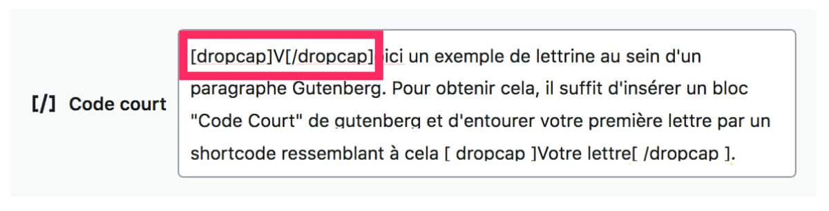
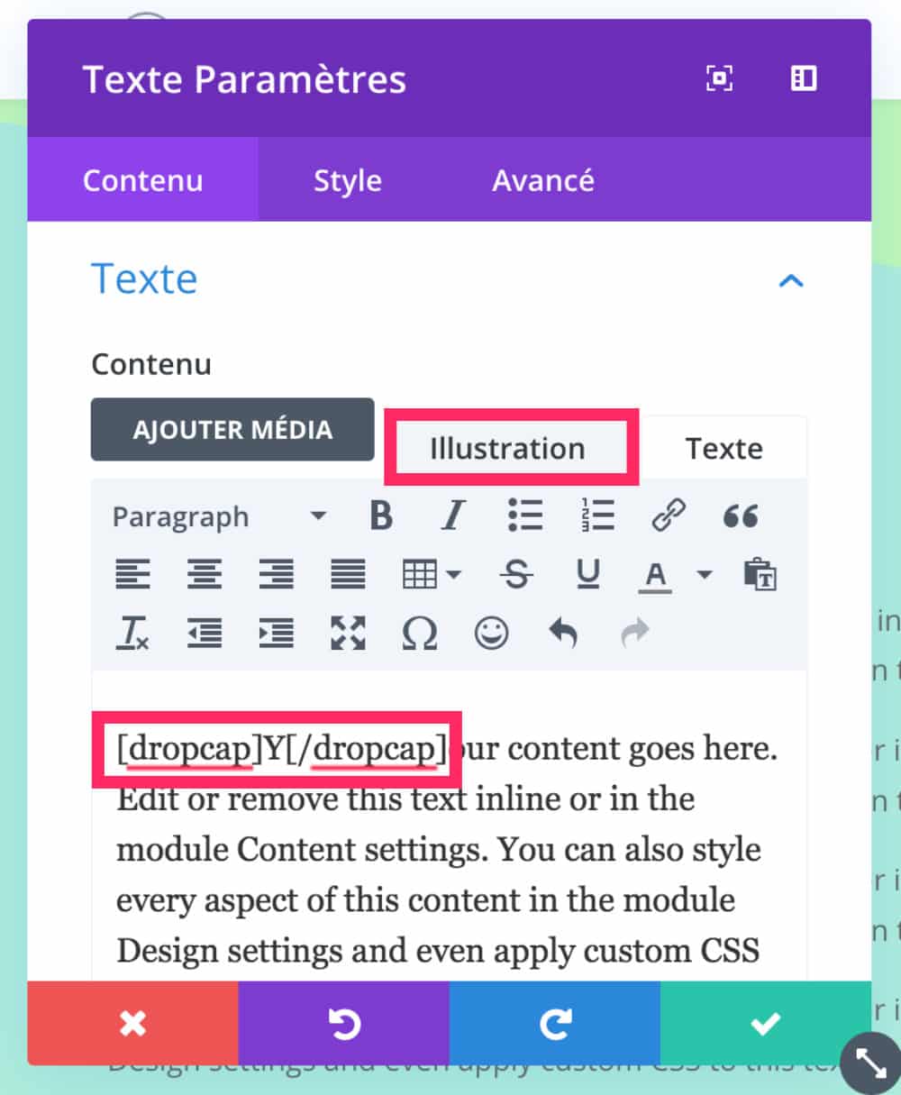
Vo here is an example of a letter in a Gutenberg paragraph. To achieve this effect, simply insert a "Code Court" block from Gutenberg and surround the first letter of the paragraph with a shortcode made available by Divi. This shortcode looks like this: [ dropcap ]Your letter[ /dropcap ]. Then continue writing your text. Finally, with a little CSS you can change the appearance of this lettrine (change font, size, color etc...)
You can also use this shortcode to get a dropcap in various Divi modules accepting text:
Then you just need to stylize your lettrine with some CSS that you will add to the tab Appearance > Customize > Additional CSS
Here is the code I used to get this appearance (you can change it):
/*------------------- SHORTCODES DIVI : DROPCAP ------------------*/

/* shortcode Divi lettrine personnalisée */

.et-dropcap {
    font-size: 80px;
    line-height: 0.7;
    color: #6c2eb9;
    font-family: Times;
    padding-top: 10px;
}
Need more resources on Divi? Visit ElegantThemes blog full of ideas and tutos!
4 - Insert a stylized testimonial (blockquote)
You like "blocks" ? These inserts that display a quote are easy to insert in Gutenberg, when using the CSS Divi class "and pb testimonial".
Look:
This is a blockquote / citation
To achieve this result, it is very simple:
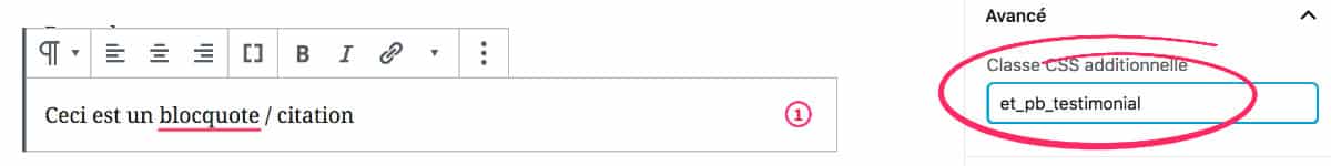
- Add a Gutenberg block "paragraph"
- In the right sidebar, open the "Advanced" tab
- Insert Class "and pb testimonial" in the dedicated field.
Then you will have to customize the appearance with a little CSS to get a more harmonious design. Here is an example:
/*----------------------CLASS DIVI : BLOCQUOTE---------------------*/

.et_pb_testimonial {
    background-color: #E0F8EC;
    padding-bottom: 30px !important;
    border: 2px solid #666;
    font-size: 16px;
    font-family: 'Montserrat';
    font-weight: 600;
}
Feel free to change the code to get a design that fits your project.
5 - Show tabs (tabs)
This feature is more than practical, especially if you need to present a series of ideas. With shortcodes that Divi has planned, you can easily insert two types of tables like these:
Here's what it looks like in the publisher:
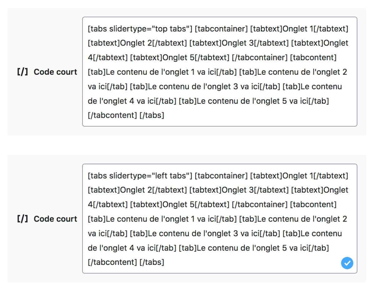
You will find the complete code to copy and paste at the end of the article (download).

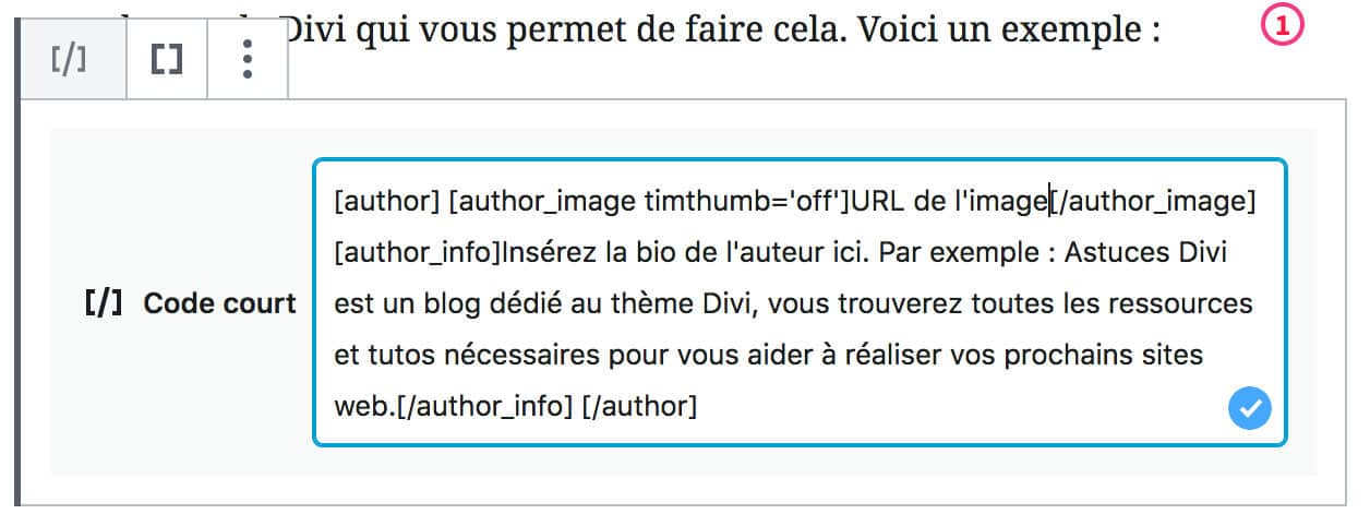
6 - Insert a "author's bio"
If you have a multi-author blog, it is better to use a plugin dedicated to automatic addition of the author's bio at the end of the article.
On the other hand, if you invite editors to your blog on time, you can use a Divi shortcode that allows you to do this.
Here is an example:
The design is not fantastic but you can easily improve it with some CSS.
Here is what the shortcode looks like within the editor:
Finally: download the complete list (snippets)
These 7 hidden features of Divi for Gutenberg are easy to use and native to the theme.
Obviously, they are quite basic and are far from competing with the features of the Divi Builder or even of a plugin shortcodes.
However, it is sometimes a pity to increase a site with a new plugin or to activate a builder page to simply add a button to your article, for example.
These shortcodes can then be interesting to enhance your content easily.
Freely download the list of all shortcodes and CSS listed in this article:
OMG !!! Merci, merci et merci ! Avec ce post, tu viens de changer mon expérience Divi vient de prendre un nouveau tournant 😀
Merci Tivo 😉
Salut, merci pour ton site, il nous aide pas mal pour des petites astuces qui s’avèrent souvent être de grandes astuces! 🙂
Mais quelque chose manque sous forme de module je trouve, on peut le programmer, mais un module est mieux! Es tu capable de coder des module? Est-ce facile?
Salut Alain… Non malheureusement j’en suis incapable, il faut être sacrément calé en JS – PHP et peut-être même React, donc c’est mort pour moi (pour l’instant)