It has been a while since Divi 5 is getting ready, I've already told you about it Hey! But now you can say that ElegantThemes put the double bites! We are at the end of the phase Beta Developers (Dev Beta) and soon, the phase Public Beta Get started! In the meantime, let me introduce you to new interface of Divi 5.
1 – Disclaimer: you will not be lost!
Before we begin, I think it is important to stress that you will not feel lost when you go to Divi 5. Of course, when we set foot in a new interface, our human brain tends to ting to resistance...
Yet there's nothing to panic about: It's just a lift of the interface of the Divi Visual Builder. The icons have become a beauty and have changed places, but for the rest, everything works as before, that's good news!
2 – Comparison Divi 4 / Divi 5
Let's start with some comparisons between the interface of Divi 4 and Divi 5...
2.1 – Activation of the Divi Visual Builder
When you enter the edition of a publication with Divi 5, you will notice that the interface is more modern while resembling strongly the old:
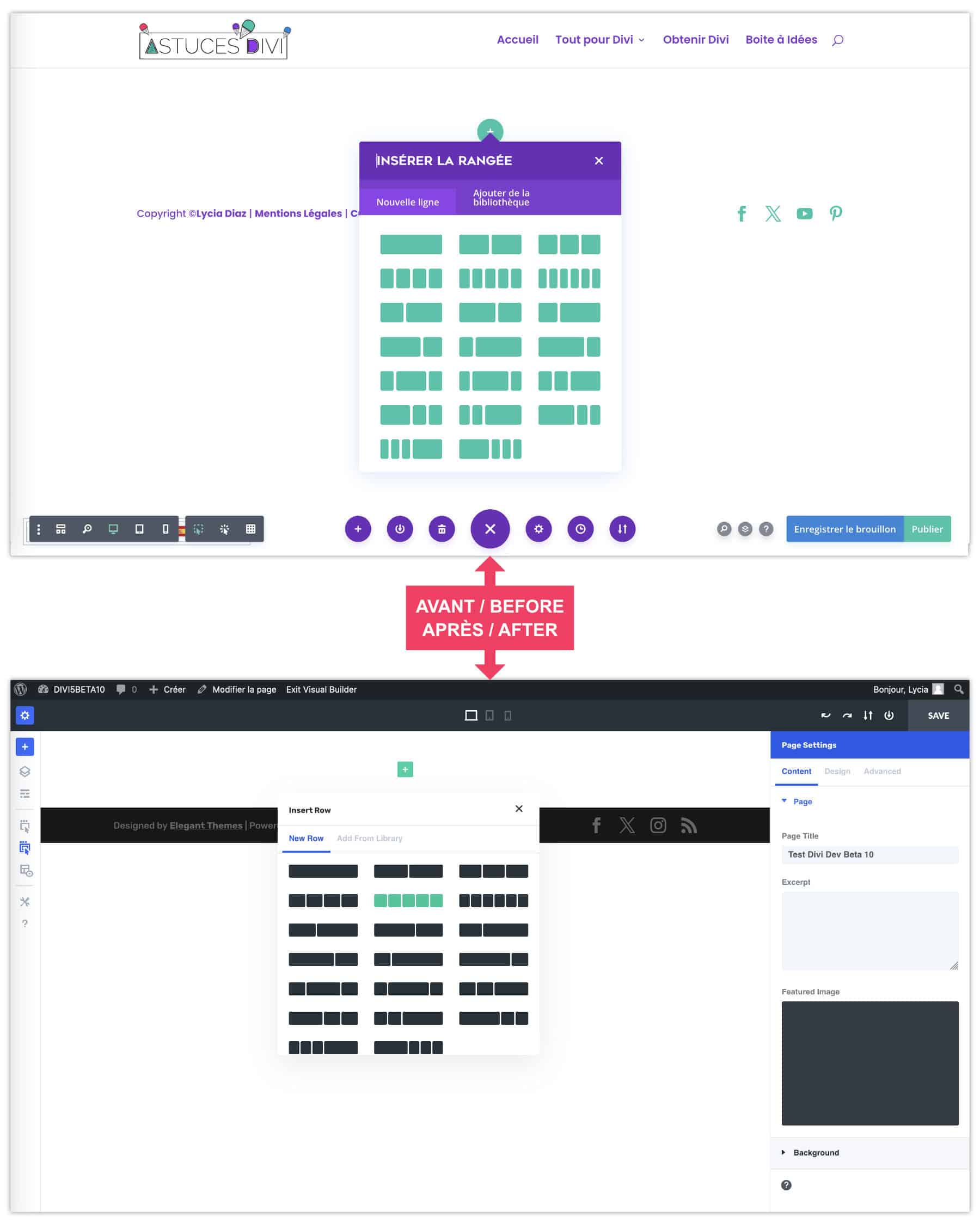
The purple and the blue left room for a bright king blue, which is not to displease me... This system is maintained by adding sections, lines and modules.
We notice that the options for each element are in a side bar fixed to the right, we will talk about it again...
2.2 - Adding modules
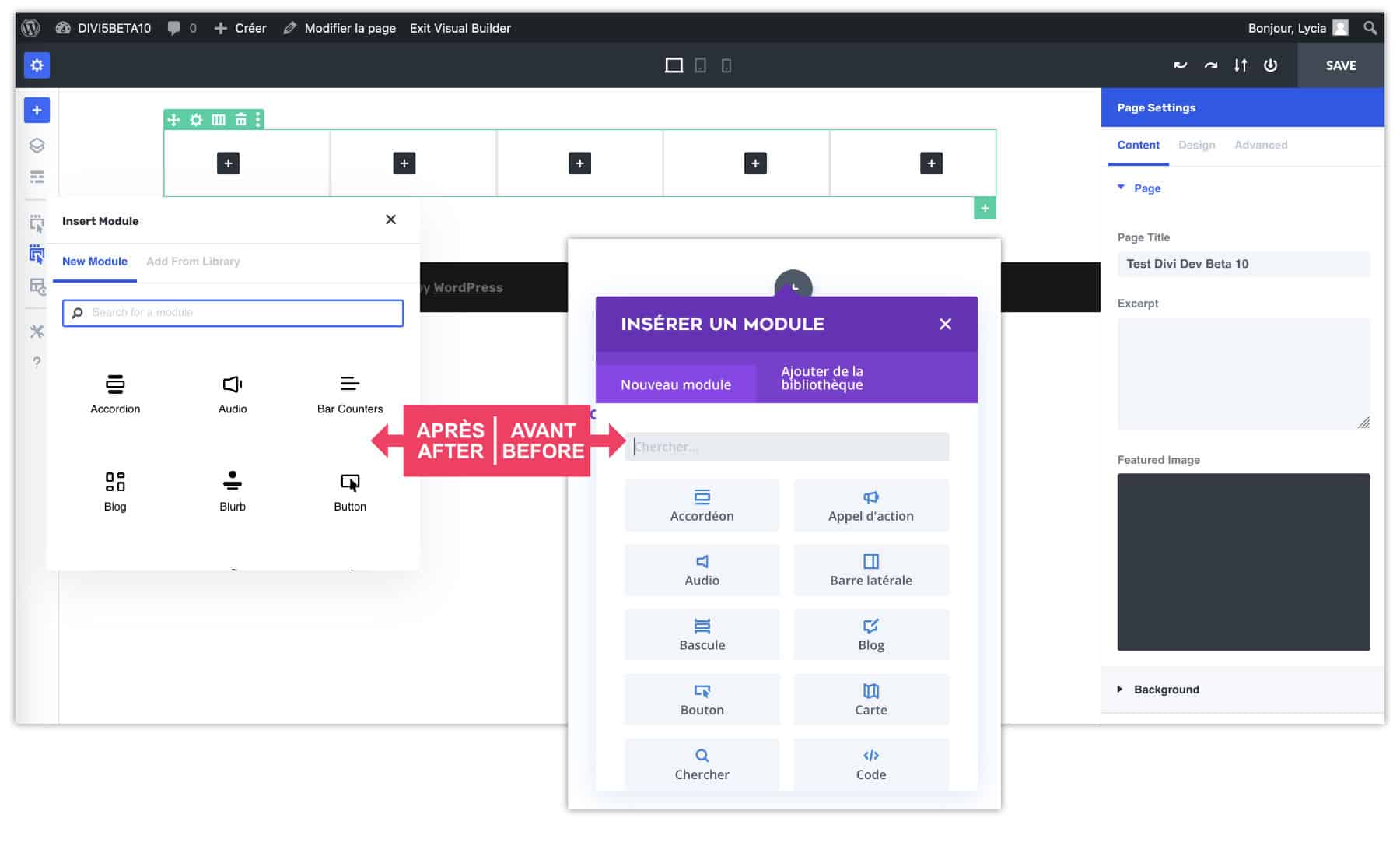
The Divi modules have not changed for the moment, but the interface that offers them has made a beauty!
2.3 – Interface options
All the interface options that were offered under the purple button were distributed to various locations:
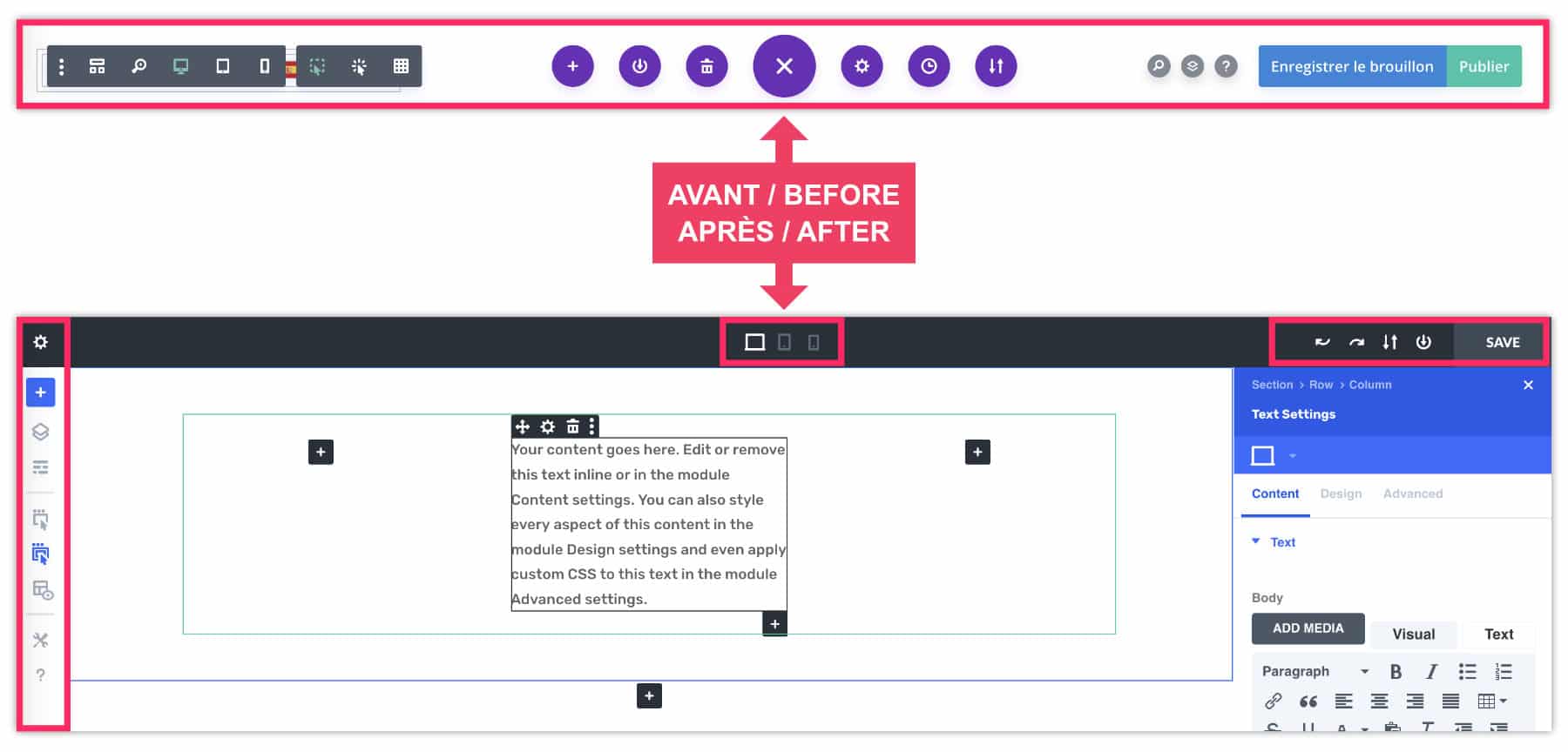
On the left side you will find the options for:
- import a pre-built layout
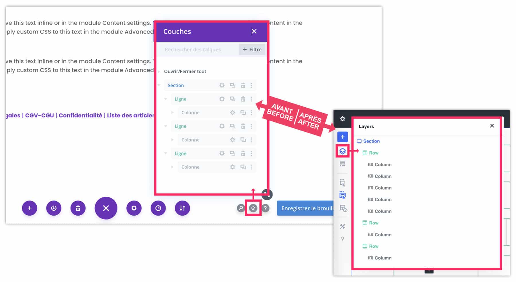
- view document structure
- choose the mode to display the builder (wired display, click/hover selection...)
- etc.
At the top of the screen are the screen size versions:
- computer
- Tablet
- Mobile
At the top, to the right of the screen are the options for:
- save
- undo / redo
- import / export layout
- save in library
2.4 - Options panel: fixed or floating
By default, you will find the options panel of the settings of a section, line or module fixed to the right part of the interface. A little in "Gutenberg mode".
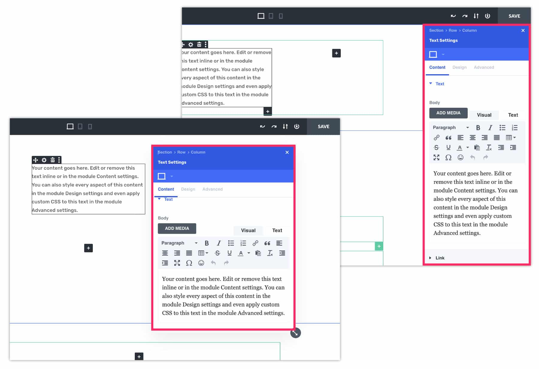
If you don't like it, you can also "hatch" it to make it "floating and mobile" (see video at the end of the article).
Did you know that? You can test Divi for free by visiting on this page and by clicking on "TRY IT FOR FREE"
3 – Improved responsiveness
The great novelty, not least: improving the management of the responsive!
This is a great advance because the Management of Responsive with the old version of Divi was quite tedious!
The novelty? You no longer have to activate the small phone icon to version the settings for each option and for each screen! Finally, it is possible for us to switch directly to the screen version we want to make our changes! That's really great!
3.1 – Example color change according to screens with Divi 5
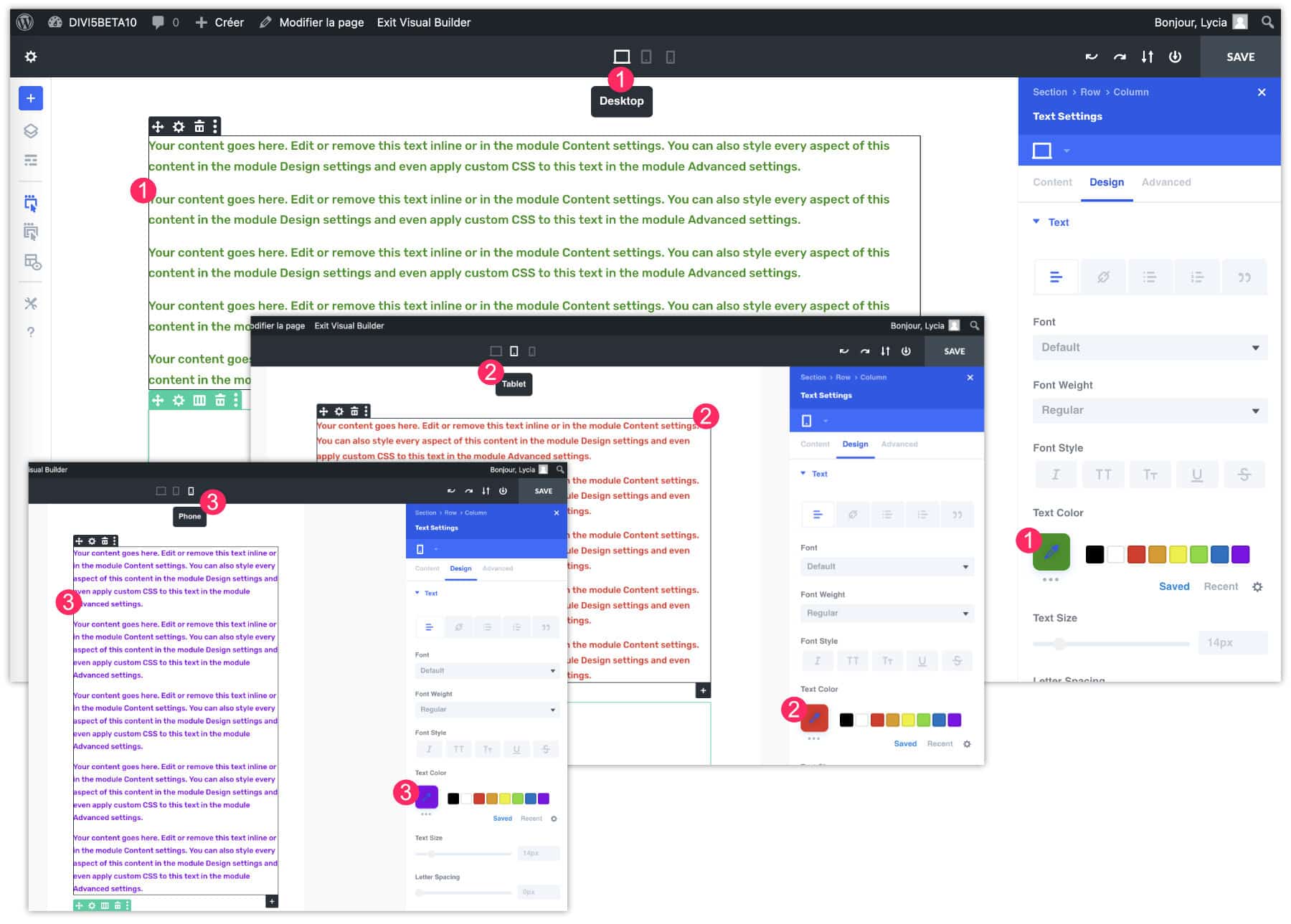
- Select the version of the screen to edit, for my example, this is the computer version. Then make your changes, for example, I put the text in green.
- Then select the tablet version. Make your changes. For my example, I pass the text in red.
- Finally, select the mobile version. For this example, I put the text in purple.
Everything is taken into account immediately! Divi 5's new interface perfectly manages Media Queries (the CSS rules that allow to create versions according to the screen sizes).
3.2 – Example color change according to screens with Divi 4
Before Divi 5, it's less obvious! There was a whole process to follow, you should not be distracted... Here's what it took to achieve the same thing:
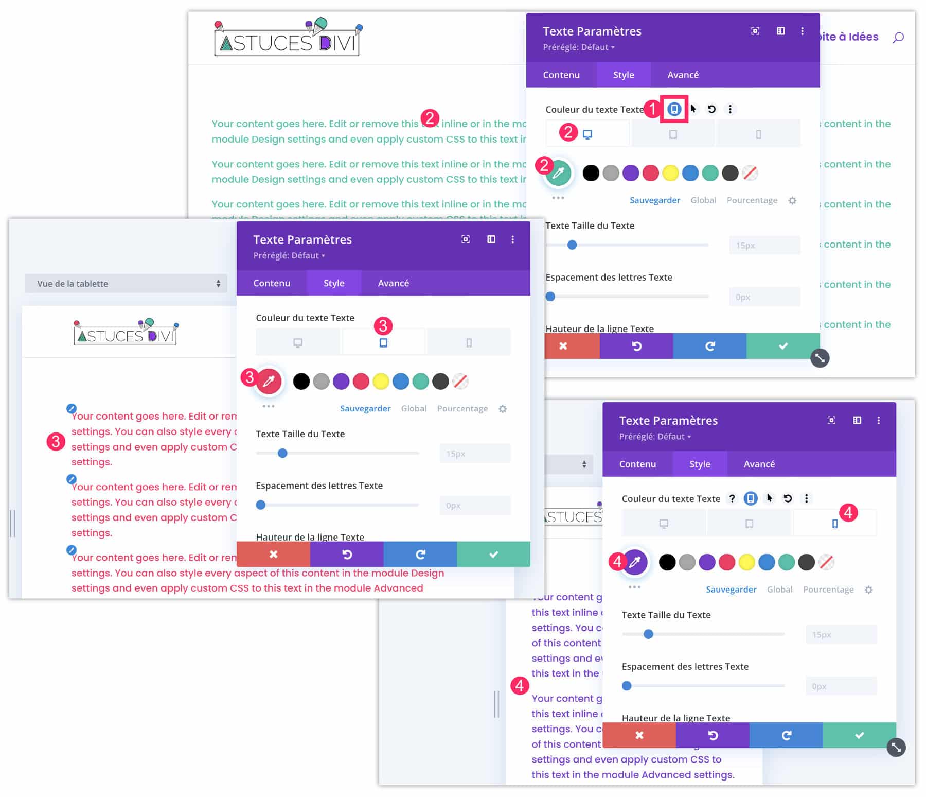
- At the option level to set: don't forget enable phone icon.
- Then select the computer tab to set the color of the text in green.
- Repeat the same action at the tablet level to put the text in red
- And finally, do the same in mobile version to put the text in purple.
So far, it seems to be the same... That's right!
Except that the difference is that you need to activate the phone icon for each option: text color, font size, interliging, etc. While with the new interface of Divi 5: everything is enabled by default within the view, you only need to make your changes.
That's good news!
4 - Improved performance (speed)
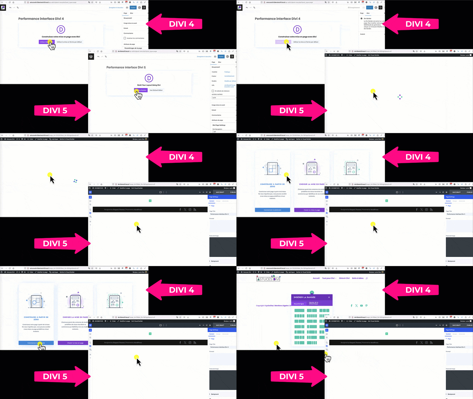
On the performance side, then, there is no photo!
Watch this video that parallels the activation of the Visual Builder in Divi 4 and in Divi 5. You will notice that in Divi 5, the manufacturer activates in a flash.
5 – Similarities with Gutenberg
It will not have escaped you: the new Divi Builder looks like the native WordPress editor named Gutenberg.
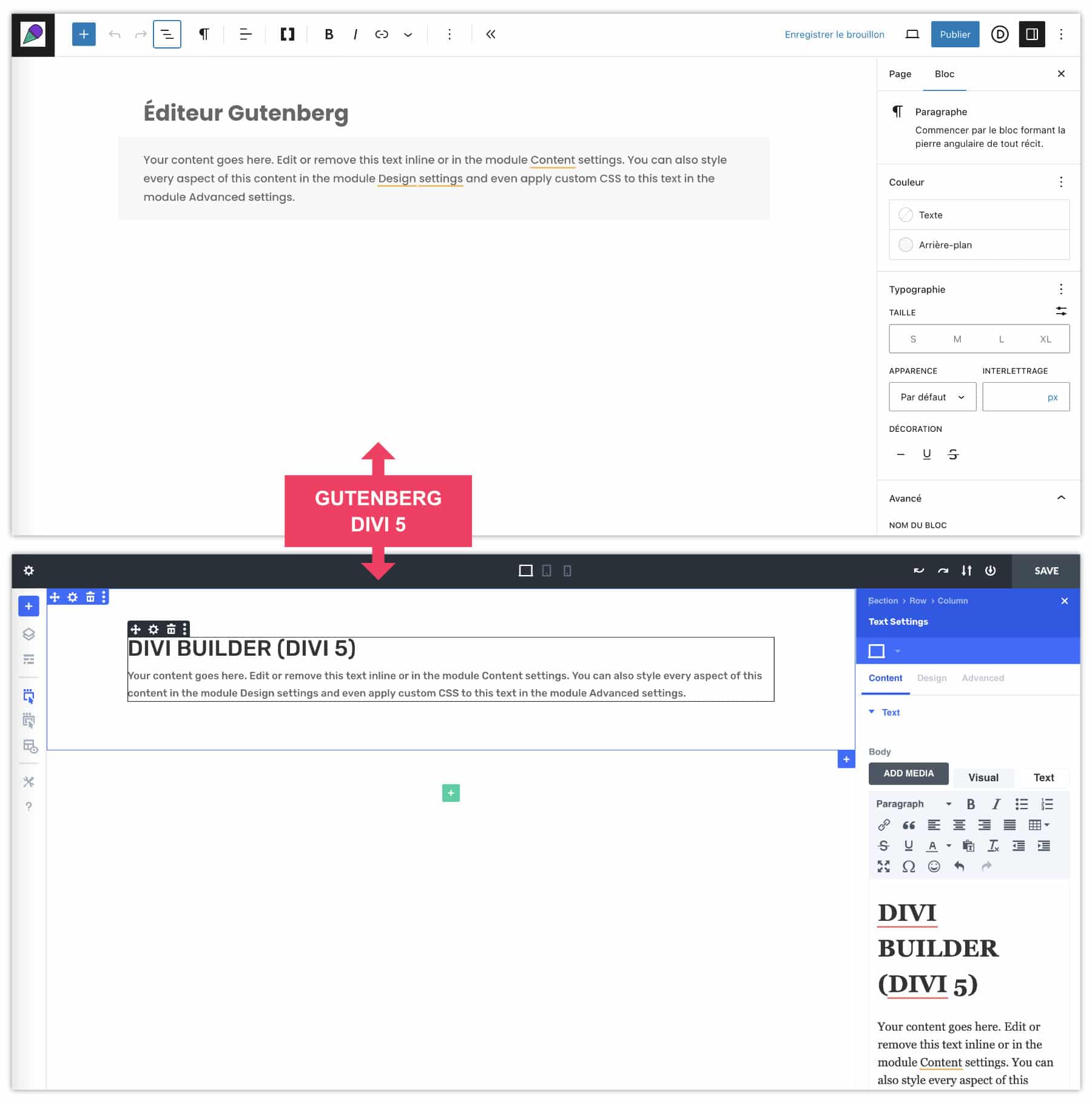
I find this approach very sensible! Thus, a new WordPress user will not arrive in an interface that is unknown to him, it is less stressful, more fluid... I can only approve!
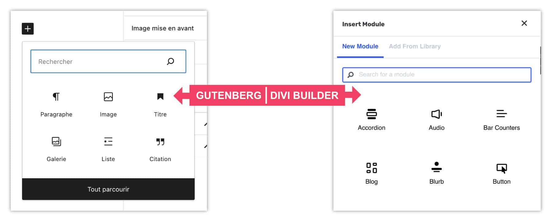
At the panel of the choice of modules, the resemblance is more than striking with Gutenberg.
5 – Video presentation
And to discover The interface of Divi 5 In action, I've prepared a little video for you:
Transcription of video
For this video, I will create a new page and I will click on "Use the famous Divi Builder" and you will see how it is super fast. I click and here's the Divi Builder is now open and I'm going to be able to create whatever I want within my page.
In this video, I let you discover the new interface of the theme Divithe famous Divi 5 Everyone's waiting.
Let me introduce myself, I am Lycia Diaz, the founder of the blog tips Divi and The Webeuse as well as the author of the book, I create my site with WordPresspublished in Eyrolles. Here we go, follow me.
So, already we see a very clean interface, we can no longer find our little purple button that was once found at the bottom of the interface, on the contrary all the options have been carried over to the left here and we see that there is a sign on the right that looks strangely like the Gutenberg panel, the native WordPress editor.
How does it work? We see that there is already a section that has been added and we can add a line, for example a line cut in four.
Here we have a new interface to propose the modules: we see that this panel looks very much like Gutenberg's. For example I can look for a text, we're not out of country, it looks like what Divi was proposing in the old versions.
At the level of the responsive, I think Divi 5 has been significantly improved. For example, in red for computer version / if I go to tablet, I will tell him that I want the text in purple and for the phone version I want it in green.
And we see that by passing from screen size to screen size everything is taken into account we are no longer obliged to activate the phone icon that allowed us to describe each option each time. So this is a big step forward. Thank you! Fortunately, Divi 5 takes care of this.
As a reminder, look at what was needed in the past: we had to activate the small phone icon and indicate for this text that we want it purple for the computer, red for the tablets and green for the phones.
We had to do this for each option, for example for font size, we have to activate the phone: 15px for computer, 16px for tablet and 17px pixels for mobile. It's an example, but we had to do that for every option. So this is a great step forward. I'm very happy to see this finally in Divi.
In Divi 4 and earlier versions, we had small options that were available here, for example, we could switch to wired display. Now it's much simpler, everything is here: the wired version so wireframe can be turned on or off, under the option Layers, we also have the structure of the document, once here by this small button.
We see that the blue is more flashy, much more pretty than the old blue and then here we still have other options like save layout in library, import or export and above all, let us not forget that we can always import the famous layouts made available by the Divi Builder.
So the good news, friends, is that it's like before except that it's much better so we're not going to worry: what you've learned about Divi is always worth it! Except now we have much more options, it's much more efficient. The interface has been lifted, it is really much sexier.
If you don't like the small side panel on the right, a little "to the gutenberg", you take it, you click, you move it and here you find our fameu floating panel as we had in the old interface.
And if we want to put it back on the side, it's pretty simple: we come and tie it to the side and there.
I let you read my article about this on my blog Tip Divi. I invite you to discover my book "I create my site with WordPress" because we can't use a theme or a Builder properly if we don't have the basics of WordPress and then I tell you very soon in a new video!
6 - Divi 5: What's next?
In conclusion, I admit I've had some doubts lately: I found the development of Divi 5 a little long... But it's for the good cause, because today, I've only got a hurry: that Divi 5 make his entrance... He'll crush everything!
This new version really has nothing to envy or to Elementor, nor to block-based themes.
I noticed that the development had accelerated well in late 2023, with the release of 3 versions of Dev Beta. We are also at the end of this phase and it would not surprise that the phase Public Alpha starts in January or February 2024.
The next phase will follow. Public Beta.
These two phases are very important: being open to the general public, many bugs will be raised by users and then corrected by developers...
After that, we can calmly click on " Update Divi We will benefit from this new interface on our old sites created with Divi!
A little more patience, it's very soon! Maybe before summer 2024?
You may like this list of links:

Merci pour ton article ! J’attends de pied ferme Divi 5 comme beaucoup d’entre vous 🙂
Si vous souhaitez vous inscrire est peut être avoir la chance d’être parmi les premiers à l’essayer, voici le formulaire officiel que l’équipe de Divi invite à renseigner 😉
https://docs.google.com/forms/d/e/1FAIpQLSeQiz9QamP8YZtUO9x7S3tjdQAfJNRVGOAdWrUB2jEYOSsFAw/viewform
Merci Lycia pour cette première découverte de Divi 5 que nous sommes en effet nombreux à attendre, surtout pour un code plus épuré et donc des pages se chargeant plus vite. La nouvelle interface est une très bonne nouvelle également!
Merci beaucoup Licia pour votre nouvel article sur Divi.
Je vois que c’est de plus en plus pratique d’utiliser Divi !
Salut
Cette mise à jour sera effective quand, le sais tu?
Oui Bruno, ça va être cool 😉
Salut Mecnun, il va y avoir d’abord l’Alpha Public entre janvier et avril. Ensuite, il y aura la Beta publique et ensuite on aura Divi 5 qui sortira officiellement. Donc à mon avis, pas avant septembre 2024, mais ce n’est que mon avis, je n’ai pas plus d’infos.
Tout à fait Philippe !
Merci Raffi pour le lien. Je pense toutefois que c’est le lien pour s’inscrire au programme « Dev Beta » (c’est là que j’ai postulé pour accéder au Divi 5 que je vous ai montré dans la vidéo). Je ne suis pas sûre que ce soit le lien pour s’inscrire en avance à la « Puclic Beta ». D’ailleurs, elle devrait arriver dans les prochaines semaines et ElegantThemes publiera certainement un article et une vidéo lorsque ce sera le cas. J’ai hâte ! Stay Tuned.
Merci Lycia encore une fois. On attends la Màj avec impatience effectivement…et avec quelques appréhensions sur les sites déjà existants.
Très bien la gestion actuelle pénible du responsive et l’arborescence directement visible et accessible « section-row-column » 🙂
j’ai hate que divi 5 sorte
Merci 🙂 Est ce que vous pensez que DIVIGRID sera toujours opérationnel ?
Suite a votre article récent, je me suis procuré DIVIGRID dont j’ai deja intégré des sections dans mon site.
Après avoir pensé que Divi 5.0 sortirai en 2021, peut-être que finalement il va sortir en 2024 …
Et en plus je suis déçu que ce nouveau fonctionnement ne semble en fait qu’essayer d’imiter et en moins bien, les constructeurs existants qui eux n’ont fait que progresser (Flexbox, loop intégrée, etc …).
Gilles, je pense que tous les développeurs de ces plugins tiers sont sur le pont. Ils font justement parti du programme Dev Beta pour commencer à migrer leur code pour que ces modules continuent de fonctionner.
Oui, c’est long ;-(