
Nowadays, I still meet some restaurateurs who think it's not useful to have a website and that a FaceBook page can be enough, but they are wrong on the whole line! Not only does the client want to be able to check the card before coming to see if the restaurant is in its budget, but he wants to be able to book online at any time.
In addition, he wants to have information that it is sometimes uncomfortable to get by phone like the price of a cup of Champagne or a glass of wine for example.
Finally, he wants to see the dishes on the map, see appetizing photos, etc. Anyway, he wants to know where he's going to set foot to avoid Put your feet in the dish !
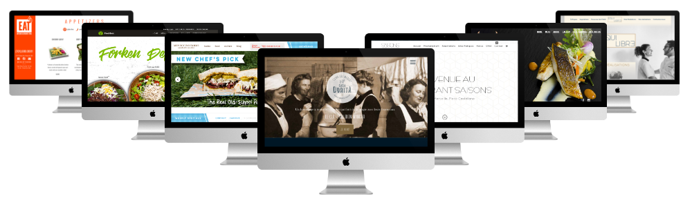
I selected for you some sites for restaurant made with Divi and you will be funnyly surprised by what this WordPress theme is able to do.
Also read: 10 good reasons to choose the theme Divi.
Discover all you can do with the theme Divi
1 - El Torrero
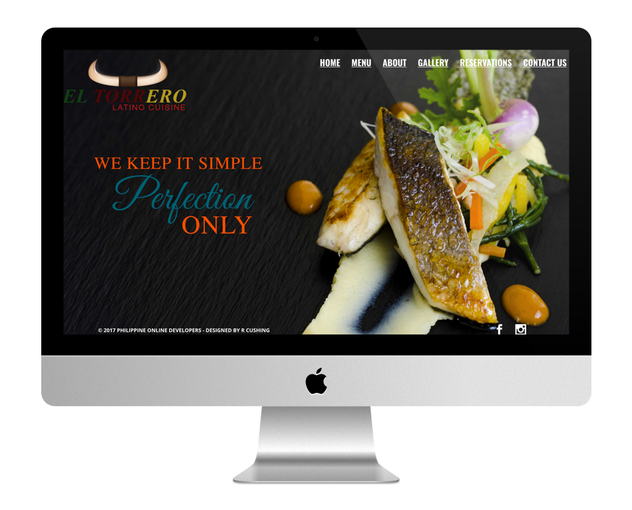
Although the order of this list does not matter, I still wanted to introduce you to the site El Torrero first because I think he's fantastic! The navigation of the homepage is very stylish and highly sought after. We don't find this on all the sites...
Indeed, the mouse scroll reveals sections whose images are divided into two parts: the left side slides upwards while the right side slides downwards. It's very original!
If you're in the business, as soon as you enter this site, you might wonder what the theme is: It's just Divi., amazing what we can do with this WordPress theme. The other pages of the site are simpler but do not indicate.
The gallery page is also nice with the hover images that reveal the title and description of the dishes.
2 - Restaurant Seasons
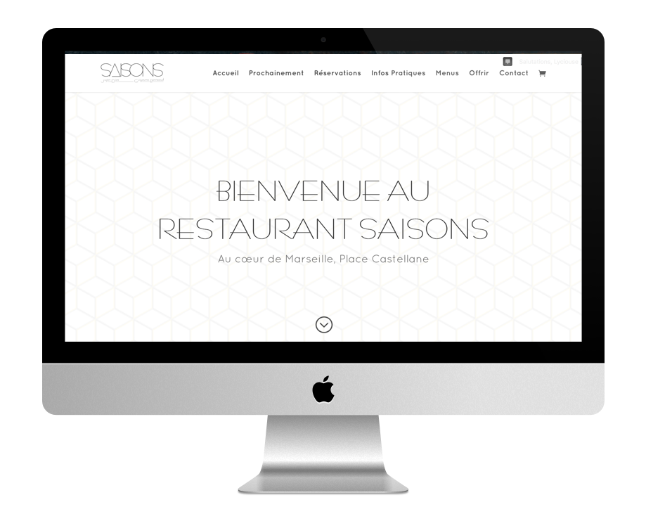
The home page of the Restaurant Seasons is sober while being very original. The white color is dominant with small touches of this rather trendy mustard yellow. The originality lies in the background images of the sections that are fixed and give an impression that the plates overlap: a black plate / a white plate and so on... It's all about opacity and scrolling.
The site is developed on a onepage that leaves room for satellite pages such as the "booking" page where a booking calendar is located or the "offer" page that displays a shop that allows to compose gift vouchers with WooCommerce.
3 - Eat.
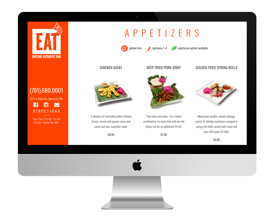
The site restaurant Eat Thai is very simple but yet so effective! One page that announces the color - an intense orange indeed - where each photograph of dish is highlighted with a description and price.
On the left is the menu, or rather Main navigation, which invites you to click : you can either click on the phone number, on the address, or on social networks... In short, a simple and efficient site, I told you !
4 Freshbox
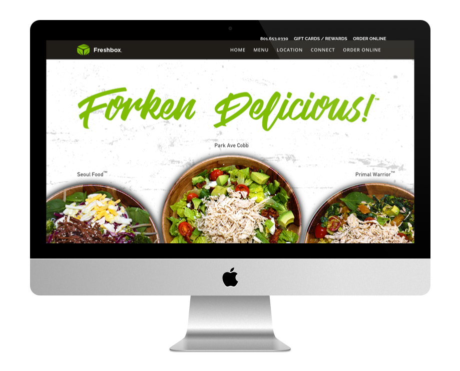
The home screen of the Freshbox site displays a full screen slider with automatic rotation. Then comes a succession of very colorful sections in intermittently with sections in parallel axis. The order online page leads to an online order page whose options for each item are impressive...
5 - Mendocino Farm
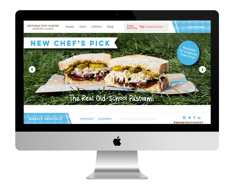
The homepage of the site Mendocino Farm displays clear colors combining white and blue sky... Moreover, this page is short and does not deserve a long scroll scrolling, which is rather pleasant and rare nowadays.
The originality of this site lies in its double navigation (one at the top, the other at the bottom) very stylized and that makes appear icons next to each element. The choice of the main font, hand drawn version, is also very well chosen.
None of the pages of this site is left to chance, it can be said that this is really a great job!
Also read: 10 site inspirations for restaurants.
6 - Rustic Kitchen

At first glance, Rustic Chicken site Sounds simple and basic... And yet he is not! His home page is, of course, loaded with images but what is very original is those sections that slide from right to left. and leading to the various menus offered by the establishment.
7 - Speakeasy Coffee Bar
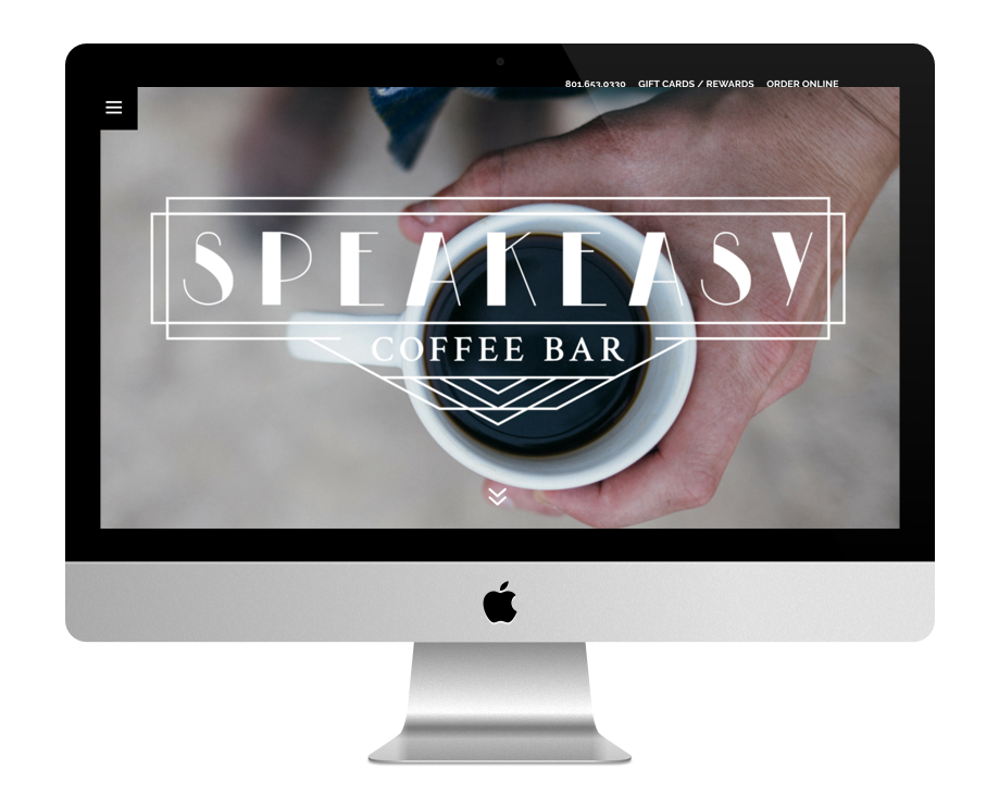
The site of Speakeasy Coffee Bar is very sober. It is a onepage in the shades of black and white that simply offers a location and menu of the establishment. The navigation is nice: it is on the left of the screen, at the mouse hover, no need to click.
8 - Gastronomy balance
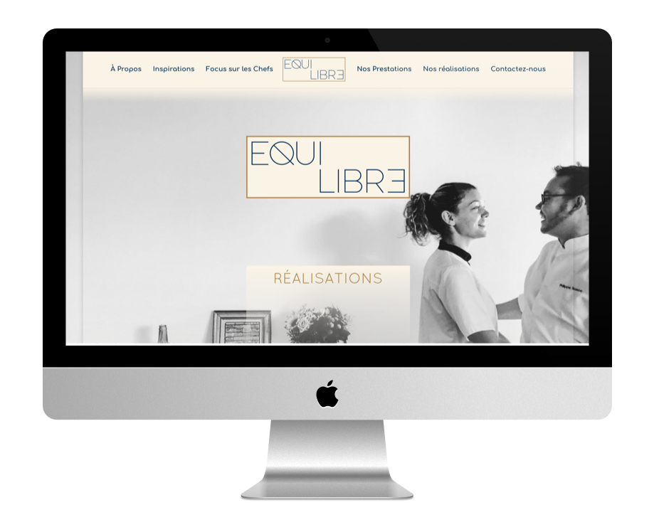
The site of Gastronomy balance reveals a home page that goes off the beaten track. Not only is it an embossed layout, but it also displays only the main pages of the site as a checker.
The mouse hover allows you to click and go to the different pages. The colours are soft, in beige/brown/marine blue tones.
The "our achievements" page displays a full-page gallery with beautiful photos whose hover reveals a description.
9 - Two Samuels Restaurant

The site of Two Samuel Restaurant offers a hompage that plays a alternation of black and white sections, some full / others in parallax mode. The other pages of the site are in agreement. Colors and fonts are very well chosen.
10 - Casa Dorita
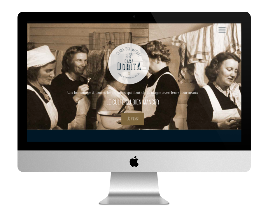
The site of Casa Dorita gives an impression of old. Colors and fonts are well chosen. On the scroll, the home page shows a succession of sections, sometimes full page, sometimes split in half, all with parallel axis image effects. It's very successful!
Navigation appears on the right side of the screen, after clicking on the icon. The photos are very beautiful and make you want to go for a walk! The site is also multilingual.
To conclude...
Here's a nice list that goes inspire you !
Whether you are a restorer or creator of websites, you have what floor: what functionality for the website of my restaurant? What design? How to organize the homepage etc...
What did you think about it and what is your favorite website?
If you too would like to present your latest achievements with Divi, do not hesitate to us submit your site to appear during a next article in the section "Inspiration for Divi".
Le site el torrero est superbe, une découverte visuelle.
Magnifique, comment faire le même site en e-commerce.
Tous les sites sont aussi charmants les uns que les autres. Apprécier l’un sans l’autre ne serait pas bien joli de ma part. Je crois plutôt que chaque site a quelque chose qui valorise le concept du Restaurant. je n’en veux pour preuve que le site du Restaurant ÉQUILIBRE GASTRONOMIE. Même le simple logo en tête du site est parlant. Au passage, je félicite le ou les concepteurs de ces sites. C’est vraiment un travail de Pro.
Merci beaucoup Emanuel.
Les sites des restaurants sont tous aussi sympa les uns que les autres. Ce serait abusé de préférer un site par rapport à un autre. Cela dépend surtout de la politique marketing de chaque Restaurant. Tenez par exemple le thème du site de ÉQUILIBRE GASTRONOMIE. C’est très bien pensé. Surtout avec le logo ÉQUILIBRE. Au passage une grande acclamations aux équipes de Web Design. Sur tous les sites, il y a de quoi donné envie de manger et d’attirer de potentiels clients pour ensuite les fidéliser.