
In a previous tutorial, we saw how to set the Divi menu at the top of the screen after the scroll of the page. In this article we will see how to get a fixed menu at footer.
In the programme of this article:
1 - Pre-requisites
First of all, you'll have to Hide Divi main menu display as explained in this tutorial.
Then go to the page you want to edit, the page where you want to set the menu at the footer and activate the Visual Builder.
Do you know you can test Divi for free? See you on this page and click on "TRY IT FOR FREE"
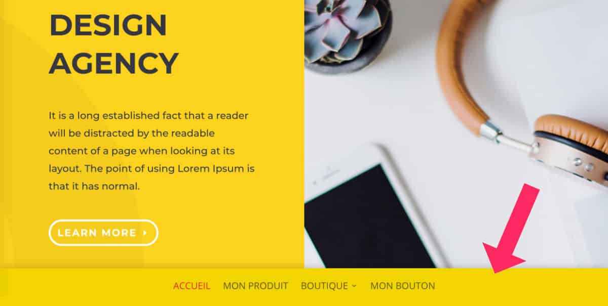
2 - Create a fixed menu in footer
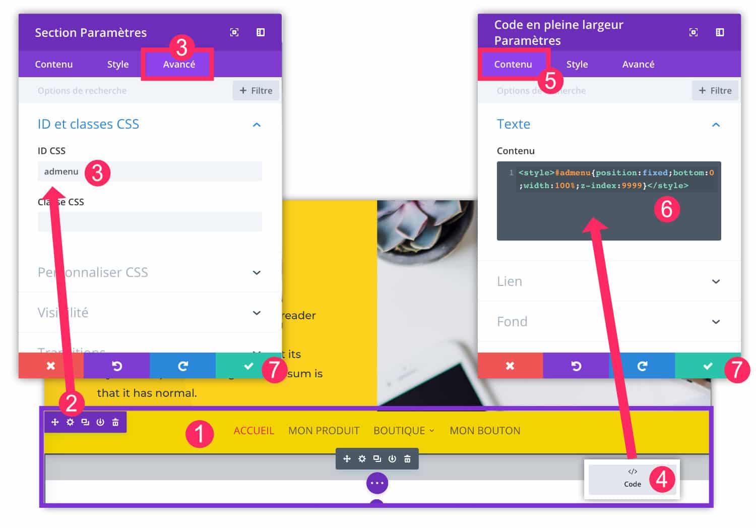
- Add a Full Screen section within your layout. You can insert it anywhere because it will not impact its final position. Within this section insert a module "Menu Full Screen". You can choose the menu of your choice: it must have been created before the tab Appearance > Menu.
- Open the settings in the Full Screen section by clicking on the wheel icon.
- Add a CSS ID to the tab "Advanced". Enter: "ldmenu".
- Within this Section Full Screenadd one Code module.
- Go to the tab "Content"
- Enter the CSS code below entre les balises <style> et </style>
#ldmenu {
position:fixed;
bottom:0;
width:100%;
z-index:9999;
}
For more information on code insertion in Diviread this article.
3 - Optimize mobile version
With the previous few steps, you are in possession a fixed footer menu.
However, the mobile version may not be optimal. Please check the right options so that the menu is also available as a mobile version.
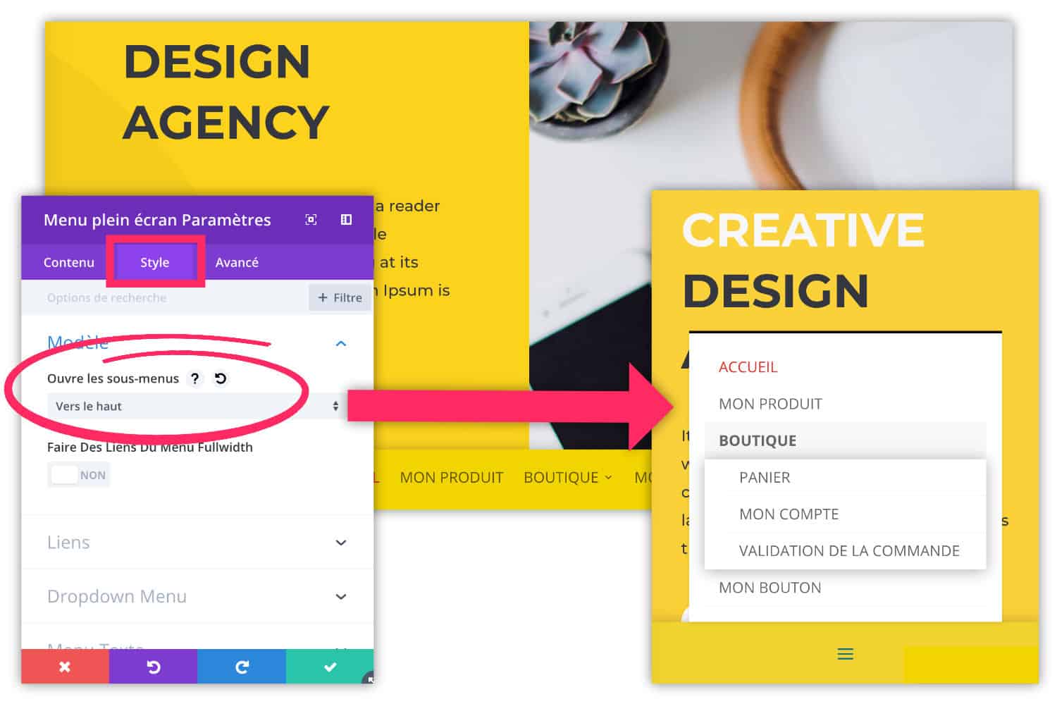
In the settings of Full Screen Menu module, go to the tab "Style" and ensure that the option "Opens submenus" either positioned on "up".
So your fixed menu will go up, in mobile version (and desktop version). This is important, otherwise the sub-elements of your menu will not be visible at all.
4 - Take design into account
The menu "sticky footer" gives an original style to a site, however, make sure it does not hinder your other design elements.
For example, with such a menu, your credits and Footer icons will no longer be visible. Neither will you be able to create a footer revealed at the scroll or other custom styles.
Be sure to make choices and not mix everything within the same page or site.
To go further, I propose 2 other tutorials to make the fixed menu at footer:
- Make the fixed menu by footer then at the top of the screen after the scroll
- Force the footer to go to the bottom of the screen even if the content is too small
Also, this tutorial for Create a Header Hero with a transparent menu Maybe you might be interested...
Need more resources on Divi? Visit ElegantThemes blog full of ideas and tutos!


Hello, merci pour ce tuto, c’est exactement ce que j’essaye de faire, pour l’affichage tablette et mobile uniquement.
Le code n’a pas l’air de fonctionner, il s’affiche tout simplement en dur en front. Une idée du soucis ? Peut être à cause du nouveau Divi ? A savoir que j’ai utilisé la fonction theme builder de Divi et que j’ai mis ça en footer.
Merci !
Salut Laura, effectivement, le code que j’ai donné doit certainement être optimisé pour tes besoins, à savoir pour les version tablette et mobile. C’est certainement une histoire de CSS. Dans ton navigateur (Chrome ou Firefox), inspecte le code (clic droit > inspecter) et regarde ce qui pourrait être optimisé en termes de taille d’écran.