
Websites displaying a "embedded layout" - also known as Boxed Layout - It's pretty rare these days. We're seeing less and less... The theme Divi proposes this option and your choice will be crucial for the further design of your project.
The boxing your site's design is a political party that must be decided at the beginning of the Customize your theme.
Is this design made for you? How to activate the embossed layout with Divi? What benefits? This article will answer all these questions...
Here is the program:
- What is the embossed layout of Divi (or boxed layout)?
- When to choose the embossed layout?
- How to activate the embossed layout on Divi?
- What does an embossed layout look like?
- What are the advantages of choosing an embossed layout?
- How to use the embedded layout of Divi in an original way?
What is the embossed layout of Divi (or boxed layout)?
Websites using "framed models" allow to define width limits for the main body of the page.
The boxed layout sets a fixed width to display the contents of each page. Thus, regardless of the resolution of the screen, your website will always keep the same size as the container proposes a fixed width.
Even if in mobile version this can reduce the width of your pages, in desktop version (and especially on large computers), the reading of your pages and articles will be easier as the user will not have to browse your editors on a 100% width. This can be tiring on very wide screens.
When to choose the embossed layout?
Ideally, you need to decide on this layout from the start of your web project.
Even if it can be modified along the way (because it's very easy to check or uncheck the Divi option), it could impact the entire design of your site.
The embossed layout (or not) should be decided at the same time as the header type you wish to offer on your site.
To learn more about the types of menus/headers offered by Divi, I suggest you discover my article dedicated to Divi menus and headers. In this article, you will discover the various types of design that you can use for the main menu of your Divi site.
How to activate the embossed layout on Divi?
Good news, it's more than simple. Just check an option in the Divi settings.
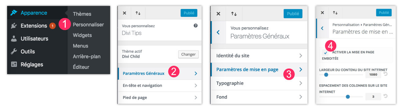
- Go to the tab Appearance > Customize
- Click General parameters
- Click Page layout settings
- Select option Enable embossed layout
- Remember to click on "Publish" to save your changes.
You can even set the width of your site's content with additional options.
What does an embossed layout look like?
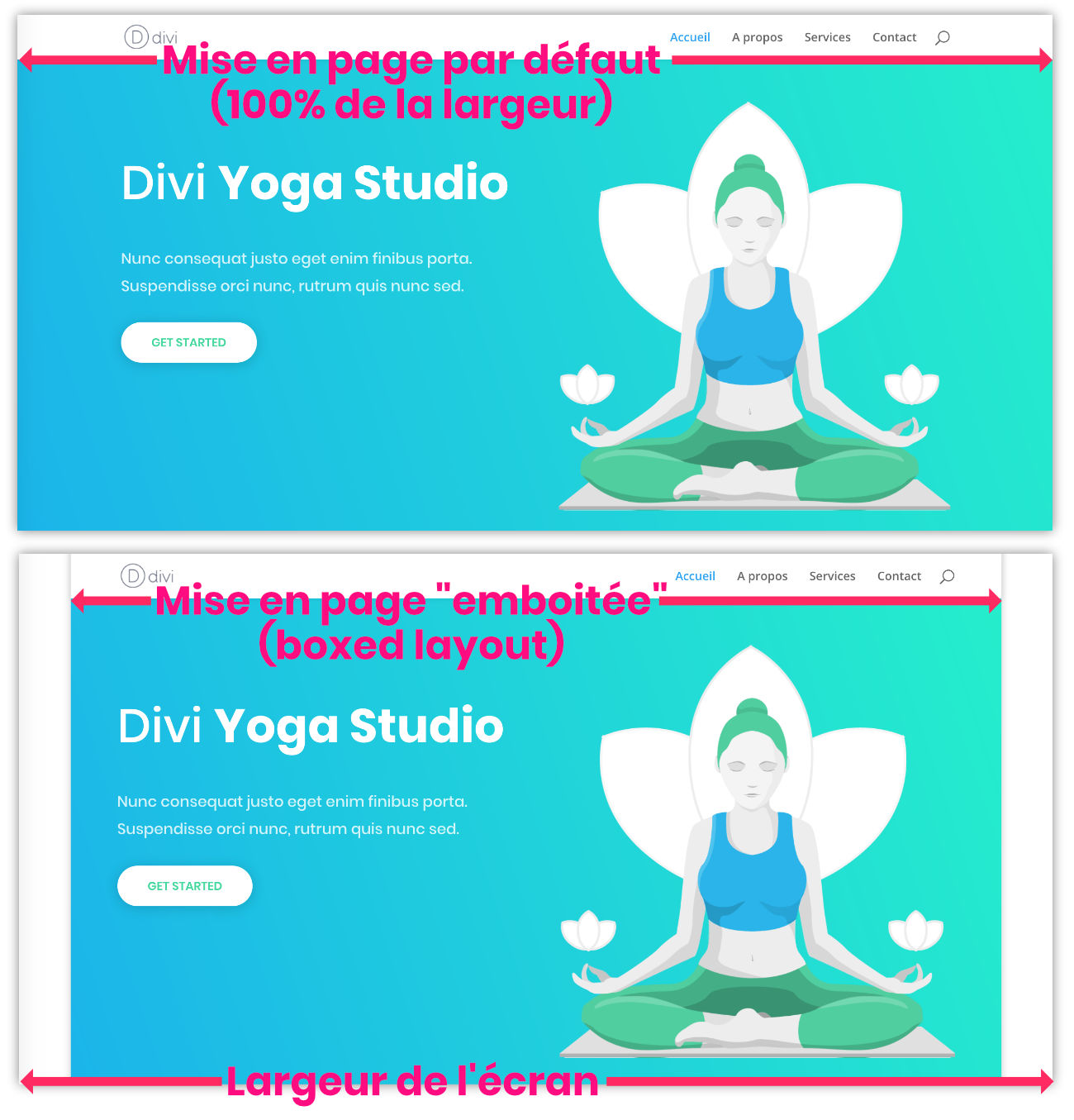
On the first screenshot, we see that the web page extends over 100% of the screen width. This is the "default" layout proposed by the theme Divi. If this type of design suits you, you will have nothing to do. No changes to make...
On the second screenshot, we can see that the content of the page is reduced, as "boxed". The web page then lets appear a kind of "empty" on both sides. The embossed layout being a specific will, you can activate it with a simple option as seen in the previous chapter.
Here are two examples of layout embossed with Divi:
What are the advantages of choosing an embossed layout?
Of course, choosing this kind of layout is a taste story, but beyond that, it's a design story...
When I create websites for my clients, it's rare for me to choose this type of layout, but I've chosen it in some cases. The target audience, overall design and atmosphere of the site must be taken into account.
In addition to all this, this embossed layout can give free rein to many customizations that it is not possible to get with a full-width layout.
How to use the embedded layout of Divi in an original way?
We're coming...
When you choose the embossed layout of Divi, this only allows you to define a background image or background color.
I propose to change this to your advantage in two new tutorials:
- How to get a different background color on each page of your Divi site?
- How to display a different background image on each page of your Divi site?
Need more resources on Divi Boxed Layout? Discover these articles from ElegantTheme's blog full of ideas and tutos!
On est d’accord que sur Ecran de PC c’est plus lisible surtout avec les tailles d’écran en WXGA d’aujourd’hui.
Par contre sur Mobile on n’a pas forcement envi d’avoir une marge sur les cotés… L’écran étant déjà réduit en visibilité (largeur).
Du coup, je cherche à mettre la taille en pleine largeur seulement sur mobile.
J’y arrive mais le top-heder et main-header se mettent aussi à 100%, du coup plus de marge là ou se trouve le logo et l’hamburger…
Voici le code utilisé :
/* Largeur page sur mobile */
@media only screen and (max-width:980px) {
.et_boxed_layout #page-container,
.et_boxed_layout #page-container .container,
.et_boxed_layout #page-container .et_pb_row,
.et_boxed_layout.et_non_fixed_nav.et_transparent_nav #page-container #top-header,
.et_boxed_layout.et_pb_pagebuilder_layout.single #page-container .et_pb_row,
.et_boxed_layout.et_pb_pagebuilder_layout.single.et_full_width_page #page-container .et_pb_row,
.et_boxed_layout.et_pb_pagebuilder_layout.single.et_full_width_portfolio_page #page-container .et_pb_row,
.et_fixed_nav.et_boxed_layout #page-container #main-header,
.et_fixed_nav.et_boxed_layout #page-container #top-header,
.et_non_fixed_nav.et_transparent_nav.et_boxed_layout #page-container #main-header {
width: 100% !important;
}
}
Je vois que sur le site Divi Soup il est bien configuré.
Avez-vous une idée des class et ID à modifier ?
Je comprends tout à fait ce que tu veux dire mais il faudrait que je teste pour voir sur quelle classe CSS s’appuyer. Si j’ai un moment, je regarde…
Merci par avance Lycia.
J’ai un site de test au besoin 😉
As-tu un lien ?
Pardon pour le temps de réponse. Je finalisais le WP de test avec DIVI et la page emboitée.
Je t’ai envoyé un mail avec les accès 😉
Merci pour vos conseils. Cela m’a super bien aide
Merci Dominique 😉
Je serais aussi intéressé par une solution de mise en page emboitée uniquement pour ordinateurs (et 100% pour les mobiles). Si quelqu’un a une solution…
Salut Fab,
Je suppose que ce n’est pas compliqué mais il faut que je cherche un peu. Dès que j’ai le temps, je mets le tuto à jour. En attendant, tu peux chercher du côté du CSS et des media-queries.
Aller c’est cadeau 😉
/* Page pleine largeur sur Mobile */
@media only screen and (max-width: 980px) {
.et_boxed_layout #page-container,
.et_boxed_layout #page-container #main-header,
.et_boxed_layout #page-container #top-header,
.et_boxed_layout #page-container #main-footer {
width: 100% !important;
}
}
Merci 😉
Bien entendu cela fonctionne que par rapport à la taille de l’écran < 980px.
Et non depuis le type de périphérique utilisé (Mobile, tablette, PC/MAC, etc…)
Il serai éventuellement possible de le faire en jQuery mais je ne vois pas trop l’intérêt.
A 980px, on a les smartphone et les tablettes (en mode portrait seulement, en paysage la largeur dépasse souvent les 980px).