
Is it really possible to obtain a background image in parallelx on mobile with Divi ?
You noticed that, didn't you? Every time you place a background image in parallelax (CSS or real), it doesn't work on the mobile version of your site.
It's such a shame, and it's pissed me off more than once! And I'm sure that's your case, too, at least if you get to this article...
Don't worry, this little problem will be solved in 2 or 3 clicks and soon become an old memory...
- 1 - What is the Parallax effect?
- 2 - Parallax CSS or Parallax Real?
- 3 - Why does the parallax effect not work on mobile and tablet?
- 4 - How do I add parallax on mobile with Divi?
- 5 - Some examples of successful parallax effect (in video)
- 6 - In conclusion: finish different designs on desktop and mobile!
1 - What is the Parallax effect?
The parallax effect Not from yesterday! It is thanks to him that you can create original designs for your websites.
Parallax (or parallax) gives a depth effect and even a 3D appearance to your websites because the background of a section moves at a different speed than the foreground elements, when the user scrolls the page down or up (scroll).
The parallax allows you to play with background images and foreground elements: with Divi, it is easy to add a section with a background image in parallax and then place a text module over it.
For the effect to be completely successful:
- Your page (layout) must be quite long: if your page is too short, the parallelax image cannot be Scrolled to display the expected effect.
- The parallax background should not be united: If the bottom is united, the parallax effect will be missed because we won't see anything. So prefer a textured image, a landscape photo, a degraded color...
To learn more about the parallax effect, read this excellent AlsaCreation article.
Do you know you can test Divi for free? See you on this page and click on "TRY IT FOR FREE"
2 - Parallax CSS or Parallax Real?
This is a question that you are asked every time you enable the parallax option on your background images. Whether within a section (blue or violet) or within a line (green)...
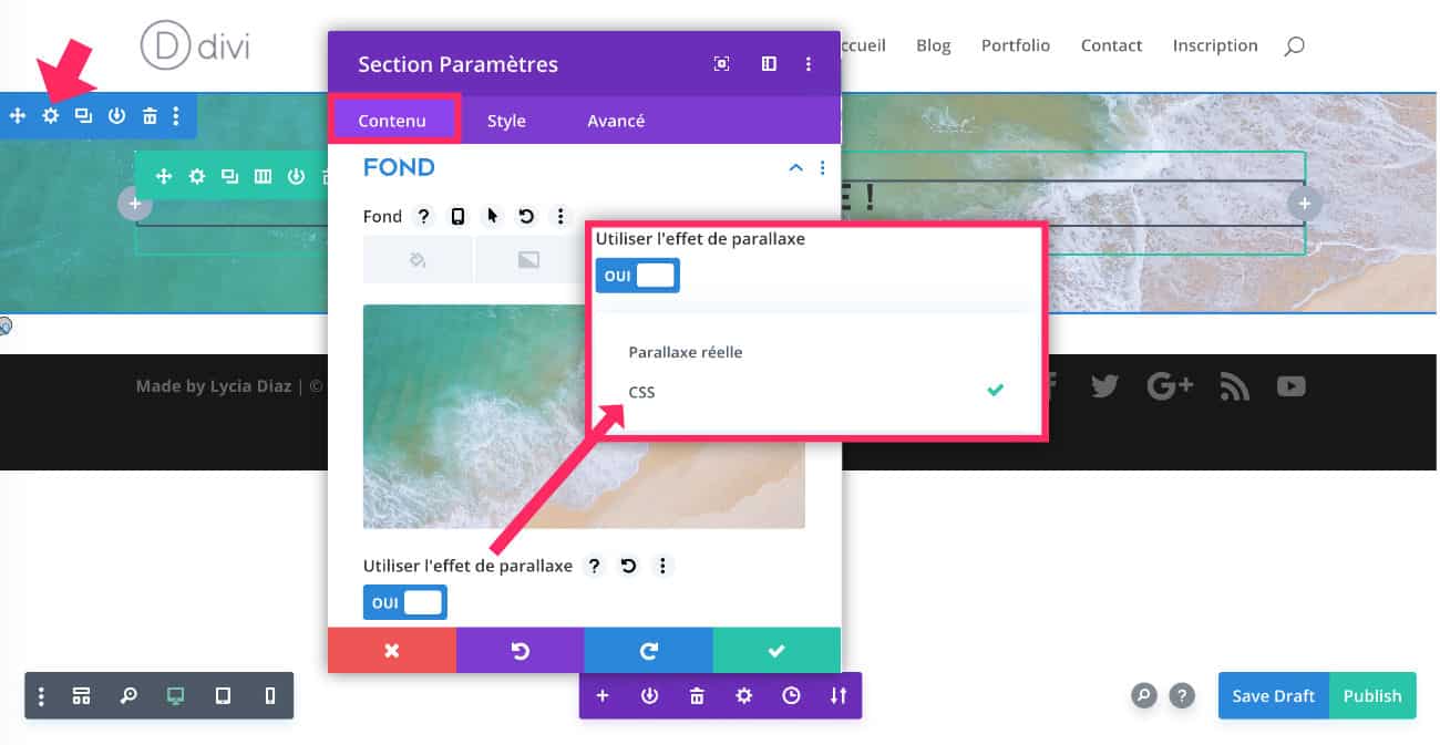
The "real parallax" option allows to get a background that moves at a different speed from the scroll. This is indeed a parallax effect.
The parallax option CSS adds a CSS property to the background image, this is the "background-attachment" having a value of "fixed". The background becomes fixed and the content slides over, as if the background image was "pinned" on the bottom of the site.
To understand better, I have prepared a video for you:
Depending on the needs of your project, you can play with both types of parallax.
The parallax CSS option is really interesting if you position several sections in a row with fixed background and more or less similar... Imagine some stop-motion images that follow each other and create an animated drawing effect 😉 Single CSS!
3 - Why does the parallax effect not work on mobile and tablet?
Yes... That's where it gets complicated! We can get great results simply with a parallax effect but the concern is that it doesn't work on mobile...
I've always been told that, I've always read that...
It almost looks like a taboo... It seems that it is because of the mobile browsers (Safari mobile and company) that would not accept the famous "background attachment: fixed"...
And also for a question of site performance...
Yet, nothing is used as much in "scroll" mode as a mobile and tablet screen, it's even the base!
Well yes, I've already seen (and you too) some WordPress sites that use parallax effects in mobile version Hey! How do they do it then?
4 - How do I add parallax on mobile with Divi?
The idea is to develop your parallax section as usual or as presented in the previous video.
For now, it works in desktop version but not in mobile and tablet...
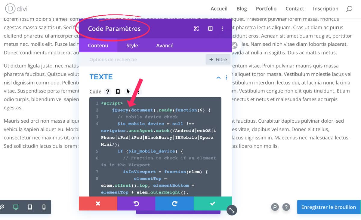
So, just add the following code bit:
<script>
    jQuery(document).ready(function($) {
      // Mobile device check
      $is_mobile_device = null !== navigator.userAgent.match(/Android|webOS|iPhone|iPad|iPod|BlackBerry|IEMobile|Opera Mini/);
      if ($is_mobile_device) {
        // Function to check if an element is in the Viewport
        isInViewport = function(elem) {
            elementTop = elem.offset().top, elementBottom = elementTop + elem.outerHeight(), viewportTop = $(window).scrollTop(), viewportBottom = viewportTop + $(window).height();
            return elementBottom > viewportTop && elementTop < viewportBottom;
        };
        // Apply Parallax transform calculations when scrolling
        $(window).scroll(function() {
            $(".et_parallax_bg").each(function() {
               var $this_parent = $(this).parent();
               // Check if the parent element is on-screen
               var $is_visible = isInViewport($this_parent);
               if ($is_visible) {
                 element_top = $this_parent.offset().top,
                 parallaxHeight = $(this).parent(".et_pb_fullscreen").length && $(window).height() > $this_parent.innerHeight() ? $(window).height() : $this_parent.innerHeight(),
                 bg_height = .3 * $(window).height() + parallaxHeight,
                 main_position = "translate(0, " + .3 * ($(window).scrollTop() + $(window).height() - element_top) + "px)";
                 $(this).css({height: bg_height,"-webkit-transform": main_position,"-moz-transform": main_position,"-ms-transform": main_position,transform: main_position});
               }
            });
        });
      }
    });
</script>
Note: this code was created by Ed Solman.
You can add this code according to 2 options:
1 - Within your layout thanks to the Code module available in the visual builder. In this case, the mobile parallelax effect will only work here...
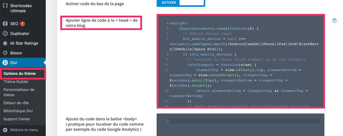
2 - In the tab Divi > Theme option > Integration : add this code in the section <head> Your site. In this case, the parallax effect will apply to the entire site.
There's nothing more! Now, the parallax effect of your sections is now compatible on mobile screens!
5 - Some examples of successful parallax effect (in video)
I suggest you discover some websites that use the parallax effect... Beware most of these sites are not WordPress sites...
This is the website digitalhands.net which uses a parallax effect that moves to the mouse movement. That reminds me a little The "starry sky" effect of Particles. js. The rendering is very successful and captivating.
The site Egopop.net offers a home screen with another parallax effect to mouse movement... It's simple and fun enough!
The site iutopi.com is a very good example of parallel axis effects to the scroll. We're in full immersion! We have almost an impression of "20.000 leagues under the seas" 😉
The Beckett.design site instead falls into the category "too much". Let's say the parallax effects are very nice but there are almost all the sections... It's a little excessive, don't you think?
The website le-mugs.com is certainly the most successful design I've ever seen. I often present this site to my students during my classes.
To tell you everything, it is a WordPress but the theme used was created tailor-made... of course!
It uses the parallax very well but if you go to this site you will see a load screen a little long, because yes, all these embedded resources (images, parallax, video, SVG animation etc...) reduce performance...
And of course, such a design leaves no room for a good SEO optimization, because little text. So, actually, a choice is required...
Don't delay! Discover the theme Divi here !
6 - In conclusion: finish different designs on desktop and mobile!
Exactly, without code (See Chapter 4) make the parallax effect on mobile compatible with Divi, you are almost required to develop two versions of site: one for computer screens (desktop) and one for mobiles and tablets.
So basically, without this code, you're happy for the computer version design and you're frustrated for the mobile version... That's what you felt before inserting the Ed Solman code ?
Moreover, this is certainly what the developers of the site of the Restaurant Le Mugs (previous video) were forced to do: a desktop version then a mobile version developed on a different URL... Watch these two videos captured on mobile:
The desktop version visited on mobile shows that the theme is not Responsive. However, the parallax effect works well... but half the content is chipped. Too bad!
Then let's see. version optimized for mobile, and without parallax effect:
Indeed, this version is much more optimized for mobiles. However, we can no longer find any effect of parallax, damage ! That's exactly what made the site of this restaurant So special... The developers of the site were therefore forced to create 2 di site versions...
So you understand: you no longer need to compromise! The parallax effect on mobile is well compatible with WordPress sites using the Divi theme!
Bonjour et merci beaucoup pour ce bout de code qui rend mon site enfin sympa avec son effet parallaxe en version responsive !
Par contre, cela ne fonctionne que si on le met en « mode » parallaxe réel, avec le « mode » css il ne se passe rien. En tout cas, c’est vraiment top que ça fonctionne 🙂
Encore merci,
Bonne journée
Merci Nathalie. 😉
Merci pour ce tuto Lycia.
En effet, j’ai lu partout que l’effet Parallaxe en JS est désactivé sur mobile pour des raisons de performance. Mais maintenant que nous avons tous des mobiles dernier cri avec des processeurs qui montent à des hautes fréquences permettant de traiter plusieurs processus sans faire ralentir le système, cela peut être remis en question.
Par contre, je m’aperçois dans ton code (ou plutôt celui de Ed Solman) qu’il injecte du CSS en JS. Ce n’est pas recommandé. Il est préférable de jouer sur les DOM en ajoutant/supprimant des classes.
Sinon, dans tes exemples, tu montres des effets parallaxe avec le pointeur de la souris… Ce qui est légèrement différent. Là tu joue sur l’emplacement x et y du pointeur et non de la position top de l’écran (scroll).
Par défaut, je n’aime pas jouer avec du JS sur ces éléments qui demandent beaucoup de ressource/puissance. On s’aperçois très vite qu’avec une machine qui n’est pas très performante (la majorité qui sont acheté par les particulier en grand surface ou pour les employés moyen), il y a de gros ralentissement avec des effets pas top.
Quoi qu’il en soit, bel article 😉
Salut David,
Merci pour ces précisions et belle année 2020 à toi !
Tu es le Roi Sauveur du JS 😉 Dommage que je n’ai pas un système de commentaires qui fonctionne avec des badges 😉 Lol !
Oui tu as raison, les X et Y, c’est pas du scroll à proprement parler…
Il ne te reste plus qu’à mettre un p’tit plugin pour ça 🙂
PS : je mets mon site à chaque commentaire, j’ai vu sur le search console que c’était indexé (bizarre) et du coup ça me fait des backlink cool 🙂
Hey hey 😉
Oui, les commentaires sont comptabilisés en tant que backlinks. Même s’ils sont « Nofollow » (c’est pas moi, c’est WordPress), Google les prends en compte !
Comme quoi, le « nofollow » est quand même « suivi » par Google, contrairement à ce qu’ils veulent nous faire croire 😉
Salut, de mon côté, ça créé un parallaxe sur mobile, mais que style parallaxe réel, et c’est tout saccadé, pas moyen de fixer pour avoir un parallaxe css qui serait sans saccade ?
PS: bonne année !
Salut Cédric,
C’est bizarre, tout a l’air de fonctionner de mon côté. Si tu regardes la page d’accueil d’Astuces Divi en version mobile, tu verras le mockup avec l’arrière-plan en parallaxe et il ne semble pas être saccadé (du moins sur mon mobile).
Ton problème vient peut-être d’ailleurs ?
Ça a toujours fait ces saccades quand j’active le
Parallaxe mobile, sur tous mes sites. D’habitude je le fais grâce à divi hacks. Je pensais que ce script fonctionnerait mieux, c’est dommage. Tu dois être sur Android non? Je pense que c’est surtout sur Apple que ça part en vrille. C’est pour ça que j’aimerai pouvoir mettre le parallaxe css et non réel, au moins plus de saccade.
Lycia, Cédric veut du parallex CSS sur mobile.
Ton script est pour du parallax JS il me semble.
Cédric : non je suis sur Mac/iPhone/iPad… pas d’Androïd.
Mais si tu veux du « Parallaxe CSS », c’est pas possible. Comme le dit David, c’est du Parallax JS (Parallaxe « Réelle »). Seul ce code fonctionne sur mobile (apparemment).
Pas possible ou tu ne sais pas? Parce que j’ai déjà vu sur des sites WordPress des images background fixes. Il doit bien y avoir une solution.
Pour info, je ne suis jamais notifié de tes réponses.
Ah…
J’ai pourtant parcouru tout le web justement à ce sujet car c’est une question que je me suis déjà posée… mais rien de probant. C’est pourquoi je dis que ce n’est pas possible. Mais une solution doit bien exister, je suppose.
Ce tuto fonctionne pourtant bien et sans saccade.
Est-ce que tu vois des saccades sur ma home ?
J’ai regardé ton effet parallaxe sur ta page d’accueil, ça fonctionne bien sans saccade.
Et même sur Android… Nan mais oh c’est quoi ce racisme loooollll
Cédric, il faut confirmer ton abonnement aux commentaires (avec un compte wordpress.com/org) pour être notifié.
Lycia, tu devrai mettre le plugin stcr, il gère très bien les abonnements aux commentaires.
Non ça fonctionne très bien sûr ta home.
Possible que tu m’envoies un layout juste avec la section qui contient ton parallax ? Comme ça si ça fonctionne pas sur mon site je saurai que ça vient d’ailleurs
David : le plugin STCR ? Tu me parles chinois 😉 Et non, y’a pas de racisme Androïd/iOS ici… MDR !
Bonjour, merci bcp pour ce code ! Et tout le reste ! 🙂
Je débute sur Divi et je me demandais si il y avait un moyen ou une astuce pour ajuster facilement le site version ordinateur à version mobile ?
Merci,
Bonne soirée,
Mathilde
Merci Mathilde. Oui, il y a des options pour paramétrer chaque version au niveau de chaque module. Tu verra un petit icône, tu cliques dessus et tu donnes les valeurs pour chaque version 😉
Merci milles fois ! J’ai trouvé le petit icône qui permet de paramétrer individuellement les dimensions ! Je suis joie !!
Et votre site est super il m’aide énormément dans la création de mon site, une vraie bible !
Merci Mathilde
Where is the script for us to copy paste for this mobile parallax pls? I don’t see it anywhere on the page
PRICELESS to have mobile parallax backgrounds! PLS
Hi Williams ! Sorry for the trouble ! Look at the french version of this post and you will found the Script . Thanks !
Hey ! Trop Cool ce script ! Merkkkiiii 😉
J’en profite pour te demander si ton divi-child est tjs d’actu avec la dernière version de Divi ?!
Je suppose que oui mais si déjà je suis là, je demande … lol
Bonne semaine
Et merci encore pour l’astuce parallaxe ! Top !
0_o mon précédent commentaire a été supprimé ?!
Je ne vois pas pourquoi. Tant pis !
Salut Val,
Non ton commentaire n’a pas été supprimé, je ne l’avais juste pas encore validé 😉
Pour le Divi Child, oui, c’est bon 😉
À bientôt
Lycia
Coucou Lycia,
Ok sorry mais c’est bizarre parce que j’avais bien une note comme quoi le message était en attente de modération et puis après, plus rien, comme disparu.
Voilà pourquoi j’ai pensé qu’il avait été supprimé 🙁
Dsl 😉
Merci pour ta réponse.
Au plaisir
Val
Bonjour mon image de fond ne reste pas fixe malgré le code, si je réduis mon navigateur en version mobile cela fonctionne mais lorsque je regarde depuis mon mobile cela ne fonctionne plus…
Si tu mets le code ça doit marcher. Ton mobile est peut-être en cache et garde l’ancienne version ?
Bonjour,
Avant tout je tenais à vous remercier pour tous vos tutos vraiment sympas !
Mon souci aujourd’hui, je n’ai rien trouvé en ce qui concerne le saut d’image. Sur ordi mon image parallaxe fonctionne bien. Si je mets la visualisation du mobile sur ordi, c’est idem, ça fonctionne bien. En revanche, lorsque je regarde sur mobile, il y a un effet qui saute sur l’image ?! J’ai regardé sur plusieurs mobiles différents et j’ai toujours ce soucis. Comment faire pour que l’image en parallaxe ne saute pas sur mobile ?
Merci d’avance de votre réponse.
Salut Christelle, normalement, si tu suis le tuto sur cet article, tu ne devrais pas avoir de souci de ce genre ?
Bonjour.
Cet article et ces commentaires sont un peu anciens maintenant, mais je les découvre seulement et je rencontre effectivement le problème d’image qui saute en paralaxe réel lorsque je regarde en mode tablette sur ordi. Je n’ai pas de vraie tablette pour vérifier et ma version mobile n’a pas de paralax.
Mais surtout, mon plus gros problème c’est que j’ai besoin de pouvoir avoir du paralaxe CSS sur tablette. C’est toujours pas possible ? Y a pas un code qui permettrait ça et qui aurait été développé depuis ?
Le problème c’est que j’ai du paralaxe CSS sur version Bureau et lorsqu’on passe sur tablette en position horizontale, c’est toujours la version bureau qui s’affiche. Donc si je veux enlever le paralaxe CSS de la version tablette, je suis obligé de l’enlever de la version bureau. Je suis donc bloqué car j’ai besoin de ce paralax pour ma version bureau.
Merci bcp de vitre aide
Salut Etienne, le tuto ici présent est toujours d’actualité pour accepter le parallaxe sur mobile (et le tuto n’est pas si vieux d’ailleurs)… Bref, tu as peut-être un souci de responsive : https://astucesdivi.com/responsive-design-divi/
Hi there!
I am dreaming of when I will be able to have parallax on mobile
I am using your code but not working
I have 2 sites:
1- the old with WIX https://www.awakeningchannel.com/
2- the new one with WP: https://new.awakeningchannel.com/
I would love to have the same parallax in the new site …
Please help
Hello Dan, with WIX, this snippet doesn’t work. For WordPress, this snippet will work if you use Divi Thème. Did you try my code ?
Bonjour Lycia et les autres 😉
Besoin d’aide pour corrige mon problème svp
J’ai inséré ce code mais cela n’a pas fonctionné come je le souhaitais : mon image de fond en parallaxe est énorme et pixellisée. Pourtant l’outil Divi de vérification au format mobile me l’affiche correctement.
Site internet pas encore en ligne.
Heeeeelp please ?
Salut Bou, est-ce que ton image de base a une taille correcte, genre 1000 ou 1500px de large ? Car si tu utilises des images de 200 ou 300 px, il est possible que le rendu soit de mauvaise qualité.
Mon image est de 2268 pixels par 1512, je ne trouve pas la solution à mon problème…
Mon fond en parallaxe parcours tout le site, c’est peut-être là mon souci : un parallaxe doit’il est plus court ?
C’est un site one-page avec un seul fond en parallaxe.
Mon image fait 2268 pixels par 1512 (en format horizontal).
J’ai l’impression que ce code mets le mode « parallaxe réel » malgré que le « parallaxe css » soit sélectionné.
Car lorsque je sélectionne parallaxe réel sur Divi au format bureau (juste pour tester) j’ai exactement le même rendu que sur ma version mobile. J’ai lu plusieurs commentaires au sujet de 2 différents parallaxes…avez-vous d’autres pistes de résolution svp ?
Sinon je mettrai mon site en ligne que vous puissiez regarder.
Oui, Bou, c’est vrai que la parallaxe CSS abime moins l’image. Je suis désolée de ne pas pouvoir t’aider davantage. ;-(
Oui, tu devrais essayer de mettre l’image dans un conteneur plus petit pas sur l’arrière-plan de la page entière. Ça pourrait être mieux.
Bonjour
Voici un code qui fonctionne pour forcer les mobiles et tablettes à accepter le parallax.
Il faut le mettre dans:
DIVI / Option du thème / L’intégration / Ajouter ligne de code à la « Head » de votre blog.
Pblm: Ca fonctionne sur les mobiles et tablettes Android mais pas Apple.
Donc pas sur Iphone ni Ipad où les effets Parallax comme les Scroll effetcs ne fonctionnent pas.
Bon courage !
jQuery(document).ready(function($){
$(‘.et_pb_parallax_css’).css(« background-attachment », »fixed »);
});
Bonjour c’est encore moi 😉
Après vérification je constate que l’image d’arrière plan ‘saute’ puis s’agrandie lors de la génération de la page web sur mobile. Mon site est dorénavant en ligne, j’ai essayé d’ajouter le code d’Etienne sans succès : est-ce que quelqu’un peut regarder ma page svp ? Adresse url : https://aucoeurdelavie77.fr/
Dans l’inspection j’ai ce message d’erreur : DevTools failed to load SourceMap: Could not load content for https://aucoeurdelavie77.fr/wp-content/themes/Divi/js/custom.unified.js.map: HTTP error: status code 404, net::ERR_HTTP_RESPONSE_CODE_FAILURE
Bonjour c’est encore moi 😉 (3ème tentative d’envoi de ce message)
Après vérification je constate que l’image d’arrière plan ‘saute’ puis s’agrandie lors de la génération de la page web sur mobile. Mon site est dorénavant en ligne, j’ai essayé d’ajouter le code d’Etienne sans succès : est-ce que quelqu’un peut regarder ma page svp ? Adresse url : https://aucoeurdelavie77.fr/
Dans l’inspection j’ai ce message d’erreur : DevTools failed to load SourceMap: Could not load content for https://aucoeurdelavie77.fr/wp-content/themes/Divi/js/custom.unified.js.map: HTTP error: status code 404, net::ERR_HTTP_RESPONSE_CODE_FAILURE
Bonjour,
J’ai essayé d’ajouter ce code, mais rien ne change. Lorsque j’active un effet de parallaxe sur mobile, l’image se double (il s’agit d’un PNG avec des modèles 3D dessus, et ce sont ces derniers qui se dédoublent).
Merci d’avance.
Bonjour Lycia,
Merci pour ton code CSS que je viens d’appliquer !
Aurais-tu une astuce pour redimensionner l’image parallaxe en responsive, pour que la largeur de celle-ci s’adapte aux formats tablette et mobile (sans qu’elle soit tronquée, comme actuellement) ?
Merci à toi.
Sabine.