
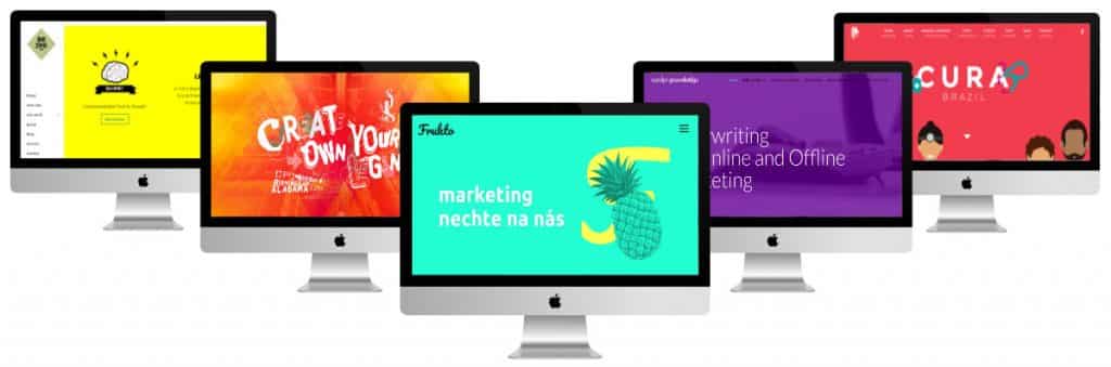
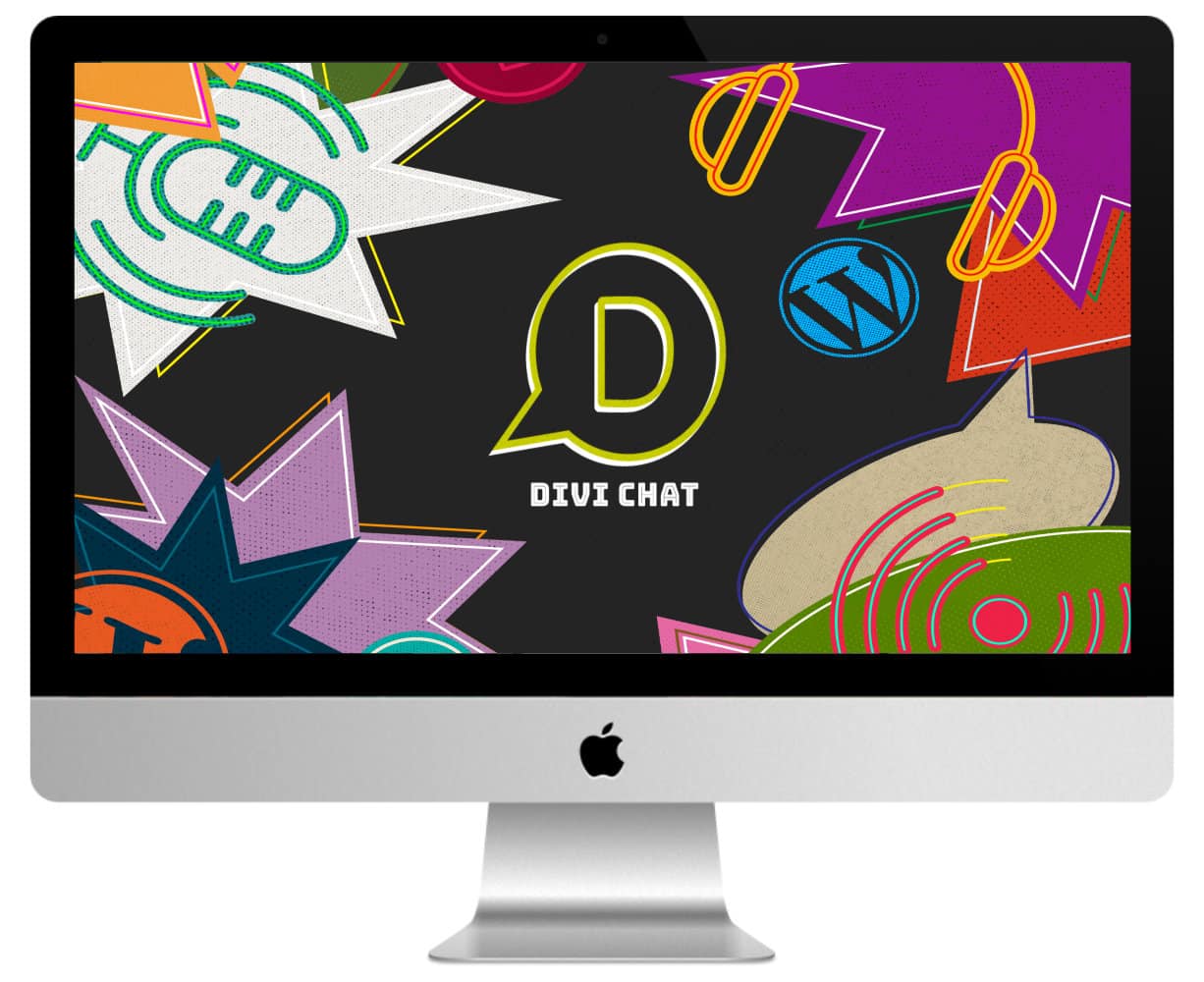
I selected a few for you very colorful sites made with Divi. It's always nice to find some inspiration!
But who said the colors were out of date? You will see that the colors can give a very punchy side to a site without falling into excess...
In this article you will see everything! Here is the program:
- A design in turquoise & yellow tones
- A design in the fluos!
- A blue web site
- A multi-color site
- A starred red header
- A purple site too...
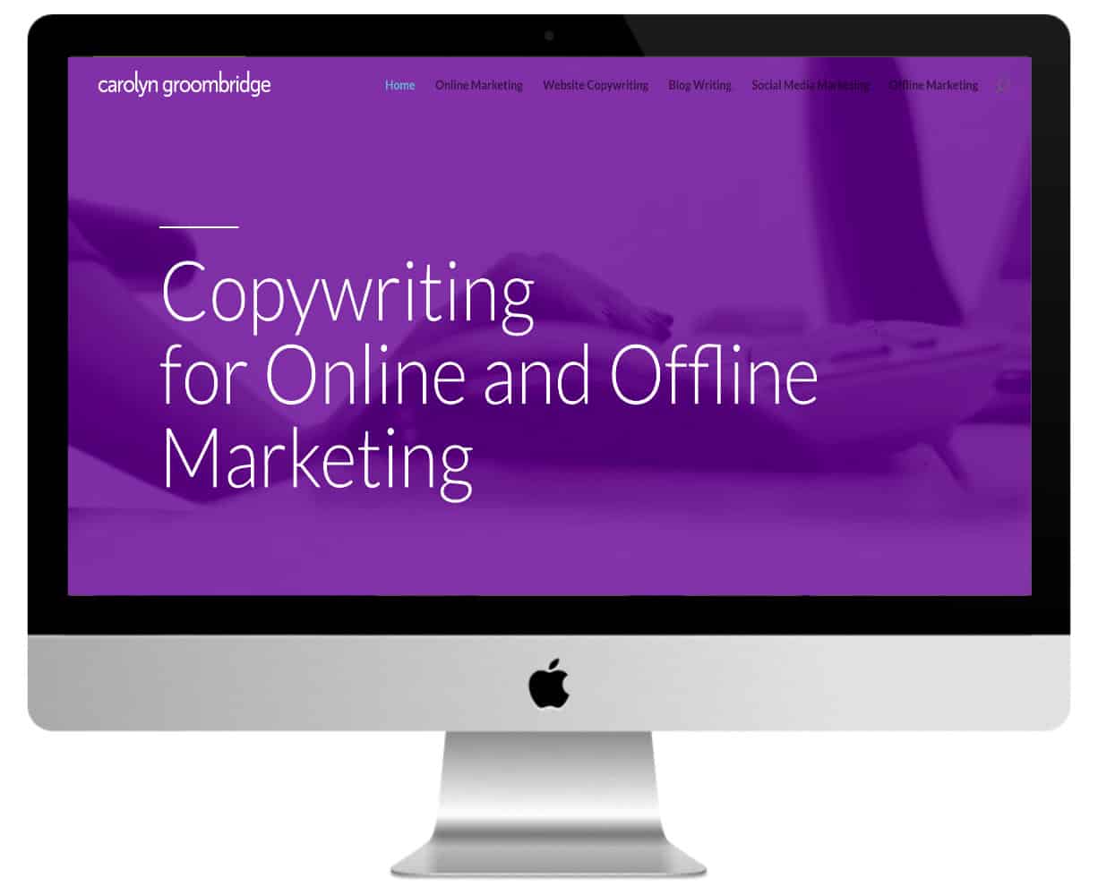
- A grenadine pink site
- A design in the tones of fuchsia
- A design in the shades of orange yellow
- An old-yellow colour site
1 - A design in turquoise & yellow tones
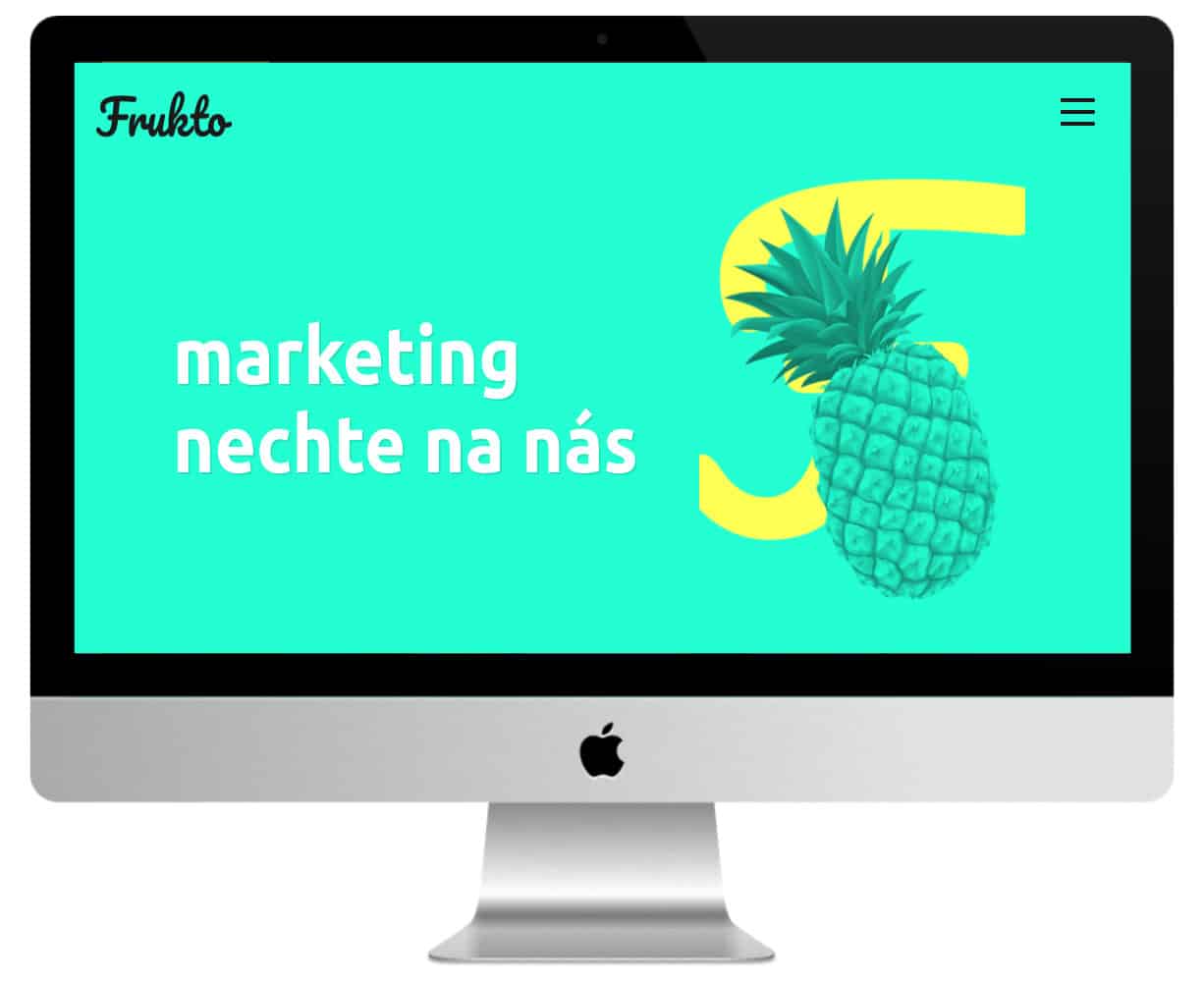
If I had to describe the homepage of this site we can no longer colorful, I would say that it is "wow" !
I love these four Divi sections that follow each other from turquoise to yellow and then green to finish in pink! Sections in acidulated colours with tones-on-ton images in parallelx. It friezes the genius (lol)!
The header with pineapple in levitation is also very successful!
Nothing very complex on the technical side since the site is a onepage Simply...
Discover this colorful site here.
2 - A design in the fluos!
Although black & white is predominant, the design of this site also highlights fluo colors that die out your screen.
Blue, yellow, green and fluo rose!
Small extravagance in the menu and its logo that changes color regularly.
They chose a left side menu That's a little out of the ordinary. It's very successful!
Ready to break your screen? Discover the site.
3 - A blue web site
The design of this website is beautiful! Everything is perfect: the choice of colors, the hand-made icons, the staggered buttons, the highlight of the titles...
Special mention to the "logo that overflows from the main menu" and to the "LazyLoad icon" which allows the user to wait the download time.
The site uses Divi Dividers on almost all its pages and page Community uses the Accordion modules Like a FAQ... Nice!
Admire this Divi site blue and pink We'll be right back!
4 - A multi-color site
A very intelligent design, in the 70's style and an animated header...
When you arrive at this site, you discover the logo and lots of multicolored images that come out of the screen to the scroll of the mouse. That's great!
It's a podcast site. Each video is published in an article and category. Each category has its own colour.
His orange "half-tone" footer is also very successful.
Do you know you can test Divi for free? See you on this page and click on "TRY IT FOR FREE"
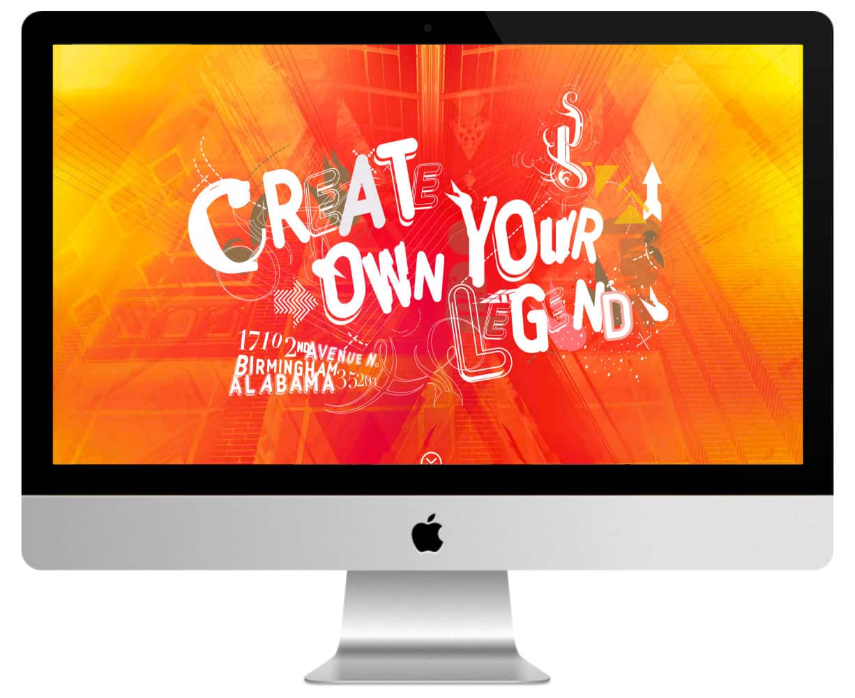
5 - A starred red header

This site is rather simple but as soon as we visit it, there is this bright red hero header that challenges us. In the background of this one discovers a constellation that follows the movement of the mouse on its fly. It's quite captivating.
If you want to reproduce the same thing, it is possible thanks to my Tuto Particle.js for Divi.
This starred red header is found on all pages of the site.
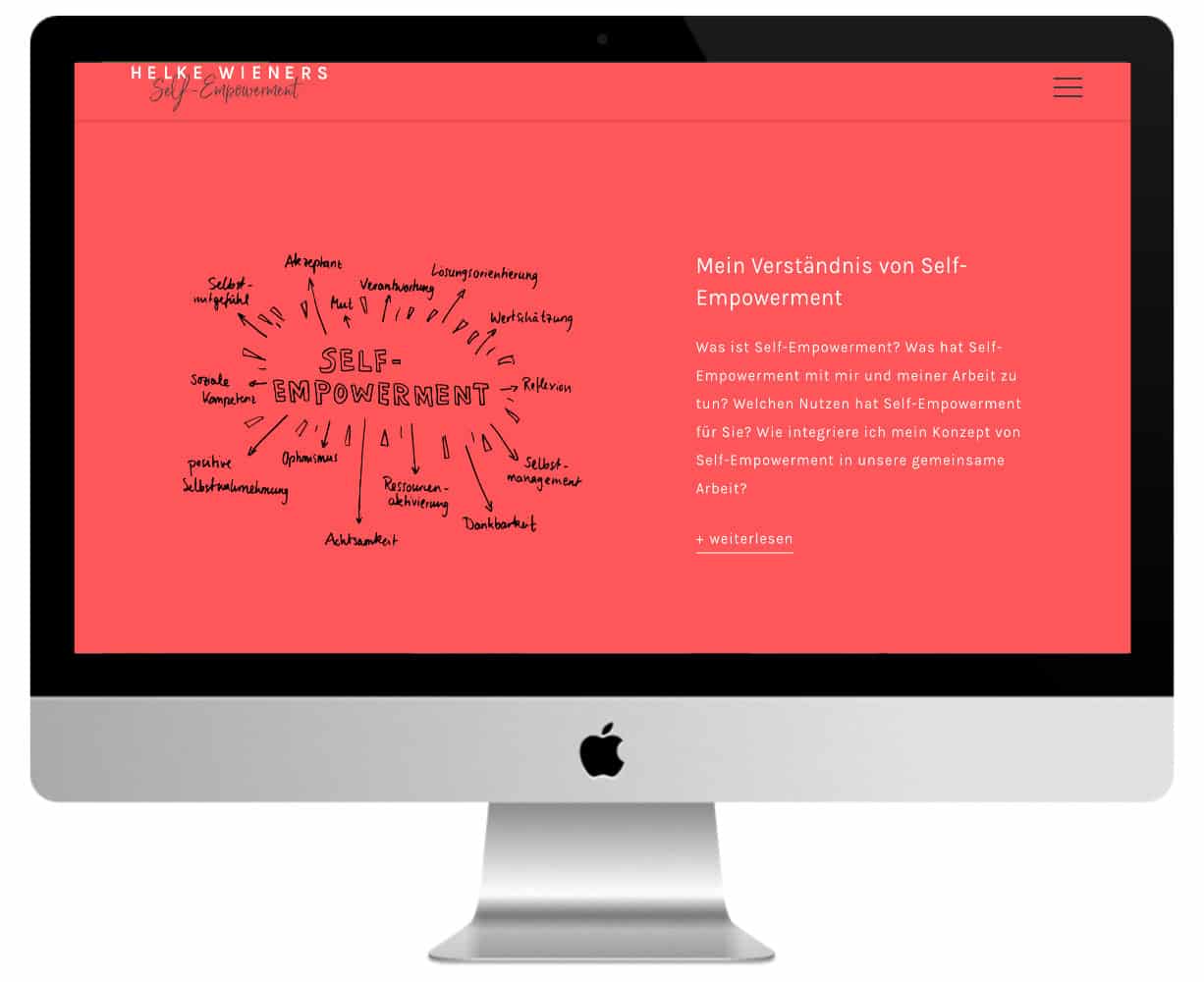
6 - A purple site too...
A sustained purple header that shows a looped video transparently.
The other sections offer blue and green. The choice of these 3 colors is rather surprising... but why not?
The background of the main menu is all in transparency. Too bad, they could have made a reminder of blue-green violet with a menu that changes color.
Need more inspiration? Discover all the official Divi Showcases.
7 - A grenadine pink site
This site is all pink-grenadine and white, I think it's pretty soothing actually.
The choice of fonts is also very successful.
It's a coaching website on which you feel confident. Is that because of the color? Or maybe because a portrait of the therapist is highlighted from the homepage?
Do you want to see life in pink?
8 - A design in the tones of fuchsia
More rose here, but more sustained. Almost fuchsia. The header hero invites us to scroll down with an animated down arrow.
When you go down, the second section is a wave-shaped video. They certainly added Dividers to achieve this effect.
After that, you reach a section in parallel with a beautiful blue sky and a bright sunlight.
At the footer, we also find the four predominant colors.
Each page features a unique and very original flat design header.
To fill up with inspiration, I advise you to browse all the pages of this site Divi very colorful.
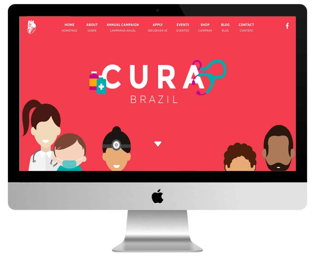
9 - A design in the shades of orange yellow
You want some color? You'll get some! At first glance, the harmony between red, yellow and orange is very successful.
It's too bad that when you scrolate it starts in every direction... blue, fixed background images that change from section to section (without having a full section between two sections with image).
The site is to be discovered here.
10 - An old-yellow colour site
Yellow, blue and grey. This is not the best choice of colors in my opinion and yet the design is harmonious. Yellow is predominant and blue tips bring an unexpected contrast. It's not bad at all.
The other pages of the site are in line with the homepage.
Need more resources on Divi? Visit ElegantThemes blog full of ideas and tutos!
In conclusion, would the coloured sites return to fashion?
What do you think of ultra colored websites ? You think it's too much. kitch ?
For my part, I think a very colorful site may be very class if the design is thoughtful, in harmony with the colours of the brand and its theme.
Depending on the theme of the site, you will not be able to afford it: imagine a site for a law firm or an accounting firm with shrill colors... That wouldn't be serious!
So, as soon as I have the opportunity, I love adding some colorful notes to the sites I create with Divi... And you?
0 commentaire