
The graphic designers and webdesigners do not miss creativity in the case of create the design of their own website. In this new article dedicated to inspiration, here are some original sites which will give you some ideas for your future creations or recasts with WordPress and Divi.
Do you know you can test Divi for free? See you on this page and click on "TRY IT FOR FREE"
1 - Pixels and Pencils
The originality of this Creative agency website resides in its home page and the graphic elements that have been integrated. The result would not have been as successful without the use of the Dividers offered by Divi as well as the input animations of each element.
Each section passes from black to grey and white using bias separators (Dividers). This gives the layout a certain dynamism.
If we think carefully, nothing extraordinary here. The creator of the site just played on the harmony of graphics and sections.
The projects have been highlighted in a dedicated section and the buttons have been slightly redesigned to make Divi's footprint forget. Well done
2 - Camille Araud
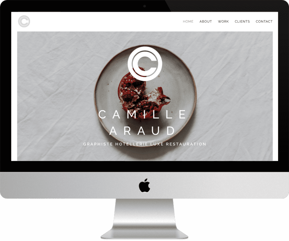
Camille Araud is a renowned graphic designer in his field: luxury hotels. She chose to trust the theme Divi for his creative portfolio.
The layout of the homepage is sober and chic. The architecture of the site is simple and the emphasis is on its creations (page work) and its clients.
This site, yet simple, has the merit of inspiring trust!
3- Becky Lord
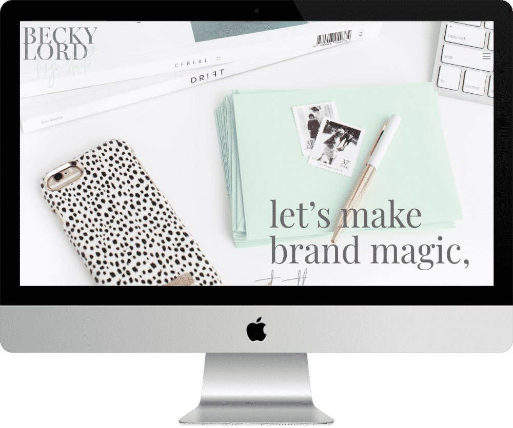
A clear and inspiring site with pastel colours. This is how I would summarize the design of the site of Becky LordA young British designer.
The site offers a transparent header with a recovery menu. This transparent header could have been a good idea, except in my opinion it's a shame because background image Hide the logo. Both are juxtaposed and confused. Too bad!
The Porfolio page is particularly successful, with sections of different sizes: 3/3 then 2/3 + 1/3 then 3/3 etc.
The FAQ page is damn rich and uses the Divi switch module to offer questions and answers to Internet users.
4 - Brinart Design
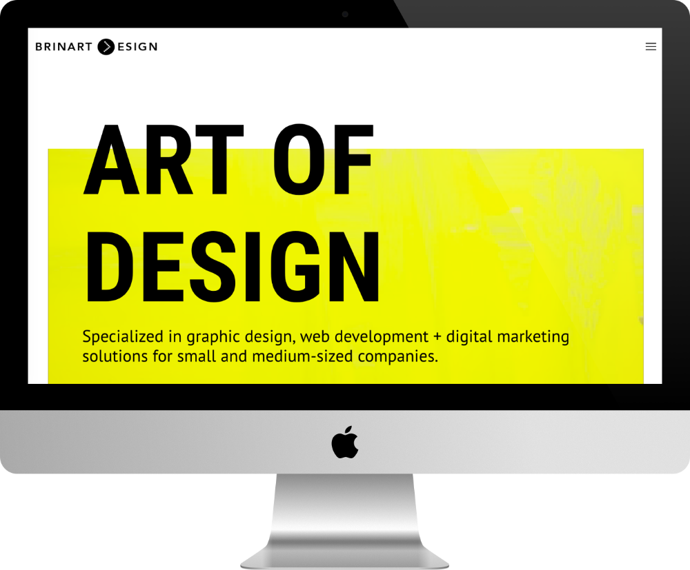
We get to the home page and this video starts... What the hell is that? Oh yes, a brush puts this yellow paint on the box... Will he succeed in painting the entire window properly? It makes you want to wait and see if this painter does his job well! Bad idea! Meanwhile, the seconds pass and the Internet user is still there!
This graphic designer made the decision to put his photo on the homepage. I think it's important for Internet users. It emits signals of confidence...
The rest of the site is consistent, sober and this yellow "flashy" tip is finally pretty nice!
5 - Mauricio Cedraz
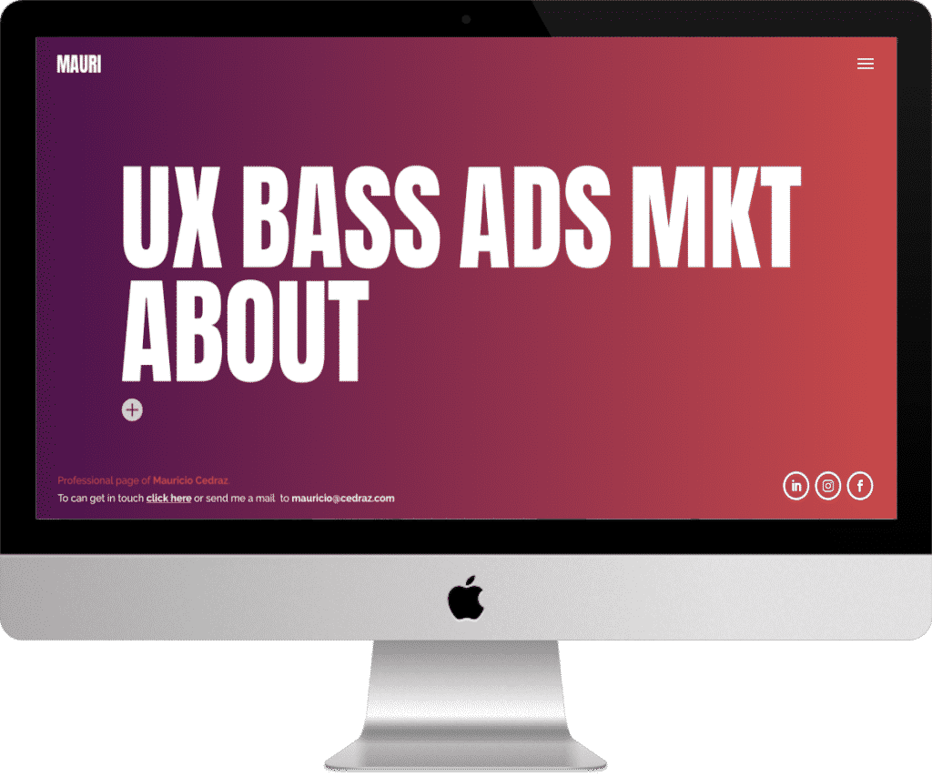
A very short but quite effective homepage for this graphic designer and UX Designer website! No scroll infinity... just a huge title where the letters change meaning and colors to the mouse hover!
Good look! And the colours are particularly well chosen.
The main menu is lateral and slides on the screen when you click on the burger.
When you changing page, changing colors and gradients. Good idea!
The ABOUT page is particularly successful with a bit of humor... It doesn't hurt!
Need more inspiration? Find out more websites made with Divi
0 commentaire