Sport is a very varied theme that covers a lot of needs and specificities. It therefore opens up unique and very interesting designs. With these examples of Divi sports websites, you will see what Divi can achieve in this field.
Among the sites you will see, some are about a specific sport, others are dedicated to a team, to training methods, to coaching... If you are interested in the coaching theme, you will find many others examples of coaching sites in this article.
The Divi sports sites analysed here can of course serve as inspiration for creating your own. Please note that they are not presented in any particular order.
- 1 - Maxime Chabloz: an original Divi sports website
- 2 - Cen Cal Sports: a rather institutional site
- 3 - Oz Tennis Leagues: a colourful site
- 4 - Mayhem in the Mountains
- 5 - Jason Joseph: another sports site made with Divi...
- 6 - London Fight Factory
- 7 - How to Beast
- 8 - Future 500 id Camp
- 9 - Mijn Personal Trainer
- In conclusion: which Divi sports website do you prefer?
Announcement: this article contains affiliate links that you will easily recognise. The classic links are in purple and sponsored links are in pink.
1 - Maxime Chabloz: an original Divi sports website
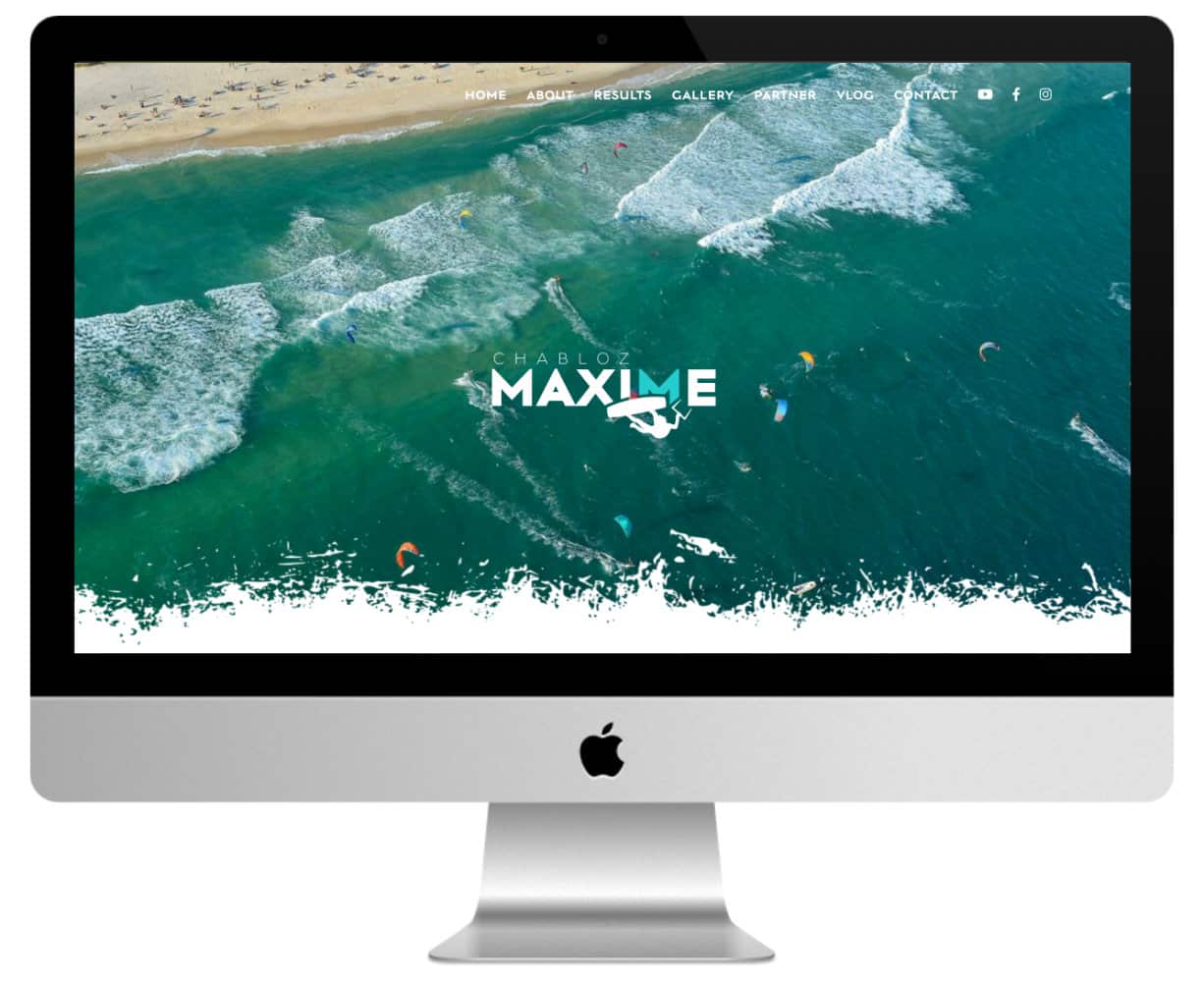
Let's start this overview of Divi sports websites with the website of Maxime Chabloz, world junior kitesurfing champion.
This beautiful one-page site features a full-width photo as the homepage, with an original separation in the form of small slivers of foam and a parallax effect when scrolling. We continue with :
- A portrait photo with social networking buttons overlaid.
- A text in which Maxime addresses the visitor directly.
- A citation followed by his record of achievement.
- Her Instagram gallery (made with the Instagram Feed Pro plugin).
- The list of sponsors.
- His YouTube videos.
- And we finish with a contact form (plugin used: Contact Form 7).
The foam splash separation is found in several places on the site. It gives a very nice personal touch to Maxime's discipline.
Another interesting point is the dynamic appearance of elements (photos, parameters, etc.) when scrolling. This adds a lot of "pep" to the site and also reminds us of the energy that this athlete and his discipline can give off.
Notable plugins used:
- WP Rocket
- Contact Form 7
- Instagram Feed Pro
2 - Cen Cal Sports: a rather institutional site
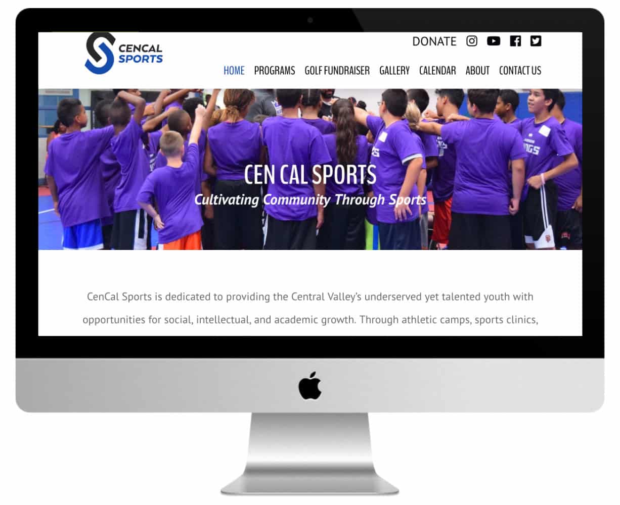
Cen Cal is an American sports centre for young people which aims to organise training courses, training sessions and competitions. The objective is primarily educational: to train young people physically but also morally. Several disciplines are offered, in particular basketball - golf and chess are also practiced.
This Divi sports site has some interesting aspects. First of all, it is an "institutional" site and as such, it gives off a more serious image and is less close to the visitor than sites for individuals or companies.
This image is counterbalanced by a professional side that reassures you that you are entrusting your children to a solid and well-organised institute. This is reflected in the choice of fonts and colours. There are no pastels or fluorescent colours here. The fonts are without MS and quite angular.
At the top of each page, a full-width photo is overlapped by a transparent overlay blue with a bold title and a punchline.
The About page is in the same spirit. You have a box introducing the director and drop-down blocks for each member of the management team.
The gallery page is not very original, but two things stand out: the dynamic display of thumbnails and the possibility of filtering photos very easily.
Notable plugins used:
- Magnificent Popup
- Simple Calendar
- Yoast
Need more resources for Divi? Check out the other articles in this section!
3 - Oz Tennis Leagues: a colourful site
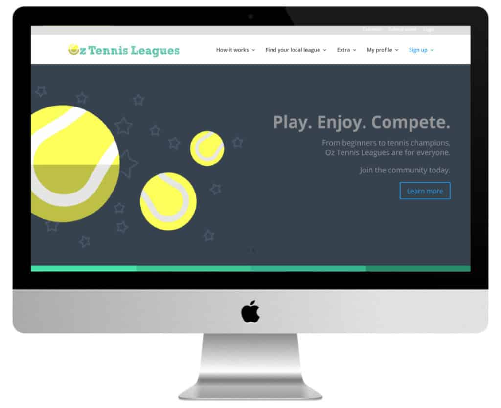
The idea of Oz Tennis Leagues is simple, but you should have thought of it!
This Australian site allows you to register and schedule matches with other competitors to move up in the rankings. So there's no need for rigid and complex structures to compete. You play when you want, where you want, with whom you want.
The home page opens with a full-page image with a call to action.
Note the design with its bold colours, basic shapes and elementary fonts. Right from the start, the idea of simplicity and originality is present.
The sticky menu (with a reduction effect when scrolling) gives pride of place to the connection functions. Indeed, this is primarily a members' site. The links to the About, Contact, etc. pages are therefore located at the foot of the page.
The welcome continues with two sections in several columns that are sufficient to introduce the concept. This is followed by various dynamic contents, including a slider of testimonials.
The site as a whole is rich in varied content: galleries, honour boards, tips, FAQ, sections for each local league... and that's just for the non-member part. Payment of membership fees is done with Stripe.
Notable plugins used:
- Magnificent Popup
- Contact Form 7
- Testimonial Rotator
- Stripe
4 - Mayhem in the Mountains
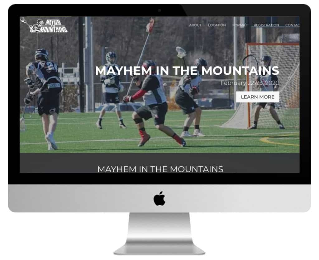
Mayhem in the Mountain is a site dedicated to lacrosse (a team sport of Native American origin) competitions.
This Divi sports site is essentially a one-page site.
It begins in a fairly traditional way with a full-page image and a CTA. As you scroll down, you will notice the play of colours alternating between brown elements on a white background and white elements on a brown background. It is this alternation that gives Mayhem in the Mountain its character.
The colour layers are transparent, leaving the photos in the background of each section barely visible. This effect is also very pleasing to the eye, while remaining rather discreet.
A contact form is available at the bottom of the main page and a link to a separate page allows you to register online for the competition.
5 - Jason Joseph: another sports site made with Divi...
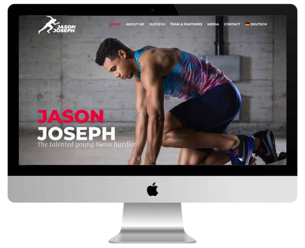
After Maxime Chabloz, here is another Swiss athlete: Jason Joseph.
Jason is a sprinter specialising in the 110m hurdles. His site gives off a very professional and inspiring image, as many athletes would like to have.
Let's look at the keys to this achievement:
- Solid fonts and colours. The combination of non-MS (headings and paragraphs) and MS (subheadings) fonts is impeccable.
- The alternation of red and white with grey-blue is perfectly mastered.
- The photos are classy. You can see that they were taken by a professional who knows how to show his subject to best advantage. Jason appears serious, focused and determined. They are rather dark, which responds to the grey-blue of the site and makes the white and red stand out.
- The Divi dividers are very aesthetic (double, curved with transparency effect).
- The integration of video and photo content into the design of the site is perfectly mastered.
The dynamic elements are also well balanced. Among them, the sticky menu with logo which changes colour when scrolling. I also really appreciate the dynamic appearance of the video in the About section!
In short, a very beautiful site that is definitely worth a look.
Notable plugin: Autoptimize.
6 - London Fight Factory
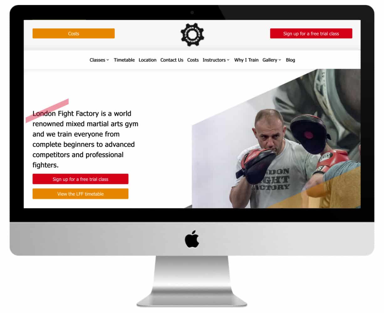
This is one of the most successful Divi sports sites in this selection! London Fighting Factory is a venue dedicated to martial arts and combat sports.
First originality: its logo! It is animated and centred at the top of the page. On either side of it, you will find two buttons. The first one leads to the section that will answer the question most visitors ask themselves: prices. The second, the one on the right, is a CTA that offers a free trial.
These two buttons immediately define the site coloursred and orange. Punchy!
This is followed by the menuwhich is very personalised. The classic Contact, Blog and Location pages are linked to more specific pages such as Courses, Timetable, Instructors (team), "Why I train " (testimonials)...
So the content is not so original, but its presentation and wording make it stand out.
Another strong point of the London Fighting Factory is its footer ! A thumbnail gallery with dynamic display points to different parts of the site.
This is followed by a newsletter registration formThe site also contains a list of contact information and social network buttons, all in the site's colours.
Notable plugins used:
- Gravity Forms
- DuracellTomi
- Yoast
- Magnificent Popup
Need more inspiration? Discover all the official Divi Showcases.
7 - How to Beast
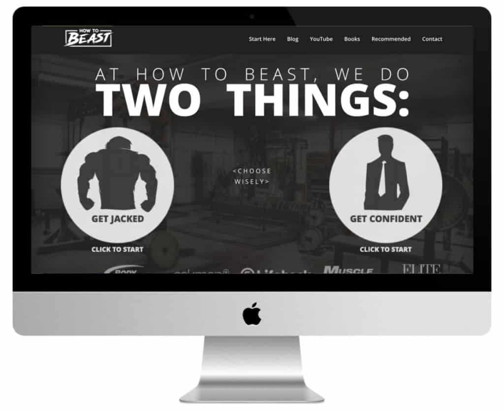
How to Beast is a site about physical training, mental conditioning and nutrition. It is therefore aimed at men who want to gain mass by going to the gym and become more confident...
With its clean design and bold typeface, How to Beast screams masculinity!
It hits hard right from the start with a double CTA with badass pictograms on the full page.
You have the choice between 'getting muscular' and 'getting confident'. Between the two images, you are warned: "Choose wisely".
The "Start here " page serves as both an intro and an introduction. It introduces the concept of the site, motivational phrases, a selection of links to the most suitable articles to start with and an introduction to David, the entrepreneur behind How to Beast.
The blog adopts a professional tone with its square social networking buttons in the sidebar, small thumbnails and clean design.
How to Beast is also and above all David's big YouTube channel (over 715,000 subscribers at the time of writing) and a more than decent insta account (over 100,000 followers). Remember that YT has a rather male audience - more than 60%, unlike Instagram where the proportion is reversed.
The YouTube channel has its own page on the site with a video gallery.
Original, effective and punchy, How to Beast definitely deserves its place in this selection of the best Divi sports sites!
8 - Future 500 id Camp
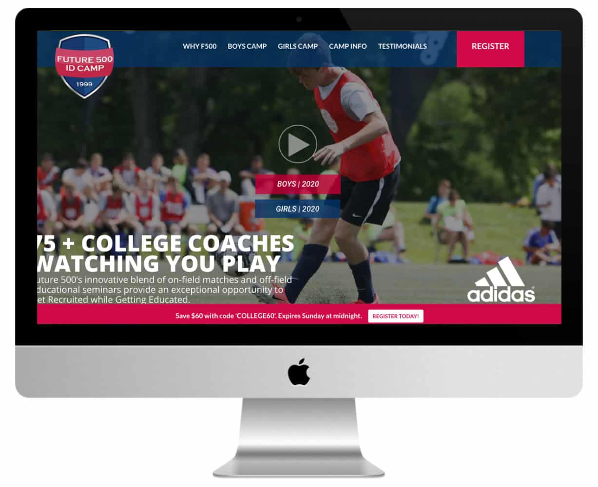
Adidas sets up and sponsors these summer camps in the US to promote soccer (football). These camps are of a fairly high standard and the stated aim is for students to gain a scholarship to one of the many partner universities.
So this is a very professional site, with real ambition and fairly large resources. That's why the site doesn't go off in all directions: fairly static presentation, neatly framed elements, high quality photos and videos.
This is a good example of a professional site that caters to a demanding clientele. Parents who send their children to summer camp are investing in their children's future. They need a serious image that inspires confidence.
Notable plugins :
- Gravity Forms
- Bloom
- Yoast
- Optin monster
- Slider Revolution
Don't delay! Discover the Divi theme here !
9 - Mijn Personal Trainer
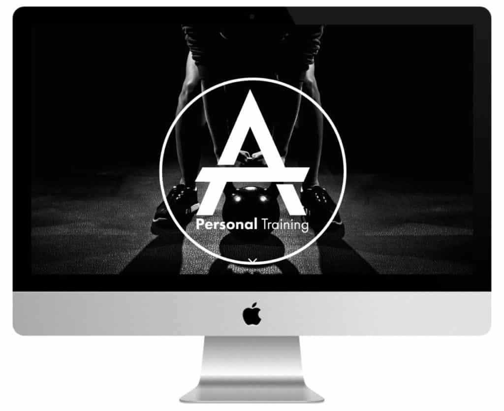
This is the website of Ayhan Tac, fitness coach and personal trainer. This one page site is a good example of a simple, clean and effective online presence.
The reception opens on a header hero which gives way to a sticky menu on scroll. This is followed by :
- a CTA,
- a presentation of the coach and his services,
- a selection of testimonials,
- of dynamic counters,
- the presentation of tariffs,
- and the site concludes with the contact section.
Note the following plugins that are used for this site (among others):
- Ninja Forms
- Monarch Social Sharing
- Yoast SEO
In conclusion: which Divi sports website do you prefer?
I hope this selection of Divi sports sites has inspired you! You can see what you can get in terms of variety of tones and actors, from the one-page athlete or personal coach to the big institutional or private site.
Divi really does do it all!
So which of these sites did you prefer? I must admit I have a soft spot for How to Beast (with its stylish double CTA as a welcome) and for Maxime Chabloz 's site (with its foam splash dividers).
Now you know everything! Don't hesitate to give your opinion in comments. Also, if you have a sports website made with Divi to submit, go ahead, you might be part of a future selection or update 😉
Did you know that you can test Divi for free? Go to this page and click on "TRY IT FOR FREE
This article was written by David Albert, a freelance writer who helps entrepreneurs publish quality content. More info on his website.



Bonjour sur le site Maxime Chabloz, comment est-ce que l’on fait pour cacher son logo dans la barre de menu et ensuite la faire apparaître quand on scroll de couleur blanche alors qu’il était fondu avant avec l’image?
Merci à toi j’aime beaucoup ton site et le parcours avec joie.
Morichon rémi
Salut Rémi, c’est une histoire de « barre de menu primaire » et « barre de menu secondaire », dans les réglages Apparence > Personnalisé > En-tête et navigation. L’une correspond au menu normal et l’autre correspond au menu après avoir scrollé. Dans le cas de Maxime Chabloz, il a dû cacher le logo en menu primaire avec un fond transparent, puis dans le menu normal, il a laissé les valeurs par défaut… Tu comprends ?
Hey, merci pour ces analyses, ça m’aide beaucoup. Est-il possible que certains sites aient changé ? Car je n’ai pas toujours retrouvé tes observations sur le site. Good job !